12/15/07

COFFEE BREAK

It's refreshing sometimes to not plan a thing, just paint a picture on impulse. After I made a rough sketch, with more consideration given to the shapes that were sunlit, I painted this quickly. Some paintings really take a long time to complete, but not this one. I like how immediate it feels to me, not fussed with or overworked....my downfall, usually.


The unique sunlit shapes caught my eye and made me want to paint this. I love melding one shape into another without an edge between them, too, and it worked here. Hope you like it too.
Total drawing and painting time - less than a half hour. Go take a coffee break!

"COFFEE BREAK" Transparent Watercolor on Arches 140# CP 7 x 11" SOLD

12/14/07

TAKING THE RIGHT STEPS

It's amazing how many times I've taken steps to close my world in instead of exploring the possibilities that are before me. This painting has something to do with that idea.

If only we KNEW what was at the top of the steps, behind that door, we'd know whether or not to climb them and knock. There are many steps and doors I've ignored, maybe because the climb seemed too steep or the door didn't look all that appealing. Then there are those steps I've chosen, thinking I was going somewhere great, and discovered, with regret, that it wasn't so good after all.

Maybe it takes a little faith or some special encouragement to make the climb and knock on the door. I'm very thankful for all the people who have encouraged my climb. I treasure each step, even the really steep ones.

"SEEK, AND YOU WILL FIND" Transparent Watercolor, Conte Crayon, Graphite, Charcoal, Painted Paper Collage, all on Strathmore Aquarius 80#, 15 x 22"

12/13/07

YUPO WINDOW TREATMENTS

The shadows and sunlight seemed to be playing hide and seek in the curtains and shutters of this old restored house. I wonder if the old quilt is homebase??? The stories they could tell ... and that's what I often hope a painting hints at.

Painting on the slick YUPO surface, using miskit to maintain really clean, sharp whites, I enjoyed tossing in colors to enhance the mood of the room. I loved painting all the shapes in the window area, but the quilt is my favorite part of the picture. I'd sure rather paint a quilt than actually sew one.

My sister, Marilyn, an accomplished and talented artist also, '''paints''' with her sewing machine using cotton also as her canvas, to create exquisitely beautiful quilts. One weekend when we got together, she sewed quilts while I painted a picture with one in it. We made a good sized mess and had a ball.

Rebecca Barker, a Cincinnati artist also, has an awesome reputation for her beautiful quilt-themed paintings, very creative and unusual. Check out her website at http://www.barkerquiltscapes.com/

"WELL WORN" Transparent Watercolor on YUPO, 16 x 25" SOLD

12/12/07

YUPO GIRAFFES

A good friend gave me a really great giraffe gift yesterday that delighted me. I've loved giraffes since my early teens, when one was born on my birthday at the Brookfield Zoo and named 'Sandy.' We even have a giraffe-themed bathroom that the grandkids use.

These four creatures were munchin' lunch and enjoying the Colorado sunshine when we visited and fed them. Painted on YUPO paper, this painting is a celebration of their grandeur. If I redid the painting now, I would incorporate some easier methods of painting the sky area in order to make it more uniform.

I love the casual sassiness that giraffes seem carry along with them and have probably completed at least a dozen giraffe paintings in my lifetime. They are such awesome creatures.

"THE LUCKY LUNCH BUNCH" Transparent Watercolor on YUPO, 11 x 35"

Myrna Wacknov recently '''tagged''' me to play an internet tag game. I must tell 5 obscure things about myself, then tag five other people. #1. Besides giraffes, I love otters, too - because they are so playful, spending their time either playing, eating, or sleeping...a good life. #2. My husband and I went to the same kindergarten, but didn't meet until Mr. Fox's high school geometry class when we were 15. In June '08, we will celebrate our 40th wedding anniversary. #3. Once upon a time, I was in a unique group that called themselves the 'OTTERS.' #4. My dad always called me 'Bugs.' I miss him. #5. I cannot remember ever believing in Santa Claus. The chimney thing never made sense to me. When I was about 5, the Santa whose lap I sat on at Mal's Sporting Goods Store had the same watch and glasses and shoes as my dad had. Seemed a little 'fishy' to me.

As per Myrna's instructions, I'm tagging some of the people who have responded to this blog. They are
Cecelia in Texas at http://cecelia-throughmyeyes.blogspot.com/
Michelle Himes in New Jersey at http://mhwatercolornotes.blogspot.com/
Suzanne McDermott in Nashville, TN at http://suzannesketches.blogspot.com/
Art Lover in Vancover BC, Canada at http://artloverscorner.blogspot.com/
Diane Kasparek from Washington State at http://www.orcasislandstudio.com/

12/11/07

BARRELS OF FUN?

It seems we all travel highways that are constantly being repaired. Late one afternoon, the cast shadows under the van in front of me, along with the ones created by the familiar orange barrels, made the best patterns and shapes, ones I had to paint.

I thought the idea was goofy, but the shapes stayed in my mind until I got them on paper. Using my taping process of saving the existing values and shapes with pieces of masking tape before painting in the next darkest value, I explored this painting. I liked the results, and it won Best of Show and also a second place in the two shows I entered it in. Each time I look at the painting, memories surface, reminding me of the thousands of miles that I traveled in a year, through construction zones, back to my hometown to teach before I began teaching classes here in the Cincinnati area.

Titling it was fun, and I think one of the judges liked the title enough to give it an award! He said he was expecting to see another floral painting and was pleasantly surprised to find this instead. Seriously, would you rather look at a floral or a bunch of orange construction barrels????? Actually, it's hanging in our living room right now, (where there are no florals.) And I used to be a master gardener?

"ORANGE BLOSSOM TIME" Transparent Watercolor on Arches 140# CP, 21 x 8.5"

12/10/07

ARTISTIC LICENSE

Windows and doors fascinate many artists for some reason. I really liked this old, old house with its ancient windows. I think George Washington even slept here!

Colors and shapes and lines and textures and lights and darks are what we have to put down on canvas or paper to try to express our visions. It's great to have the freedom to change whatever we want in a painting, like I did in this one. There were flowers in the window box, no bottles in the window, only a lighted bulb hanging down inside, and the bricks were mostly one color. Artistic license is a great thing and should be used liberally so, therefore, each of my students has a personalized artistic license to keep forever.

There are probably at least seven paintings of this same window done by me, with changes made in each one according to what seemed best at the time. All have been created with watercolor using masking tape to protect each painted area from the next layer of paint. Since I continue to be inspired by my reference photo and because the memories of the my trip there are special, I'm sure I'll paint it again soon.

"VISITING NEW HOPE" Transparent Watercolor on Arches 140# CP, 14 x 20" COLLECTED

12/9/07

YUPO FRIENDS FOREVER

This is one of my earliest YUPO's done with a loosey-juicy treatment, and the rug almost looks like it's the thing that's rocking the chair. When I look at the painting, I notice the lack of accomplished skill and technique, and yet, there's a strength of emotions that speaks to me.

The chair and window are from an old historical house on the eastern seaboard where a woman lived her life out. While we were there, I sensed conflicting feelings of contentment and loneliness in the house, which I tried to convey later with the paint.

When my best friend, Sandi, saw the finished painting, she really loved it. She's been gone five years, and I miss her still. The painting was named in her honor for the beautiful difference she made in my life.

"HER PRESENCE" Transparent Watercolor on heavyweight YUPO, 14 x 20"

12/8/07

NOT A VISA OR MASTER CARD ON YUPO

My sister is an adventurer, and
when she lived in Africa, she managed to snap this picture (without a telephoto lens) and still escape the charge of the beast. She said she did it for me, and I really appreciated her risking life and limb for a future painting.

YUPO was about the only surface I painted on four years ago when the top painting was done. When I did the lower 'close up' view this fall, I chose YUPO again.

For both paintings, I miskited the palm leaves before painting. Once the foliage and elephant were painted and the miskit removed, I spritzed some diluted yellow-green paint over those sharp leaf shapes to help soften the harshness of the miskit, then jiggled the piece of YUPO to try to loosen the edges of paint a little. The leaves could have been lifted out with a moist brush, but miskit helped create crisper edges.

Because of the unique YUPO 'slide-of-the-paint' on the elephant's trunk in the lower painting, I decided not to add too much detail to it. I was especially pleased with the intensity of that painting. It seems like he's just come out of the brush, and we can almost feel his breath. What do you think, Marilyn?

Upper Painting titled "CHARGER" SOLD
Lower Painting titled "CHARGE!"
Both done with Transparent Watercolor on YUPO about 26 x 20"

12/7/07

YUPO - MORE THAN A HISTORY LESSON

"PEARL OF GREAT PRICE" Transparent Watercolor, Gouache (Opaque Watercolor,) and Tube Acrylics on YUPO, 17 x 13"

I expected our visit to the memorial at Pearl Harbor in Hawaii to be a good history lesson, but I was taken off guard by my overwhelming emotional response. I'd always considered Pearl Harbor as part of my parents generation's history, too far removed to have much emotional impact in my life. The very strong reaction I had completely surprised me - - - feelings of pain, confusion, sorrow, anguish, compassion, hope, reverence, and awe washed through me while we were there. Painting this picture helped me express some of those powerful feelings.

This is the only painting on YUPO I've tried using other watermedia. The painting is five years old and still all in one piece, so I'm hoping all the watermedia stays on the surface. The flag effect was done using tube acrylics diluted with matte medium. After it dried, I thinned opaque gouache with water and painted over the acrylic to portray a watery blanket. The structures out of the water were created mostly with transparent watercolor. If you've been there, I hope this painting brings back some of the profound feelings you may have had. Someday there will be no more wars.

12/6/07

DAINTY LADIES

I love the first snow each winter, but as soon as it melts, I'm so very ready for spring. Maybe posting an earlier painting of spring roses will hurry the season here. Just wishful thinking...

Many, many decades ago, I used to grow and show roses at the state fair, but now it seems like the craziest thing to do. Painting them is a whole lot more challenging, and the results last much longer (if the painting's successful.) One warm day in late May, these Dainty Bess roses begged to have their picture taken, and, of course, later I knew had to paint them.

"DAINTY LADIES" Transparent Watercolor on Arches 140# CP, 44 x 33" SOLD

12/5/07

PATTERNS AND TEXTURES

"AFTER WORK" Transparent Watercolor with Gouache (Opaque Watercolor) on Arches CP140# - 16x11"

A friend took a picture of two men in a bar in South Africa. The surroundings were fairly stark, and the patterns created by the bottles, the shirts, arms, heads and hat really caught my eye. Based on my impression of the scene, I began this painting.

I love mud cloth and want to try to make it sometime, but for now, I imitated some mud cloth patterns throughout the painting. Since giraffes are one of my two favorite animals, they had to be included. They live on the continent and have unique patterns. I like the tallest one between the two men. He seems to be their lookout.

... textures and patterns, shapes and colors, edges and lines ... such neat 'toys' to play with when expressing thoughts and emotions with paint!

12/4/07

YUPO ADVENTURE AGAIN

Here's another YUPO painting, this time with less control of the paint in many areas. The joy of YUPO is letting the paint go where and how it wants. Amazing things happen when the more sedimentary colors charge under the staining colors and push them out of the way - see results of this in the foreground and background areas.

The colors on YUPO remain so vivid since they have no soft surface to sink into. This European peasant paused just long enough to get his picture taken. His mule dwarfed him, too, and gives a bit of a subtle message to the painting.

"LONG JOURNEY HOME" Transparent Watercolor on heavy weight YUPO 19 x 15"

MORE EXPLORATION

What a wonderful opportunity artists have - to be able to express their feelings in a tangible way. This painting started out as an expression of misery and depression, but I think it resulted in a pleasing painting full of hope and peace, a strong contrast to how I felt when I began it. While working, I noticed that my focus turned to creativity and delight instead of the destructive thoughts I'd been entertaining. The angels in the painting were an unexpected joyful surprise, too. Thank you, God!

"ANGELS AMONG US" Transparent Watercolor with Conte Crayons on 80#HP Strathmore Aquarius, 15 x 11"

12/3/07

TREASURE HUNT

Done on watercolor paper, this painting includes both torn rice paper collage and tube acrylics, plus a lot of rubbing alcohol used to rub off some areas of pigment to reveal colors and textures underneath. The idea was to create a weight or tension between the top large shape and the bottom band of color.

Using rubbing alcohol to lift areas of dried ACRYLIC paint creates surprises and textures that I could not get any other way. It's like a treasure hunt to see what's been hidden away.

"FULL MOON" on Arches 140# CP 15 x 11"

12/1/07

ACRYLIC & COLLAGE

"DOWN RIVER" on stretched canvas - Collage and Acrylic 42 x 30" SOLD

Traditional tube acrylics have come a long way in the past 40 years. This painting, done on canvas, was first covered with several layers of small pieces of various textured washi papers. Tube acrylics, diluted down with matte medium, finished the painting, and although the transparency of watercolor is lacking with tube acrylics, I still liked the vibrancy of the painting. The painting received 'Best of Show' at The Fitton Art Center in Hamilton, Ohio, in 2005.

One of my good friends returned from a trip to the Grand Canyon, and after she showed me a slide show of her adventures, I was inspired to create my impressions of the colors and textures from memory. I need to go to the canyon and see it myself, I know.

11/30/07

GINKGOS

I've used fluid acrylics a lot in the past two years, but mostly straight from the bottle, without diluting them. Using them just like transparent watercolors works superbly! Thanks, Nick, for showing us how versatile they are.

It seems that transparent watercolor has a nearly identical twin sister now in the fluid acrylics. Both paints have their own personality, but come out equally as transparent. I would NEVER have thought acrylics could be used this way, ever. The ones I used in college straight from the tube certainly had a plastic, cheap look to them. This is entirely different. Painted on Arches 140# hot press 30 x 22."

I like how much more versatility is at my fingertips by having a choice of which kind of paint to use to do the best job at the moment. Can you tell which part of this painting was done with transparent watercolor and which part with fluid acrylics? Click on 'comments' below and let me know.

11/19/07

YUPO THANKSGIVING

"JOURNEY TO JUNGLE JIM'S" Transparent Watercolor on heavy weight YUPO 40 x 26" SOLD
I painted this a couple of years ago as a still life demo in one of my classes and really liked the richness of the colors and variety of textures that were possible to paint on YUPO. My friend Mary has it hanging in her studio. If you haven't tried painting on YUPO paper, you're really missing something to be thankful for. . . but it took me two years of experimenting on it to be very thankful. The nice thing is, with YUPO, if you mess up, you can wash it all off and start over. The YUPO surface will wash off completely. Have a very Happy Thanksgiving.

('Jungle Jim's' is a great place to visit anytime you're in Cincinnati. What started out a couple of decades ago as just a truck stand selling produce is now an innovative, unique and fun complex to shop for ANY kind of food item known to man or woman! It's the Disneyland of grocery stores and even has award winning restrooms.)

ACTIVITY

Ginkgo trees loose their leaves in one day. The way the leaves lay on the ground under the tree when they fall reminds me of wearing crinolines when we were little kids. The leaves around the trunk on the ground look like the crinolines did when you dropped them down around your ankles, before you stepped out of them.

Since I'm inspired to paint Ginkgos, I'm headed down to the studio and will hopefully be incorporating many things learned this past week from Nicholas Simmons. This painting is just an up close of part a painting we did last week in the workshop. The COLORS!!!!! WHEW! Doesn't get much more dynamic than this. I'm charged up.

Fluid Acrylic Watercolors on Arches HP 140# SOLD

11/17/07

NICHOLAS SIMMONS WORKSHOP

I surely wish all artists who work in any type of watermedia could spend at least one week at a workshop with Nicholas Simmons. This past week's workshop put a new bar up for what a great workshop entails. I've been able to enjoy learning from so many talented and well known national artists, and yet, this week was way beyond my expectations. Nick taught us new techniques that were great, but most of all, he also taught us to push ahead, to think creatively, to explore beyond what we can imagine, and to really stretch the boundaries of our world. Inspirational. What an incredible week!

My painting posted here shows my attempts to incorporate some of the techniques Nick taught us, but you must visit his diverse website to see his work. Fabulous. Although this painting is not the success I had envisioned, (workshop 'art' seldom is,) I gained so much from doing it.
.
.
"BOW TO YOUR PARTNER" (created at NES workshop) Fluid Acrylics on Arches HP 140# 16 x 23"

11/16/07

LET IT SNOW

We had our first tiny bit of snow early yesterday, but I missed it 'cause I was asleep ... exhausted from a week of painting and learning. But the week has been chock full of excitement and experimenting.

Nicholas Simmons, a MASTER artist, is here at the studio sharing with us so much of what he's discovered about watercolor and the world of art. The workshop has far surpassed our expectations. If you can get into one of his workshops, you will not regret it. He's a musician first, he says, but his paintings, his skill at handling the medium, and his diversity an amazing part of this artist's brilliance.

I can't wait for this morning to begin. It's our last day of the workshop, and we will have him return for another session in the near future. Check out his website (see side bar) if you haven't already. I have the highest respect for Nick. Getting to know him and learn from him this week is a special treasure that I will always cherish.

I'll post some goodies from the workshop soon. This post is from last week's demo at the Cincinnati Watercolor meeting, the third card of the demo (see previous posts.)
"LET IT SNOW" on Arches 140# CP about 6 x 9"

11/9/07

DO YOU SEE WHAT I SEE?

Many painters like to create their own greeting cards. However, I find that painting really small is MUCH more difficult than painting really big, so cards can be a challenge for me. I used to paint an original Christmas card for every person in my classes, (but now we don't even send out Christmas cards.... shame on us.)

Each year, one of my friends reproduces a picture that one of her grandkids paints then sends them for her holiday cards. I love that idea because the card is so fresh, plus that child has been encouraged to be creative and expressive with such a positive focus on art.

The painting posted here was one of the demos for Christmas cards at our watercolor meeting this week. The size is bigger than a regular card for the sake of the demo. I splattered miskit, tiny specks of it, in the sky, and miskited the edges of the lambs, plus all of the star. Can you imagine a star that bright? Absolutely awesome.

"DO YOU SEE WHAT I SEE?" Transparent Watercolor on Arches 140# about 6 x 9"

11/8/07

YUPO PRIMARY CHRISTMAS

Yesterday we had our monthly Greater Cincinnati Watercolor Society meeting at the Cincinnati Art Club and worked on making our own Christmas cards. After I demo-ed two cards, Judy asked if I would do a demo on YUPO. No problem! She gave me a sheet of her YUPO (I had none with me) and requested I do some Christmas ornaments. What do you think? The ornaments are my three favorite primary colors - quinacridone magenta, turquoise and hansa yellow - so the title was a snap. I'll post the other two cards soon.
"PRIMARILY CHRISTMAS" Transparent Watercolor on Yupo - about 7 x 6"

11/6/07

A FAVORITE PAINTING

Taken from high in the bleachers at the Brickyard 400, this bird's eye view just had to be painted....on YUPO. It's my husband's favorite painting, and since today's his birthday, I thought it was appropriate to post it.

Happy birthday, Honey!

"ON PATROL" Transparent Watercolor with Texture Medium on YUPO 14 x 25"


11/4/07

YUPO = PAINTING FEARLESSLY

"OVER THE RHINO" Transparent Watercolor on YUPO 25 x 11" SOLD - Giglees are available
This old girl in the Cincinnati Zoo seemed to like showing off her old, wrinkled skin, and I couldn't wait to paint her. First I tackled the background area, letting the paint have its way with a little encouragement from gravity.
Mixing sedimentary colors with juicy puddles of the more finely ground colors, like Phthalos and Quinacridones, resulted in fascinating textures on YUPO ..... making it totally fun to watch paint dry. YUPO 'paper' won't let the color soak in, so the colors stay brilliant and strong. It's a perfect surface for making the wildest textures. If you paint in watercolor, I really encourage you to play with YUPO. I call it FEAR FREE watercolor, because anything can be changed/fixed/washed off! Go for it!

11/1/07

COLLAGE AGAIN

A painting can turn in to a political or religious statement for an artist, as a way for the artist to express personal views or experiences without speaking aloud. This painting began with no thought of that in mind but grew in a direction that I liked.

The bank of snow and the bold sun in the hazy winter sky started me on a journey in this painting. The stone wall, mixed with so many different shapes and colors and diverse textures of rocks, (people) symbolized what I believe has built a lot of America into what she is today.

As I added more rocks, I also added pieces of printed collage, words, and small pictures that helped deliver the message of the painting. Many words, like heritage, corporate casual, virtue, tax, progress, abortion, war, save, money, new car, and insurance, are collaged into the painting. I photo copied part of a dollar bill, a dime, a picture of Marilyn Monroe, and pasted them down, along with a piece of the American flag, a feather, a drawing of an arrowhead, and anything else that would add to what I wanted to say. Most things are partially hidden.

The deep snow appears to be partially covering some tombstones. A Bald Eagle flies in front of a rising moon, toward a dormant tree. The wall appears to be well made. Is it? Will it hold up? What's the cost to keep it in good shape? What's missing?

"AMERICAN EULOGY" on Strathmore Aquarius II 80#, watercolor, conte crayon, collaged materials 19 x 26"

10/31/07

TEXTURE REIGNS IN COLLAGE

This summer I took a short workshop with an Indiana artist, Peggy Brown, AWS. She's an excellent teacher and loves watercolor, incorporating a bit of collage into her very subdued paintings. She also sews spectacular art quilts which include her watercolors painted right on the fabric!

My work shown here is a result of using the process she taught. Transparent watercolor, pieces of loose papers and other items pressed onto the wet paper (then removed when the paint had dried,) as well as shaved charcoal and conte crayons all add to the effects. A very small amount of the painting is also collaged from pieces of my own painted papers secured to the painting with mat medium.

"PASSING" on Strathmore Aquarius II 80# 15 x 22"


10/30/07

COLLAGE WITH WATERCOLOR

Collage can enhance a painting in many ways. The leaves as well as the gray and brown band above them are collaged pieces. Most of the other textures were either painted in or enhanced by shaving conte crayon onto the wet watercolor paper. Pieces of misc. papers were placed on the wet paint then removed after they dried, creating some subtle, special textures, too.

There's no acrylic paint on this one, but I did use acrylic matte medium to secure the collage pieces. As I painted this, my thoughts began to dwell on the beauty of our country and the wisdom of those people in the past who knew how to care for it so well.

"BEFORE" Transparent Watercolor and Conte Crayons on Strathmore Aquarius 80# with some collage

10/29/07

COLLAGE

After taking an excellent Gerald Brommer workshop on collage and watercolor/acrylics, I returned home and began this piece. Under the paint are several layers of pieces of paper torn from a variety of textured rice papers which were glued down with mat medium.

The fun began as I painted over the then dry and bumpy surface of those rice papers. Textures peeked out everywhere. Using rubbing alcohol, I lifted off the acrylic paint in certain areas to reveal more nuances of colors and texture underneath. (Click on the pix to see the textures up close.)

It was another painting that was hard to stop painting on. The photo reference was taken in Malta where my sister once lived. It could certainly be anywhere in Italy, too, where texture and ancient are married forever!

"AROUND THE CORNER" on Arches 140# CP with Collaged Rice Papers, Watercolor, and Acrylic 14 x 20"

10/28/07

PORTRAITS AGAIN

I was taken by the elegance of this woman. She was having lunch with a friend and oblivious to my taking her picture. I've changed her features just enough that it really doesn't look exactly like her.

This portrait is painted with much more control than the one I posted on Oct. 22. I find it much easier to paint like this than to paint loosely the way the other one was painted.

"COFFEE TALK" on Arches 140# CP 22 x 15" TRANSPARENT WATERCOLOR

10/27/07

CREATURES

Capturing the liveliness of a living creature always challenges and excites me. In this painting, I took photos of a client's frisky dogs then created the painting later, relying on my photo references.

To help anchor the painting and give it unity, I employed John Salminen's 'good white shape' process. As Salminen explains, the process gives 'bones' to the painting and holds it together, even though it's not visible in the finished painting.

"SANDY AND FRIEND" on Arches 140# CP 21 x 16" SOLD

10/26/07

DRY BRUSH WATERCOLOR

Once, a gallery owner kindly told me to stick with one recognizable style in order to further my art career. His advice was sound, but ... There are just too many excellent ways to express feelings when painting, too many wonderful, awesome, beautiful things to paint, and not enough lifetime left to paint it all. So I continue to paint what I want to paint in whatever 'style' I want to paint it in. Diversity is a lot more fun than sticking to a specific formula for me. And the Art Career? I figure Success is measured in more than one way.

The technique shown in this painting is called "Dry Brush." Andrew Wyeth is the master of dry brush, and Joseph Boehler uses it superbly, too. I seldom paint this way, but once I'm into the painting, I hate for it to end. The paint was applied with almost no moisture added and built up by crosshatching to develop depth of value, color, and texture. Because there's no water to spread the paint around, it takes many, many, many hours to complete a painting like this. The richness and depth can't be achieved any other way.
"WELL KEPT SECRETS" on Bristol Board 10 x 14"

10/25/07

MASA PAPER 'BATIK'

A batik-look can be achieved several ways without using wax on the paper. This painting was done on Masa paper, a type of rice paper.

Painting on Masa paper with transparent watercolor is easy to do. First, I squished and wrinkled the Masa into a snowball sized shape and placed it in clean water. After soaking it a minute or two, I removed it from the water and very carefully spread it out, laying it out flat on a clean white surface. When it's wet, Masa tears easily, but when it does tear, it can be patched back together later when it's glued it down.

While the Masa was still fairly wet, I splashed light valued, warm temperature watercolors over the page, taking care not to brush the paper more than once in any one spot. After adding a few cool colors for balance, I let the paper dry.

After sketching the building, etc., on the dried Masa paper, I painted in the darker values to define the subject matter. Much of the original 'first wash' colors still show in this painting where the values are medium and light. White acrylic ink was used to highlight the flowers and a few other spots.

The only problem with painting on Masa is that it 'balls up' like a bad sweater if you paint on an area too much. Otherwise, it's very, very easy to get great results using this technique. It's a good surface for beginners to try. The crinkly look resulting from the wadded up Masa paper certainly lends a special texture to this old Italian villa. To see a master's work on Masa paper, check out Cheng Khee Chee's work - awesome!

When the Masa was dry, I used methyl-cellulose wall paper paste and glued it down to a sheet of Arches 140# paper, smoothing and flatten out any wrinkles. Some artists like to leave some wrinkles.

In a couple of weeks, many artists in my classes will have the privilege of learning another more sophisticated 'batik-look' technique from Nicholas Simmons, one of the major names in contempory watercolor. He'll be here teaching in the studio for a week, and we can't wait! Just last week, he received the TOP AWARD at the National Watercolor Society's annual show. Way to go, Nick! He does a great job explaining his process on Wet Canvas (see side bar.) My friend, Rhonda Carpenter, 'introduced' me to Wet Canvas and Nick's awesome paintings. Thanks, Rhonda.

I never did title the villa painting. Titles are just hard to do sometimes. Finished size is 16 x 22" approx. Here's another painting I did on Masa paper with the batik look, done in the same way.

A final note - no rice paper is made of rice! Go figure???


"A RIDE TO WORK" on Masa 19 x 14"

10/24/07

WATERCOLOR BATIK

Although painted with transparent watercolor, this painting included the use of wax and rice paper. The batiking process has been around for many centuries, and using batik to create a painting can be tedious but full of surprises. Once it was finished, I 'glued' it to a REALLY large sheet of Arches 140#, using methy- cellulose wall paper paste. I've also painted this same subject using the taping technique with nice results. Both paintings have been sold, but I do have prints of this one for sale.
.
"TIMES PAST" Transparent Watercolor and Sumi Ink on Kinwashi 36 x 24" SOLD

10/22/07

JUST THINKING

Sometimes I see a face and must paint it. This woman seemed to have both self assurance and mystery. We were in a cafe in Maine having breakfast when she walked in. Later, while I was painting her from my photos, I liked making up stories about who she really is....hmmmm, I'll never know, but maybe the painting will make you want to know her.

"JUST THINKING' on Arches 140#CP 18 x 14"

10/21/07

SEAWORTHY

Several years ago, I tried gouache, aka opaque watercolors, combined with transparent watercolors. FUN! At one time I thought the only way to go was transparent watercolor, but so many new avenues opened up when I became more flexible. Now, whatever it takes to make good art is what I'll pursue. I liked the playfulness of this painting, and it felt like play when I painted it, too.
"DEEP BLUE SEA" on Arches 140#CP 29 x 20" SOLD

10/20/07

PAINTNG ON YUPO

Almost 10 years ago, I attempted to paint with watercolors on YUPO. Two years of frustration finally resulted in a wonderful 'ah ha!' moment, and I was really hooked. Back then, no one gave workshops about how to paint on YUPO, so I plodded and experimented on my own.

Now on video you can watch George James demo the many, many ways paint can be used to transform the slick YUPO surface. Creative Catalyst Productions produced the videos, and James also gives workshops throughout the US. Several of my friends have taken his workshops and learned a bunch.

The painting below started out as a workshop demo and was awarded Best Of Show at Viewpoint 2004 at the Cincinnati Art Club. The painting on the right is more recent and received a first place in another show after getting a rejection notice for Viewpoint 2006. My inspiration for the one on the right came when my friend, Ginger, donated some chemistry flasks to my studio still life collection.

"UNDERGROUND RAILROAD" on YUPO 40 x 26", and above, to the right, "PARTY TIME" on YUPO 26 x 40"

YUPO IN EUROPE

"EUROPE'S BEST" on YUPO 40 x 26" SOLD

If you haven't painted on YUPO, you are missing a great adventure with watercolor. I wanted to paint as impressionistically as possible on YUPO and had a blast doing this painting. I worked from a small color study I'd done in oil, and referred to the photo below only for small detail info. The paint sits right on top of the plastic paper surface and maintains its brilliance and intensity, and anything with texture deserves to be painted on YUPO. It takes the aspects of watercolor into a new level.

MY PHOTO REFERENCE BELOW AND, TO THE RIGHT, MY SMALL COLOR STUDY DONE IN OIL

10/19/07

EXPLORATION

Some paintings take on a life of their own, telling me what to do next. This one was fun to discover. Having NO IDEA at all what I would end up with, I began the painting using my taping process along with some of my favorite transparent colors.

After many glazes had been washed on, I removed the layers of tape and began to search through the chaos of the colors and shapes for some sort of form. I hoped to preserve as many textured areas as possible.

"SECOND HAND ART" on Arches 140# HP 30 x 22"
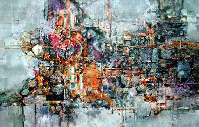
The little old ladies on the right '''showed''' up and led me on a fantastic journey. Much of the tape texture was covered up with gouache and watercolor as I developed the composition. I also used Caran d'ache crayons, a water soluble crayon that is freeing to use on paintings.

Robbie Laird said that this method of work takes chaos and turns it into control. I agree. It's certainly the most challenging approach for me. I removed the painting from its frame three times and made changes before I was happy with it.

The painting's presently in the Ohio Watercolor Society's 2007 Traveling Art Show and also won the Best of Show in 2006 at the
Middletown Arts Center Annual Show.


DETAIL OF SECONDHAND ART - textures resulting from tape make fantastic patterns.

Just another note--- At a recent show, a couple was admiring this painting. I leaned toward them to hear what they were saying, and when I discovered that they really liked it, I felt a panic in me that they might purchase it, that it would no longer be mine. Up to that point, I hadn't realized how attached I'd become to the picture. Some paintings are just too hard to part with when you've invested so much in them, and this is one of them. I can't wait to get it back.

FOREVER

"FOREVER" on Arches 140# CP 27 x 21"
Today's a gorgeous fall day. The colors outside remind me of this painting done two years ago about this time. Before using all transparent watercolor, I placed masking tape, torn into the appropriate sizes, to mask out the lightest value areas, before painting almost randomly with color to evenly darken the remaining areas. Usually it takes about six to seven layers of tape and paint glazes to get the textural effects and value patterns as seen here. Putting all that tape on then removing it when I'm all done is tedious, but I love the results.

My desire was to portray the 'old' of the village with the old, old couple, and I was pleased with the outcome. The painting received the Gold Medal from the Ohio Watercolor Society's Annual Juried Show in 2006, with Stephen Quiller as judge. YES!

10/18/07

ICE STORM INSPIRATION

" THE BIG ICE STORM" on Arches 140# HP 18 x 30"


The reference photo on the right shows many more branches, etc. than in the painting. Artistic license is important to use so that the reference photo doesn't become the 'boss' of the painting.

.


One of the classes wanted to know how to paint 'ice.' We had a really long lasting ice storm this past March. Every day for seven days I snapped photos, thinking I shouldn't take more... but each day was even more beautiful than the last. I couldn't resist.
Choosing a reference photo and cropping it using the Phimatrix program I'd purchased, I was inspired to teach the class how to paint ice. Of course, all we could paint were shapes, edges, values and colors. But they looked like ice when we were done:-)
The phimatrix system is a great tool to help an artist find the ideal focal point for a painting. The site's listed as one I visit often (on the right hand side of this blog.) Check it out at http://www.goldennumber.net/ It's good reading and awesome info for an artist. From that site, I'd purchased Gary Meisner's Phi Matrix program (inexpensive - $14.95 download and so easy to use!) which helped me find the ideal center of interest.
The upright branch divides the top of the painting into a 'phi' proportion, making the right hand side .618% of the whole width of the painting. Right at the bottom of that branch, where the redbud seed pod hangs down, is an ideal focal point. Putting sharp edges and strong contrast of value and color there helps to grab the viewer's attention. Hopefully you felt a 'brrrrrrr' when you looked at the painting.