3/6/08
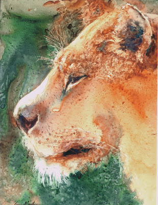
YUPO LIONESS
For this painting, the sliding paint almost worked for the fur on this cat's face. Then the little spot dried between her nose and eye, leaving an unnatural hard edge where I did not want a hard edge. Somehow, for once, I was able to leave that spot alone and go on with the rest of the painting. Trying to correct it after it had dried would've resulted in destroying the beauty of the cheek area.
Once the whole thing was completed, I found that the hard edged spot no longer bothered me. In fact, I liked what it did for the painting.
I also got lucky under her chin where the background color sneaked into the wet paint of her fur, adding just bit cooler look to the shadow there. The grainy area between the ear and the eye is a result of the Lunar Earth separating or granulating in the Quinacridone Burnt Orange area.
If you haven't tried YUPO yet with watercolor, you are missing out on a great adventure. Although this was painted back in 2001, it's still one of my favorite paintings. Fortunately I'd made giglee' prints of it before it sold.
"GRRRRRRR" Transparent Watercolor on YUPO 10 x 12" Collected
3/4/08
SEEING CLEARLY
By far, the most influential element that we (mistakenly) think we must paint is color. A person may spend lots of time trying to find the perfect match for a color. However, color's main job is to develop the emotion of a painting. It also adds atmospheric perspective to a painting. Color alone seldom describes an object very well. The darks and lights or VALUE changes are what does the job of telling us what's going on in a painting, what it's about.
When painting glass, (or brass or any shiny item,) a broad range of colors will work as long as the lights and darks are created in the correct shapes with the correct edges. To give more emphasis to this, I've added some Photoshop enhanced pictures of the above painting.
The first pix has much less value change, with fewer darks and lights, resulting in a flatter painting, showing what happens when there's not enough value change from light to dark. While the jars still may look like canning jars, there is no impact when looking at the painting because the value changes are only strong between the metal handles and the glass. The other three 'paintings' now have crazy color combinations, to show that glass looks like glass if the values and edges are correct, whether the 'color' is correct of not. COLLECTED
3/3/08
PORTRAITS
His eyes were so gentle, kind... and direct, making them the specific reason for me to want to paint the portrait. I wonder why some people are so much more photogenic than others. He struck a casual pose outside the diner, and the only thing left to do was capture it all on watercolor paper, which I was anxious to do.
"COLORADO ROCKY" Transparent Watercolor on 140#CP Fabriano Artistico 15 x 11"