Showing posts with label great white shape. Show all posts

6/25/09

FIVE PAINTINGS


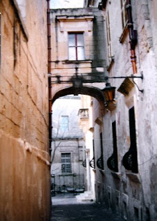
The five paintings above, along with the reference photo, show my slightly different takes from one inspiration. I know that I've completed several more paintings of the same subject - one very dark and somber - one very, very colorful and patchwork quilt looking - and the rest I can't remember. For several years, I didn't take photos of my work, and now I regret that lapse.
All of these have watercolor in them and are more or less in chronological order, with the first one being painted about 15 years ago. It was done using masking tape to protect previously painted areas as I darkened more shapes to build up the painting. The tape's all removed now. It's a technique I continue to use today because I like the batik looking effect it lends to the painting where the paint leaks under the pieces of tape.
The second one is a collage with watercolor, using rice papers to build up texture on the paper. It was easy to create the delicious textures of those old walls with the layers of various rice papers.
The third painting was done on watercolor paper that had a layer of white gesso painted over it first. The paint 'floated' on the gesso-ed surface, drying in irregular ways that helped establish the textures of the walls and street.
The fourth painting began with one good white shape and three 'cool temperature' shapes touching it. The white shape went off the page on three sides, originally, but now is hard to find. The process of using a good white shape initially in the painting was a springboard to help establish a sense of unity and focus in the painting.
The fifth painting is the batik with hot wax that was just posted last week on this blog. Check out that post for more info about how it was done. When I see these five together, I think I really prefer the first one the most. Do you have a favorite? (I still regret having sold that first one.)
You'd think I'd be so tired of this painting by now, but I have plans for another approach --- or two or three dozen. Mike Bailey (click to check it out) has painted one still life over 90 times - so look out. I'm not anywhere close to that yet.
There are so many ways to approach this painting, and the only approach I've used so far is to try different techniques and design processes. I have yet to focus on an element of design as being more important that anything else --- and certainly texture would be the first element I would emphasize. And I haven't yet pushed the picture beyond the confines of realism. That's an aspect begging to be explored. And I don't remember ever painting the scene on YUPO, either. The things that await me in the studio....
But this next week I'll be away from the computer to challenge 15 other artists at Miami University in Oxford, Ohio. We'll be using hot wax, four different rice papers, watercolor paints, fluid acrylics, canvas, and various inks as we explore other ways to create gorgeous batik artwork. It'll be fun to share some of their finished batiks here on my blog when I get back. See ya then.

6/3/09

VENICE on YUPO

This painting was one of the demos done at a YUPO workshop I taught this past April. The challenge was to begin the painting with one good white shape that was unpredictable, irregular, and had diagonal movement, and which took up less than a third of the whole paper. Everything around that shape was painted with a combination of cool, pale colors first. Next, some small warm darks were added.

From that point on, the painting was developed by interrupting that original white shape and painting in the dark and medium valued shapes. Much of the original white shape was obscured at this point.

This approach to painting takes some advanced planning, but it continues to amaze me how easily the painting falls together when done this way. The sense of unity in the painting is greatly enhanced because of the preliminary planning with the original good white shape.

I had plans to post some of the workshoppers' paintings but have somehow misplaced my photos of several of the finished paintings. I'll post what I do have later this week, even though some are works in progress.

"GONDOLIER" Transparent Watercolor on YUPO 20 x 26"

3/12/09

NEW APPROACH - OLD FAVORITE

This photo, one my sister took in Malta, has been a source of inspiration for me to paint from over the past fifteen years. The March 7th post (WARMING UP) shows one of those completed paintings, but here the image has been reversed. The approach and techniques used are also very different than before when I painting this same subject.

The black and white image (above) relates to the basic light shape in the photo. In that simplified design, there are three black shapes with one continuous white shape, which goes off the page on three sides. That white shape's was transferred to the watercolor paper and was left white - unpainted - in the few first steps of the painting.

The first layer of paint was very, very pale and was also the opposite temperature of the finished painting. Some of the painted edges creeped into that white shape more than I

wanted, but they'll be ok.

The gray areas shown around the balcony, the door, window panes and the upper window, and in the light are not paint, but actually gray miskit painted on the paper to keep it totally white. There are some splatters of miskit in various places, too, especially in the walkway. It'll all be removed later.

Next, a few small warm dark shapes were added within the painted areas, touching the white shape somewhere. You can see a variety of edges, from sharp, hard edges to soft to disappearing edges in the dark shapes. The contrast of dark and light helps establish the basic range of values early in the painting.

To finish the painting, the largest areas must be painted first, then medium sized shapes, with the smallest details added last. The next couple of photos represent the gradual progress of painting from large to small.

Areas that used to be pure white are adjusted, and the original white shape seems to slowly disappear. That good white shape was important to help establish unity to the final painting. The white shape won't be visible when the painting's done, but that part of the painting will have the best glow and the purest colors.

I enjoy using as many sedimentary colors as possible in paintings like this to take advantage of the textures created by the granulating colors. Lots of violet has been added to the warm oranges and yellows on the walls, and the only brown used was Quinacridone Burnt Orange.

That initial cool glaze over two thirds of the painting helped quiet down or 'gray' the outer edges of the warm colors. The subtle graying of those warms away from the focal area actually makes the focal area have more impact and seem to glow more.

There are several stages of this painting shown here so you can compare each progressive stage of the painting. Once the upper right hand windows had some color on them, I applied miskit over the lighter parts of the windows to preserve the shutter highlights. After darken that window area, the miskit on the windows was removed. In the third to last picture, the miskit has finally been removed from around the door area, exposing pure white paper.

The last two pictures seem almost the same. In the last picture, the lamp has been separated from the archway and detail added to the boarded up windows. The tree was lightened a bit and the balcony shadows darkened. The last thing painted was to darken the top panes in the upper window to anchor it better.


.
.
.
.
.
"CAUGHT UP IN THE MOMENT" Transparent Watercolor on 140#CP Arches 18 x 24" COLLECTED

3/11/09

SEE IT NOW! BRUSH-PAPER-WATER

It's not too often that we meet a 'giver' who gives with no expected return. Then there's Chris Beck. She started her own art blog, then quickly decided to start another blog with the sole purpose of featuring other watercolor artists.

This week at BRUSH-PAPER-WATER, Chris chose to feature my work and took the time to write up a nice bit of info about my art journey. She really knows how to make a person's day! Click on over to the blog for a look-see and be sure to stop in at her art blog, too, to check out her dynamite adventures with her brush.

Thank you, Chris, for being so generous with your time and talents, for encouraging others, for promoting watercolor and artists. You are so appreciated!
.
This painting was posted on this blog a long time ago but seemed appropriate today, too. It's a good journey when life is full of good friends and art. Like CHRIS!
.
"OXFORD CIRCUS" Transparent Watercolor on 140#HP Arches 30 x 22" COLLECTED

1/10/09

MAKING GOOD SHAPES

For a demo last month, it seemed like a good plan to paint a trial run to work out any kinks in the process. Below is a step by step description of the method used to paint that demo cardinal painting, which was on the previous post. This cardinal is reversed from the demo painting but otherwise was painted the same way, same techniques, same colors, etc.

The blog below describes in detail how using a good white shape in the planning stages will help hold the painting together. If you're an artist and want a challenge that will help make your paintings stronger, read on.

After making a sketch of the bird and branch, specific areas were miskited that had to stay light or white, like the feathers on his shoulder and chest and the top of his beak. There's a highlight speck of miskit in his eye and a thin line around it, too, and his feet on the branch have some miskit on them.

Applying miskit is an art in itself. The best way to think about its application is to realize that you are actually painting the exact white shape that you want in the finished painting. No haphazard, sloppy brush strokes, please. Make the edges of the miskited shape appropriate for the texture of the surface, too.... like skin areas would be smooth edged, tree bark might be rougher at the edge, etc. Along with applying miskit to the specific white/light areas, some miskit was splattered over the paper to add extra sparkle later. Any directional shaped miskit splatters were removed once they were dry, leaving only round-shaped splatters on the paper.

Temperature dominance of the painting was the next consideration. Would the overall temperature be cool or warm? It would be cool, and the focal area would include the opposite temperature to make a nice, eye catching warm contrast against the overall coolness of the painting. Contrary to instinct, the first layer and biggest of paint would be warm, not cool.

Both Steps 1 and 2 are shown in this photo, but Step 1, the lightest wash, will be discussed first. A juicy mixture of mostly pale warm colors was painted very lightly over the painting, except in a specific shape that was determined before the painting began. That shape, known as the good white shape, would serve as the bones of the painting to help hold it together and give it unity, even though it would not be visible when the painting was completed.

By definition, a good shape must have a diagonal or oblique thrust, be unpredictable in its shape, and be irregular. The shape also needs to have either mostly curvilinear lines or linear lines and go off the page on at least three sides. It needs to take up no more than a third of the paper and to include all the areas that would remain pure white. Finally, it must be one connected shape.

Shown next is a super imposed blue outline defining the original good white shape of this painting. Creating a good shape to serve as the bones of the painting is crucial for this process, so below is a description of what seemed to work well to help establish that good shape.

Starting on one edge, a line was drawn over to another edge to create the first side of the shape, A to B. None of the whites in the painting were in the corner shape created by line AB.

Then starting close to B, a second line was created from C to D, with the whites of the painting located between the first and second lines. Care was taken to NOT outline much of the obvious shape of the bird in order to keep the white shape unpredictable.

Adding the third line starting next to D and continuing over to A completed the shape. Notice that the three lines never cross or touch each other and therefore make one continuous shape, going off the page on three sides. Care was taken to make sure that all the future white areas were included within the shape. Usually adjustments must be made at this point to make the shape more irregular and unpredictable, but this process creates a basic overall shape.

Referring back to the first picture posted here, you'll notice that the white shape has mostly soft or lost edges and is very subtle. As paint was applied around the good white shape, attention was given to whether an edge was to be hard, soft, or lost. Most of the edges were softened or lost because they were part of a larger sky area that had only gradual value changes in it. Some hard edges remain around the bird's head and the branch.

Step 1 of this process presents a perfect opportunity to create varied textures in the wet or damp wash, by making back runs or blossoms, stamping, spritzing, etc. The old standby of popcorn salt was added here to the barely damp background, and reapplied as the paper dried, creating various sized speckles of white. The paper was allowed to dry completely before going on to Step 2.

The next step involved adding some dark shapes. The selected colors would be made up of mostly the opposite temperature of the first wash and would establish the dark values in the painting. The dark shapes would cover less than 15% of the overall picture, somewhere touch the white shape, have soft, hard or lost edges, and could have a variety of dark values within each dark shape. Every dark shape should be a different shape and size, too.

The darks in the bird's wings, tail, and mask all touched the white shape as did the branch, so those areas were chosen for the darks of Step 2. Notice that none of the dark value shapes encroached into the white shape just yet.

Step 3 helps pull the painting together. Master artist and excellent teacher, John Salminen, who introduced this process to us at a workshop at Springmaid Beach via an abstract painting lesson several years ago, called this the INTEGRATION STAGE. The white shape, the pale wash area, and the darks will all be integrated together now to make a 'real' painting.

By following basic watercolor procedures, you can integrate the painting at this point. Choose the largest unfinished area, in this case the background, and complete it. Then select the next largest area or palest area and work on it, and so forth. During the process of painting, most of the white shape will probably be covered up with at least one layer of paint.

At this point, the background was completely painted with a cool wash, and more popcorn salt was added to the barely shiny wash. The dissolving salt revealed the warm color under it, creating a bit of mystery and depth to the atmosphere around the cardinal, with that first layer of salt texture showing through to add more dimension to the painting also.

Think of Step 3 as 'painting like you normally would paint a painting.' Ignore the white shape. The background has been resolved here and the whole branch darkened. There's hardly any evidence left of that original white shape.

Painting the rest of the cardinal shape included painting a warm yellow over most of the bird, then adding magenta and orange to the moist yellow. Careful attention was given to the changes in values in the reds. Keeping the lightest areas really light helped give roundness to the bird's body.

Step 4 involved finishing details and removing miskit. If you like details, you'll be in heaven doing this step. A few select darks were popped in to help add dimension to the bird and bring more emphasis to his face. All the miskit was removed and more adjustments were made to those edges, too.

The distant branches in the painting were actually an afterthought and slightly suggested already in the first two washes on the sky area. The background needed to be balanced against the strong shape of the cardinal, so a 1" flat brush was used to jab in some very pale "Y" lines to indicate branches here and there. The color used was actually just dirty water, which was perfect for quiet gray branches out of focus in the distance. Some of the lines were blotted lightly with a tissue before they dried. That helped make them look less conspicuous. They were not carefully done, but slapped on and blotted off randomly.

Colors used in this painting were all from Daniel Smith Company in Seattle and included Ultramarine Turquoise, Indanthrone, Phthalo Blue-Green Shade, Transparent Pyrrol Orange, Permanent Yellow Deep, Raw Sienna, Quinacridone Magenta, Quinacridone Burnt Orange. Except for miskit application and signature, a 1" flat brush was used for the whole painting. Any colors or brushes would work, but those were the ones used for these painting this time. More important than the colors or the brushes was the fact that each painted area was allowed to dry very thoroughly before painting on it again, to avoid dullness or a muddy look to the colors.

The completed painting, begun with considerable planning and shape making, scarcely shows any evidence of all that shape making work. So what's the point of going through all that good white shape business?

John Salminen explained that the shape would 'hold the painting up' just like our bones, though not at all visible, hold our bodies up. Indeed, it does.

Applying that first opposite temperature wash around the good white shape eventually helps neutralize colors that are furthest away from the focal area. The colors added later in the white shape are pure colors, rather than grayed ones, and enhance the luminosity of the painting where it really counts.

The other thing that using this process seems to accomplish is this. Since the focus is on 'shape making,' which is a right brained, creative activity, more of the expression of the artist is released.

So often, painters duplicate the things they see, like tails, and eyes, and hands, etc. The result is a well rendered duplicate of their reference. But by focusing on painting shapes, not things, more of the artist's hand and heart will come out in the painting. Expression is more likely when we're in our 'right minds.' Painting shapes (not things) is one good way to be in our right mind and to increase our artistic abilities.

Although the 'skeleton' of this picture is very hard to see, it IS holding the picture together in a way that wouldn't have happened if I'd painted the background first, then the cardinal, etc. My normal background sky might have been a sweeter, prettier blue overall without the subtle nuances that exist painting this way. Those first couple of steps of the good white shape process make all the difference in the unity as well as the strength of the painting.

In the earlier post on Jan. 8 of the demo cardinal, you can 'find' the great white shape there by looking at the purity of color in the background and on the bird. The sky area is a beautiful, clear blue near the bird's head and chest and is slightly grayed as it moves toward the edges of the paper.

As a teacher, it's been rewarding to see the improvement of so many of the artists in my classes who have embraced this approach to painting. It is challenging to apply at first, yet the results are so worth the effort. If you want to see a variety of paintings done using this good white shape process, check the lower right hand side bar of labels under great white shape.

Thank you, John Salminen, for sharing this process and being such an excellent teacher and encourager. And thank you, again, Lynne, for allowing me to paint from your beautiful photo of this glorious bird.

1/8/09

WINTER

This painting was done in early Decermber as a demo for our Cincinnati Watercolor Society. My Michigan friend, Lynne, took the photo and allowed me to paint from it. She's got a great eye for wildlife photography and has the uncanny ability of being in the right place at the right time for exquisite photos.

I think the cardinal's looking for spring. It's sure been cold and wintery here all week, and I'd welcome a warm day. Don't think that'll happen for a couple of months.

Thank you so much, Lynne, for letting me use your photo.

"KLINGER'S CARDINAL" Transparent Watercolor on 140#CP Arches 13 x 18"

12/20/08

AN EXTRA BRUSHSTROKE OR TWO

Some adjustments were made to this painting Thursday evening. The tall pillars, as well as some of the water areas, were darkened. More shadows and cracks were added to the building because I just didn't want to stop working on this painting. Some small dots of Cobalt Teal Blue were spotted here and there to add interest when viewed up close. The balcony grill work was adjusted, too, as well as that overhang above it. Gotta call it quits on this for sure or I'll fall back into my old ways of overkill. Can you see the slight differences the minor changes made? It's done.


12/15/08

PLANNING AHEAD

Wednesday's class last week included a holiday luncheon at a nearby restaurant overlooking the lake. But before we left for lunch, we had time for a demo as well as critique time of works some of the artists had brought in from their studios.

This photo reference from our trip to Italy has several minor details changed to help improve the composition. The chimney was reversed and moved to the left to make the division of space more comfortable and the perspective seem correct. That roof line has been straightened, too, at the top and bottom edges. Click on each picture to see the details if you like.

There's 'junk' in the photo on the center right that's been turned into building surface, and the picture is narrower, with measurements that follow the golden mean and Phi.

Notice the distant hills and how that horizon line has been adjusted, too, to bring more focus on the buildings. Although I loved the palm fronds on the upper left, they were changed to repeat the look of the foliage on the right so they wouldn't draw too much attention. The long lines of the fronds seem to steal focus from the roof tiles.

All the planning ahead of time used to bother me because I wasn't painting. Now I relish the planning, organizing, and rearranging of the composition and enjoy having several future paintings in the planning stages.

It's rewarding to take a decent photo and try to make it better before painting the scene. (But it didn't used to be...it was a struggle for a long time.) Plus, all that time spent studying the photo and drawing helps me know the subject better. 'They say' the better you know something, the better you can paint it. They may be right.

This painting took less than two hours to actually paint. However, the planning and drawing involved at least six hours, plus it took a long while to fly to Italy to get that picture!

"SMELL THE CAPPUCCINO?" Transparent Watercolor on 140# CP Arches 13 x 19.5"

12/9/08

REPAIRED

This unique window was near our hotel in Venice. Actually, we stayed in an updated old monastery, not hotel, in Academia, the artsy area of Venice. The place at one time was a home for orphaned boys, and they've remodeled it to be graciously comfortable with some very up to date features.

These ancient walls have been repaired, plastered, bricked over, and patched as much as possible, and that look fascinates me immensely. The textures of the structures there are beyond belief. And the stories those walls could tell when they learn to talk.....

The painting is done in a trasnsparent watercolor style using fluid acrylics. Acrylic ink was used with a nib to help create some of the cracks in the walls, too. It's a painting I really didn't want to finish because it was so much fun to do.

"PRAYER BOX" Fluid Acrylics on 140#HP Arches 15 x 21" COLLECTED

11/17/08

LINE DANCING

Thank you so much, everyone, for critiquing this painting. After making some adjustments, I think this is as good as it's going to get. The original is posted here also for comparison.

Some teal has been dabbled on the tablecloth to the left of the jeans, but the post here doesn't pick it up very well. There's an excitement in the older painting that may be missing in the newer version, but it's done. This will be a good subject to try again and again. And to think I hate to do laundry!
Thank you, all of you --- Myrna, Nava, Suzanne, Rhonda, Joan, Dawn, Milind, Stephen, Lynne, Nick, Vicki, and Ann --- for your help and encouragement with this painting. Critiques are probably the most important part of the process for me right now, and I so appreciate your artistic eye and helpful suggestions. Now I'm headed to the studio to see what's going to happen next - no laundry to do today thanks to my sweet 'Honey.'

"LINE DANCING" Fluid Acrylics with Gesso on 140#HP Arches 30 x 22" Title - compliments of Rhonda Carpenter:-D

11/10/08

DIFFERENT COLORS

Venice was incredibly beautiful. The light changed constantly and mesmerized me.

I quickly snapped a photo of this scene while we were hurrying to catch the water taxi again. It's my favorite picture I took on the whole trip and reinforces Linda's three second rule about taking pictures.

The lightest parts of this painting are pure white paper - no paint. I liked how the sunlit walls fasten into the sky area and decided not to define the sky with any color at all. Gosh, Venice glows!

This is painted with fluid acrylics, which are as transparent as regular watercolor when used like Nicholas Simmons uses them. Thanks, Nick, for teaching us!

"GOLDEN VENICE" Fluid Acrylics on 140#CP Arches, 24 x 19"

10/22/08

A SECOND YEAR OF BLOGGING

This blog is already in its second year now, and I've posted many current works and lots of past paintings. This one is another oldie - painted in a more romanticized look than I normally paint.

Although the water wheel needs rounded out a bit, I do like how the water in the stream looks, and was pleased with the foliage in the picture, too. Painting sharp edged shapes with strong contrasts seems to be what I like to do a lot, as you can see here. This old mill is in Tennesee, and the painting is for sale.

"TRANQUILITY" Transparent Watercolor on 140#CP Arches, 30 x 22" COLLECTED

10/12/08

ON YUPO - BEST OF SHOW from Watercolor Society of Indiana

Inspiration for this painting came from an experience I had walking across avery windy bridge on a rainy day in London a couple of years ago. We were hurrying to see Westminster Abbey before it closed.

The wind had already broken my umbrella, and the rain was icy cold. We certainly were not dressed for the sudden change in weather. Those were the things I remembered as I tried to capture that moment in time on a piece of YUPO.

Rather than painting an accurate picture of the area as I saw it, my desire was to convey the feelings I felt during that cold, rainy, hurried walk. I already had a photo of the scene and wanted to be able to express what took place in a more visual and emotional way.

The excitement of being in a other country, exploring it's beautiful city with so much going on, even on a rainy, windy day, is what this picture is about. If the viewer can connect to that feeling, then what I'd hoped to create was successful.

We didn't make it in time to go into Westminster Abbey. Someone viewing this painting may even sense my disappointment of not getting to see it. Still, the overall trip was a great success.

The title, INTERLUDE, conveys several meanings. The rain and wind were an interlude in our beautiful day. A stop at the abbey would have been a special interlude but was not to be. And the trip overseas for me was a HUGE interlude in my life, changing the way I saw things, and even the way I painted. I am so thankful that I got to take the trip as well as be able to visually express my reactions to the experience as an artist later. It was an interlude I will always cherish.

Betsy Dillard Stroud was our judge for this show, and she offered each of the nine award winners some wonderful comments about our paintings. The paintings will hang through the last weekend of October in the beautiful Indianapolis Museum of Art.

If you like, scroll to the very bottom of this blog for my post dated May 5th, where you can also see the first painting of this scene created from the same photo, with changes posted on May 18. I think this newer painting captures more of the feeling I wanted to convey. May 5th's post also shows the original photo I worked from.

Just in case you wanted to know, this painting started out with a good white shape. The good white shape became the 'no longer visible' bones that help hold the painting together. I really appreciated this award from this great group of watercolorists!

"INTERLUDE" Transparent Watercolor on Heavy Weight YUPO, 20 x 26"

9/10/08

MORE FUN WITH FLUID ACRYLICS

For some reason, I thought painting a big picture of pigeons would be fun to do. Here's what happened, in progression. Let me know what you think...... a super dumb idea or ???

Here are the background steps, shown above, but the miskit's been removed from the leaves. The leaves as well as the giant pigeons were miskited so I could wet the entire paper and let the paint flow without it getting on the pigeons or leaves. I worked the foreground in two pourings, covering most of it the second time with Phthalo Blue.
The upper portion of the painting was poured with a shadow-like edge created on the bottom of the horizontal shape. I added excess water to create blossoms in various areas, then as soon as it was almost dry, washed off the loose paint. Since the painting's 42 x 27," it was easiest to work on sections.
The post above shows the next step. On wet paper, I added more color to the leaf areas, made more blossoms and back runs, then after letting it dry a bit, blasted off whatever paint hadn't set up yet, creating the textures seen below. Check out Nick Simmons' blog - see side bar - to see more of his watercolor batik effect on his blog and web site.
The leaves shown above are just a close up of the leaves after layering of paint twice and spraying off twice to create the batik look. Initially, the background behind them was also treated with the same process.Above, the miskit is off the pigeons but new areas on their backs have been miskited that will remain white. Time to paint those pigeons.
Paint was added to both pigeons, but only the one on the left had back runs created and paint washed off of it. Click on the image to see the difference in textures of the two birds. The miskit's been removed from both birds.
At this point in the painting, I really began to question what in the world I was thinking --- painting PIGEONS??? Giant pigeons? These two birds each measure about 18 inches long.

Then I remembered. The very first memory I have of ever being afraid was when I was maybe three years old and playing in our backyard. Suddenly these HUGE birds landed near me. They had shiny, iridescent feathers and bobbed their heads in a goofy way. I flew up the back porch steps to the safety of my mom's arms. I do think those particular pigeons WERE at least 18 inches long, maybe even longer. I can certainly remember being very terrified.
Above is the nearly finished piece. Although I'd used some warm colors near the birds, the painting had no contrast of temperature other than the red orange eyeball of the 'lady' pigeon. Contrast can usually add some interest, and since this painting needed more pizazz, I popped some orange in the feathers. See below.

I'd guess I've faced my fears of those pigeons, just in time to visit St. Mark's square in a couple of weeks. Can't wait. Bring on those pigeons!
"PIGEON TOED?" Fluid Acrylics on 140#HP Arches 42 x 27"

9/4/08

SeE ThE DiFFeReNcE?

While living with this painting (below on the left) for a couple of days, I kept asking myself questions like, 'does anything get undo attention?' or 'does anything jump out at me that shouldn't?' I finally determined that there were seven specific areas to adjust.

Though the changes were minor, they made a difference in the outcome. The larger picture on the right includes the final changes.

First change - some very diluted Cobalt Blue was charged into the bigger orange panel. Even though I hated to part with the glorious textures on that panel, as soon as I glazed it, I could see it get knocked back where it belonged.

Next, part of the top orange panel was darkened with Transparent Pyrrol Orange and Pyrrol Red. The darker value helped suggest the change in direction which the umbrella makes where the spokes bend and angle upwards.

Using both Cobalt Blue and Transparent Pyrrol Orange, I subdued all but about five of the white dots. Doing that seemed to add some needed movement to the picture. I'd previously toned part of them down, but hated to part with too much of the white of the paper. However, the red had been so bossy that it took over everything, and toning down the powerful 'whiteness' of the dots helped alleviate the strength of the red.

The glow of the deck is my favorite part of the painting. I think that with the adjustments to the dots and orange panels, the red umbrella is now less demanding, allowing the eye to move easily around the rest of the painting.

The bottom of the handle on the red umbrella didn't quite seem to be touching the deck, so there are a few edge and shadow adjustments in that area. A slightly lighter value was also added to the under side of the steel bar going up into that umbrella so that it didn't look so wimpy. It's so nice with transparent fluid acrylics to be able to add a lighter value when it's needed - something that's way more complicated to do in transparent watercolor.

The next adjustment was on two parts of the deck. Very diluted Quinacridone Burnt Orange was painted in a small part of the really white deck area above the top notch post of the red umbrella. Then, the crack between the boards to the left of the handle of that umbrella was widened slightly.

The only other change was in the upper right hand corner where a darker wedge was added to create a 'push' down into the picture where the bluish umbrellas overlap. Edges in that area were melded together a bit so they weren't so important.

Small changes can help tweak a painting. In the past, the danger for me has been to overdo the tweaking process, causing my painting to loose freshness. I've thrown away far too many paintings that would've been okay if I hadn't tried to perfect them so much.

It's taken years, but I've finally quit trying to make a painting perfect. A great quote by Michael J. Fox was the ultimate thing that made me stop over tweaking. He said, "I am careful not to confuse excellence with perfection. Excellence, I can reach for; perfection is God's business."

A very special thanks go to Jude, Sandy, and Bob, who used their expert eyes to help spot some of the needed adjustments. And thank you, Almighty GOD, for making painting so much fun, for giving me the chance to be an artist.

The painting is finally signed and completed, and I'm on to the next one. It's of two giant pigeons, and it's the biggest painting I've ever attempted. More later.

8/18/08

TEAM WORK

My honey LOVES racing, both Nascar and Indy cars. A few years ago on race day we visited the garages at the Kentucky Speedway, and I wanted to paint the sense of determination and teamwork that I felt there.

Starting with one good white shape, I began painting a pale warm wash over all but the white shape. Next, I added in a few really dark shapes touching the white shape, then pulled together the dark and white shapes with more color and value. My focus was on painting the shapes and values that I saw in my reference photo and wanted to avoid painting a shirt or a car, etc.

The final placement of the black, white, and red shapes complimented by the grayed shapes of the garage walls and ceiling helps give the painting a sense of excitement and energy, which is what I'd hoped for. The blacks in the painting were made from Daniel Smith watercolor paints - Ultramarine Turquoise, Quinacridone Magenta, Quinacridone Burnt Orange, and Indanthrone Blue, mixed together fluidly on the paper for the most part. I liked connecting as many dark shapes together as I could, making no distinction between dark objects.

Seems like there's a bit of teamwork between the values, shapes and colors in the painting. I painted this about four years ago, and I still smile when I think about what a challenge it was and how much fun I had painting it.

"IT'S ALL TEAMWORK" Transparent Watercolor on 140#CP Arches, 30 x 22"

8/16/08

TAKING ON A CHALLENGE

Jane James provided the photo to the left for a July paint challenge for one of the Yahoo online groups called Watercolor Workshop. I decided to try this one on YUPO to see what I could come up with.

The results posted to the right were very predictable and indicative of how I paint when given an assignment. Although I submitted this first attempt to the group, I knew I wanted to pursue the subject more.
I adjusted the same painting several times before I felt I was getting anywhere. The third post here shows some progress, a bit more contemporary but still not what I had envisioned.
Susan Roper from the group helped me out with a critique part way through which I much appreciated. After simplifying the background areas some, I called it quits - see the last painting posted here.
It's great to work on YUPO with watercolor because adjustments are fairly easy and fun to do. George James calls it deconstruction and reconstruction of a painting.
The finished painting's stored in a drawer now, and I doubt I'll do any more to it. It was fun taking on the group challenge, but I think I paint better when I'm challenging myself.
"PARTY CRASHERS" Transparent Watercolor on Heavy Weight YUPO 20 x 26"

7/24/08

POURING PAINT

One of my favorite things about watercolor is how luminous the paint appears. When paint is applied by pouring, without the aid of a brush, it seems to have even more luminosity, too. That's how this painting started.

The first picture here shows the painting right after I'd removed the miskit. All the edges are crisp as a result of using the miskit, but the painting has a very graphic and, unfortunately, almost monotone look. (I think I let the colors blend together too much during the early pours.) I was not ready to call the painting finished so I had to get out my brush and make lots of adjustments.

This old nurse log 'lives' in Washington State, where Dawn Bailey took an excellent photograph of it with all the moss and ferns growing around it. Be sure to check out her nature blog - Vulture Cafe - on the side bar.

We painted together a week ago, and this was one of our projects. In fact, it's actually her fault that I'm teaching 'online' now to several artists - she instigated the idea and nagged me until I said we'd give it a try. She's a great photographer and knows her way around handling a paintbrush pretty well, too. We had a good time last week painting in real life instead of via cyberspace on the Internet.

The next painting shows lots of the adjustments, but the last photo shows what I think is the finished painting. In this last photo, only minor adjustments were made to various edges along with subtle value and color changes to some small areas. Because I painted over almost the entire picture with a brush, much of the original luminosity of pouring the paint has been compromised.

See if you can find the mountain chickadee that was added in the last photo - which sang to us as we painted that day in our woodland studio. It really looks more like a sparrow, so you'll have to use your imagination.

"HAVEN" Transparent Watercolor on 140#CP Arches 11 x 15" COLLECTED