Showing posts with label architecture. Show all posts

3/16/09

COMPARISON

This painting was the very first one of the my Malta street scene series, painted over fifteen years ago. Common masking tape was used to create - or actually protect - each new shape before paint was put down.
.
Plain masking tape was torn or cut into the proper shapes then placed anywhere I didn't want the paint to go. Each new layer of paint was one value darker than the last one, with the colors painted almost randomly without regard for what object was being painted. After each layer of paint dried, more tape was torn or cut to fit the next shapes that I didn't want paint on. This process continued for seven layers of tape and paint.
.
The advantage of using masking tape this way is that the wet paint sneaks under the edges of the tape and creates a unique, batik-like look. When the tape was removed, some corrections were brushed in to adjust edges or values, and the wall on the right had to be repainted a lot. The fence and details of the lamp were brush painted, too.
.
Compare this with the recent posts of the same scene to see what a difference technique choices can make on a painting. This is one of my paintings that I wish I still owned, but an architect bought it years ago. It was my first successful 'tape' painting, and although the lines and shapes were somewhat crookedy, I really enjoyed looking at its unpredictable qualities. Or maybe the crookedy part was my favorite part. (That's not a real word...but it describes it pretty good.)
.
Plans are in the making for painting it again soon with hot wax batik and watercolor. Once that one's done, I'll post the photos of five different paintings done from this photo of Malta, each created with different techniques. Although I've painted this picture at least a dozen times, I sometimes (often) neglected to take photos of my work. So, now I have no record of those other paintings. (Thank goodness for the convenience of digital cameras.)
.
"LIGHT UNTO MY PATH #1" Transparent Watercolor on 140#CP Arches 11 x 15" COLLECTED

3/12/09

NEW APPROACH - OLD FAVORITE

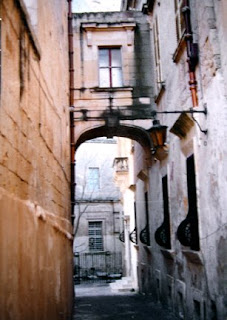
This photo, one my sister took in Malta, has been a source of inspiration for me to paint from over the past fifteen years. The March 7th post (WARMING UP) shows one of those completed paintings, but here the image has been reversed. The approach and techniques used are also very different than before when I painting this same subject.

The black and white image (above) relates to the basic light shape in the photo. In that simplified design, there are three black shapes with one continuous white shape, which goes off the page on three sides. That white shape's was transferred to the watercolor paper and was left white - unpainted - in the few first steps of the painting.

The first layer of paint was very, very pale and was also the opposite temperature of the finished painting. Some of the painted edges creeped into that white shape more than I

wanted, but they'll be ok.

The gray areas shown around the balcony, the door, window panes and the upper window, and in the light are not paint, but actually gray miskit painted on the paper to keep it totally white. There are some splatters of miskit in various places, too, especially in the walkway. It'll all be removed later.

Next, a few small warm dark shapes were added within the painted areas, touching the white shape somewhere. You can see a variety of edges, from sharp, hard edges to soft to disappearing edges in the dark shapes. The contrast of dark and light helps establish the basic range of values early in the painting.

To finish the painting, the largest areas must be painted first, then medium sized shapes, with the smallest details added last. The next couple of photos represent the gradual progress of painting from large to small.

Areas that used to be pure white are adjusted, and the original white shape seems to slowly disappear. That good white shape was important to help establish unity to the final painting. The white shape won't be visible when the painting's done, but that part of the painting will have the best glow and the purest colors.

I enjoy using as many sedimentary colors as possible in paintings like this to take advantage of the textures created by the granulating colors. Lots of violet has been added to the warm oranges and yellows on the walls, and the only brown used was Quinacridone Burnt Orange.

That initial cool glaze over two thirds of the painting helped quiet down or 'gray' the outer edges of the warm colors. The subtle graying of those warms away from the focal area actually makes the focal area have more impact and seem to glow more.

There are several stages of this painting shown here so you can compare each progressive stage of the painting. Once the upper right hand windows had some color on them, I applied miskit over the lighter parts of the windows to preserve the shutter highlights. After darken that window area, the miskit on the windows was removed. In the third to last picture, the miskit has finally been removed from around the door area, exposing pure white paper.

The last two pictures seem almost the same. In the last picture, the lamp has been separated from the archway and detail added to the boarded up windows. The tree was lightened a bit and the balcony shadows darkened. The last thing painted was to darken the top panes in the upper window to anchor it better.


.
.
.
.
.
"CAUGHT UP IN THE MOMENT" Transparent Watercolor on 140#CP Arches 18 x 24" COLLECTED

3/7/09

WARMING UP

Check out the difference between this painting and the cooler version below. The 'blue' painting is the original, painted on gessoed watercolor paper several years ago.

This week, that blue finally got to me, so I dug out my mouth atomizer, diluted some transparent pyrrol orange fluid acrylic in water, then sprayed or actually 'misted' the blue painting to warm it up. Those ancient streets just looked wrong in cool colors.

A few small blue shapes were taped off before spraying, like the walk in front of the fence and parts of some windows. It would have been impossible to glaze paint over the surface because the friction from my paint brush would've easily lifted the existing watercolor paint right off of the gesso.

Once the orange dried, darks were added on the left hand side, and the sky area was darkened a lot to decrease the importance of its shape. A smattering of burnt orange was touched into the distant wall and more warms added to the lamp. Some of the darker shapes were darkened even more, and the fence was extended over to the wall.

A new painting is in the works right now of the same subject, but the approach is very different this time. The temperature dominance WILL be warm, for sure. It'll be posted once it's completed.

"MALTA EVENING" Transparent Watercolor with Fluid Acrylics on 140#CP Gessoed Arches, 15 x 21"

1/28/09

YUPO - NEW JOURNEY

This was finished this morning on YUPO using fluid acrylics, and it was certainly a great journey of discovery to find out what could be done with these acrylics on the YUPO. Several different techniques were used to develop the textures of the brick and walls.

Miskit, masking tape, spritzes of rubbing alcohol on wet paint, spritzes of water on wet paint, splattering with a toothbrush and a brush, salting with popcorn salt, removing paint with alcohol and a tissue, removing paint with alcohol and a squeegee, removing paint with a brush dipped in alcohol...... The possibilities seemed endless, and I enjoyed trying as many different ways to develop the textures as I could think of. Some areas were really wonderful accidents that created delicious textures.

What was best was the fact that once the paint dried, it couldn't be removed, as opposed to painting transparent watercolor on YUPO, which lifts off easily if dampened or brushed over. The look of watercolor is still evident since the fluid acrylics were used - watered down and washed on - just like transparent watercolor.

Click on the painting for an up close look. The reference photo, taken along a Venice alleyway, is posted, too, to show the changes in composition from the original scene to the painting. Seems to be a possibility now to never want to paint on cotton paper again...... It's time to live with the painting a while before making anymore adjustments.

"JOURNEY" Fluid Acrylics on YUPO 14 x 25"

12/20/08

AN EXTRA BRUSHSTROKE OR TWO

Some adjustments were made to this painting Thursday evening. The tall pillars, as well as some of the water areas, were darkened. More shadows and cracks were added to the building because I just didn't want to stop working on this painting. Some small dots of Cobalt Teal Blue were spotted here and there to add interest when viewed up close. The balcony grill work was adjusted, too, as well as that overhang above it. Gotta call it quits on this for sure or I'll fall back into my old ways of overkill. Can you see the slight differences the minor changes made? It's done.


12/18/08

EMPTY NEST???

Recently something unexpected has happened in my painting process. In times past, once a painting was about half done, I 'd often lose interest in painting it and have to push myself to stay with it. Occasionally I'd wish someone else would just complete the picture for me.

Lately I've discovered that I actually don't want a painting to be finished because I'll miss working on it. Is there such a thing an '''''empty nest syndrome''''' for painters? This post is one of the paintings that I didn't want to 'grow up and leave home.'

For the past several months, the entire process of planning, painting, and adjusting paintings has been invigorating and exciting. It's fun to see how the next part will look, to find out what would happen if... and I've certainly not been in my usual rush to finish works in progress. Even though I presently have a couple more paintings already in the planning and painting stages, I'll miss not getting to 'visit my brush' on the one that just got completed. Is that weird or not?

"SERENADE" Fluid Acrylics on 140#HP Arches 30 x 19"

12/15/08

PLANNING AHEAD

Wednesday's class last week included a holiday luncheon at a nearby restaurant overlooking the lake. But before we left for lunch, we had time for a demo as well as critique time of works some of the artists had brought in from their studios.

This photo reference from our trip to Italy has several minor details changed to help improve the composition. The chimney was reversed and moved to the left to make the division of space more comfortable and the perspective seem correct. That roof line has been straightened, too, at the top and bottom edges. Click on each picture to see the details if you like.

There's 'junk' in the photo on the center right that's been turned into building surface, and the picture is narrower, with measurements that follow the golden mean and Phi.

Notice the distant hills and how that horizon line has been adjusted, too, to bring more focus on the buildings. Although I loved the palm fronds on the upper left, they were changed to repeat the look of the foliage on the right so they wouldn't draw too much attention. The long lines of the fronds seem to steal focus from the roof tiles.

All the planning ahead of time used to bother me because I wasn't painting. Now I relish the planning, organizing, and rearranging of the composition and enjoy having several future paintings in the planning stages.

It's rewarding to take a decent photo and try to make it better before painting the scene. (But it didn't used to be...it was a struggle for a long time.) Plus, all that time spent studying the photo and drawing helps me know the subject better. 'They say' the better you know something, the better you can paint it. They may be right.

This painting took less than two hours to actually paint. However, the planning and drawing involved at least six hours, plus it took a long while to fly to Italy to get that picture!

"SMELL THE CAPPUCCINO?" Transparent Watercolor on 140# CP Arches 13 x 19.5"

12/9/08

REPAIRED

This unique window was near our hotel in Venice. Actually, we stayed in an updated old monastery, not hotel, in Academia, the artsy area of Venice. The place at one time was a home for orphaned boys, and they've remodeled it to be graciously comfortable with some very up to date features.

These ancient walls have been repaired, plastered, bricked over, and patched as much as possible, and that look fascinates me immensely. The textures of the structures there are beyond belief. And the stories those walls could tell when they learn to talk.....

The painting is done in a trasnsparent watercolor style using fluid acrylics. Acrylic ink was used with a nib to help create some of the cracks in the walls, too. It's a painting I really didn't want to finish because it was so much fun to do.

"PRAYER BOX" Fluid Acrylics on 140#HP Arches 15 x 21" COLLECTED

6/5/08

YUPO & VARENNA, ITALY

Here's a painting done from the same photo reference as the last post, but the surface I painted on was slick plastic called YUPO instead of cotton paper. The textures that can be created on YUPO are unending.

I loved the textures on the walls and steps in Italy. They were yummy, and I've often said I could've crawled inside them. Next summer, if you want to paint there, Janet and Steve Rogers will be teaching a watercolor workshop in Varenna. Their website is on the sidebar here on my blog. Janet will be here at my studio teaching again in April, 2009. Carol Carter will be here this August, and life is full of ART!

This fall I'll post some more paintings done on location in Varenna, Venice, and near Lake Maggiorie, all in gorgeous northern Italy.

"CHURCH SPIRE IN VARENNA" Transparent Watercolor on YUPO 13 x 20"

3/9/08

HILLFOREST

There's a beautiful, historic home sitting on a hill above the Ohio River in a town next door to our town. "Hillforest" was built for the Thomas Gaff family, who lived there from 1855 through 1891.

There were three Gaff brothers who developed much of the town of Aurora and relied heavily on riverboats for their businesses. Notice the look of a 'pilot house' atop the mansion, and how the front porch resembles a steamboat deck. Designed by Isaiah Thomas, this home has since been carefully preserved in its Italian Renaissance style and is a favorite spot for visitors to stop, especially to see the gorgeous suspended staircase inside.

Just about every artist in this county has painted this house from one angle or another, so several years ago, I had to give it a try, too. I combined my taping technique with some miskit control (for the curved areas of the house and the big Sycamore) to create this painting. The picture now hangs in the Dearborn County Country Club.

An interesting historic fact about the Gaff family - - - their riverboat, The Forest Queen, was used successfully at the siege of Vicksburg as the headquarters of William Tecumseh Sherman for the Union cause during the Civil War.

"TOWN TREASURE" Transparent Watercolor on 140#CP Arches 30 x 13" Collected