11/13/11

YOU ARE INVITED !!!!!

Our  Open Studio Show  opened yesterday at the Women's Art and Cultural Center in Cincinnati, Ohio.  Their huge building has been incredibly refurbished - - - it used to be a dairy barn!   Our hanging crew of fifteen had the whole show hung in about two hours, with over 80 beautiful paintings displayed, including acrylics, collage, ink, and watercolor.   Many of the pieces can be seen here, but to really appreciate the show, you'll need to see it in person - reception info below.
Many of us got our exercise for the day, reaching and stretching as we changed pictures from one wall to another.  Ginger helps Diane straighten one of Eileen's acrylics as Marianne reaches up to straighten a watercolor.
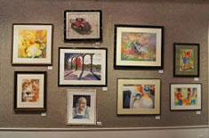
A variety of techniques and subject matter enhances the carpeted gallery walls.
'Open Studio' happens in my studio four times per week.  One session meets in the evening, and the other three are longer daytime sessions, from mid morning into mid afternoon.  I get to facilitate the sessions and assist in any way I can as the artists create unique, one-of-a-kind masterpieces.  Often, I demo a process or technique to guide someone to work out how to accomplish what the artist wants to express. 
This show features some of their recent work.  With forty artists showing their work, many of their paintings had to be left in their home studios, paintings that also deserved to be hung on the walls.  There's just not enough wall space for all the work they have done over the last 24 months. 
Here we are --- me, contemplating whether or not something needs to be moved - Valerie, pleased with how really good it looks, and - Kathy, just about ready to call it a day!   Diana is behind us checking out artwork from a different Open Studio than she attends.
The subject matter in this show includes abstracts, landscapes, still lifes, portraits, and florals.  You'll find fine art created by professional artists as well as by artists who have just recently taken up painting.  From traditional to unpredictable, this show has so much to offer. 
Three more 'picture hangers' are discussing where to pound the next nail - Bernie, MaryJane, and Jean.
Our Artists' Reception is this Saturday, Nov. 19 from 5 to 7..... lots of paintings, people, and refreshments to enjoy with free admission, too.  Regular show hours are Tues - Fri, 9-2 and Sat/Sun 12-4, (closed on Thanksgiving day.)  The show is open through November 27, 2011.

The Women's Art Center is located in Mariemont on Cambridge Avenue.  Be sure to Map Quest or Google the location and please join us if you're near Cincinnati, Ohio

For more info about Open Studio Sessions, you can contact me at sandymaudlin@gmail.com.

More photos of this show will be posted on this blog after the reception.  Hope to see you there and I wish you could all attend!
A big thank you goes to Kathy Sarlo for providing all of these photos.

10/17/11

GRATE DAY!

Yesterday was the Watercolor Society of Indiana's annual juried show opening.  (Click on my painting at the WSI website to see it enlarged.)  The show will hang in the Indianapolis Museum of Art until early December, and my 'Amazing Grates' received the second place award!  YES!!!  Jerry Smith received First Place for a stunningly beautiful rural scene done in acrylics, also. 

Gerald Brommer was the judge and stated that he judges work on four criteria --- technique, drawing ability, visual design, and the spirit or content of the work.  Although I knew that he dislikes YUPO, I submitted my Grates on YUPO anyway.  

Here's what he said about my painting - "The surface of this painting is wonderful.  Gorgeous stuff happens in the painting.  It is well designed, and the design works beautifully.  The surface is to die for.  The composition fits together so well that one could possibly get 16 little paintings from this big one." 
The painting is 40x26", and it was amusing to watch as one guy tried to 'find' all 16 paintings in the piece.  It's been said that a good painting should be able to be divided into four good smaller paintings, so a big smile landed on my face when I heard what Brommer said.  I consider him to be one of the best workshop instructors ever, besides being such a wise judge:-)  He's a very affirming, positive person.

All the grates and sewer lids in the painting are from Indianapolis.  It was a grate 'happy dance' day!

"AMAZING GRATES" Fluid Acrylics on YUPO 40x26" COLLECTED

9/11/11

TREASURES

Discovering unexpected treasures is one of life's best joys.  This evening view of a courtyard is part of the former home of two people whom I treasure very much.  When it was started, my plans were to give it to them as a 'thank you' for a wonderful visit there. 
After applying several layers of paint interspersed with layers of masking tape, I began peeling off the tape layers to reveal the painting under it.  Treasures again!  The surprises of color and texture were astounding, and I got the feeling that parting with this painting might be more difficult than I ever imagined.  Yet, this would make the perfect 'thank you' gift for treasured friends! 
The second photo shows details near the door and the tape removal in progress. When all the tape was removed, the painting was corrected and tweaked with the fluid acrylics. On the YUPO surface, bits of the paint accidentally lift off when the tape is pulled up, creating new possibilities for more texture.
This weekend's workshop here at my studio was the unveiling of this finished painting.  She loved it!  (And the workshop went very well, too.)  I'm waiting to hear how her husband likes the painting.  Since it was his childhood home, I am pretty sure he'll love it, too.
Next month, this unique 'tape batik' process will be a big part of the weekend workshop here at my studio - see the sidebar for more info.  After three days of my demos and instruction and lots of work and painting on your part, you will have created your own, original 'tape batik' watercolor from your reference materials --- or, like this painting, your own 'tape batik' fluid acrylic watercolor on YUPO.
'Tape Batik' is the name I've given to my technique, but no hot wax is involved at all.  After initially figuring out how to do this process in the early 90's, I've been honing it ever since.  Being able to finally create the 'batik look' on YUPO added to the possibilities my technique. 
If you're near Dallas, Texas, you can sign up now for the five day workshop there in late October/early November, featuring my instructions for Tape Batik, too.  (See side bar for Artists' Showplace.)  There are several other of my 'Tape Batik' workshops lined up for 2012, also, in various locations in the U.S. and abroad.  Hope you can join us at one of these workshops.  Happy painting.
TREASURES  Fluid Acrylics on YUPO 26x20" Collected

9/4/11

JUST A LITTLE CHANGE

A slight change to this Irish woman's expression made this picture more appealing.  The original, shown below the finished painting, seemed to have a sour expression on her face.  By making a minor adjustment to her inner lip line and lip corners as well as to her eyes and brows, her expression is more gentle and evocative. 

This TAPE BATIK painting won a first place at a show this weekend, too.  Some may be bothered by the 'square' within the faces.  Putting it there was important to me.  This beautiful couple seemed to be totally melded.  They were lovely to talk to and so gracious as they viewed the trip through the train window.  The square represents their balanced life together as well as representing their apparent outlook on life, and is symbolic also of the train window.

Using my TAPE BATIK method to create skin, especially faces, is challenging.  This process will be taught at a five day workshop in Dallas, Texas in late October. Hope to see some of you there.


"IRISH EYES"  Watercolor TAPE BATIK on Hot Pressed Crescent Board

8/8/11

BATIK WITH FLUID ACRYLICS

Once again I've removed a painting from its frame and changed things.  The three photos here show the original painting at the bottom, the painting as it was when framed in the middle, and the top painting, which is now completed and reframed. 
Notice the changes to the window and the posts beyond the door in the top painting.  The window sill was adjusted to create more interest and variety there.  The stone work was also quieted down by simplifying some areas as well as by bringing back whites to the brick work.  All of this has helped create more movement in the completed painting.  A cool wash on the bricks helped settle down those aggressive warm bricks, allowing more emphasis to be on the man. 
The bottom painting had way too many bricks with no place for your eye to rest.  The foreground was too light, also. 

The Tape Batik process is one that I developed and love to share at my workshops.  I really like the finished painting now and think it was well worth it to adjust it.  Hope you like it, too.

7/2/11

YUPO AND FLUID ACRYLICS

These pigeons were stunningly beautiful on this ancient fence just outside Notre Dame in Paris.  The bright blue sky that Sunday made their feathers appear even bluer than they were.  Their attitudes were fun to capture, too. 

This photo of the painting was taken through the non glare plexi, so the colors are a bit off and the values not quite as dark as the painting in some areas.   

"SITTING ON THE FENCE" Transparent Fluid Acrylics on YUPO 40 x 26"

6/10/11

STARTING ALL OVER AGAIN

Starting over on this portrait of my nephew, Jon, I decided to quiet down the drips and focus more on his face.  This newest painting of Jon is much easier to look at, in my opinion.  See the first one at the bottom of the post. 

His mom will be here next week to pick up the painting.  I think she'll approve.  The portrait I painted earlier this year of his brother, Peter, is shown here, too.  Hopefully they will they compliment each other nicely when Chris gets them both hung in her home. 

Jon's eyes are at least as blue as the painting shows, and he's a very gifted musician who frequently plays in London and surrounding areas. 

Painted with Transparent Watercolor over Fluid Acrylic drips on Cold Pressed 140# Arches, all are 22x30."

JONATHAN

PETER

Older painting - on gesso-ed paper with strong focus on drippy technique


4/25/11

ROTATE MORE

Here's the new Atelier acrylic abstract painting turned on its side.  Just now I adjusted the color to be closer to the actual painting, too.  Better? 

Or upside down? 
I like it better these two ways, with the horizontal format being my favorite.  Thanks for your comments, too.  Sure appreciate your taking the time to give your opinion.

4/23/11

EASTER

This abstract was started a week ago and has evolved slowly.  When the painting began, my purpose was to just play with the paint on YUPO, using the Atelier Acrylics which lift even after they have dried. 
Today after taping it up across the studio, I was surprised to see the face.  The word 'FORGIVENESS' was added vertically to the right side of the face then subdued.  It's also printed backwards so it's nearly impossible to see.  Using Caran d'Ache crayons I added some other scribbles and other meaningful words as well as lightening the eyelids and adding a highlight on the lower lip. 
Easter is my very favorite day of the year because of its significance for me.  Happy Easter!
"GOOD FRIDAY" Atelier Acrylics and CAran d'ache Crayons on YUPO 20x26"

4/1/11

MIDDLETOWN ART CENTER

Soon after we first moved here 16 years ago (today!) the Middletown Fine Arts Center hung a solo show of my work. Their gallery is beautifully done, excellent lighting, lots of gracious space to show off art. Later, they sponsored yet another solo show for me, then another featuring works by people in one of the classes I taught.

The Middletown Fine Arts Center showcases nearly a dozen shows a year, and I've been blessed to not only teach a workshop there, but also win several prizes, including Best of Show, at some of their events. They hold workshops, classes and other art related opportunities throughout the year. It's a wonderfully nurturing place for artists of all ages. Next month, they are having their annual fund raiser.

This year will be different. Rather asking the people to donate a framed painting, they have asked us to paint an egg... a LARGE egg made of a special plaster/gesso mixture. After visiting a cave in the Dordogne Valley of France which had Cro Magnun's paintings on the cave walls, I was inspired to use that concept for the egg. 'Birthplace of art' - - - 'eggs are about birth ' - - - that was my thinking.

Hoping to capture the exquisite lines of the one bison that really impressed me in the cave, I began creating textures, first with more gesso and modeling paste, then with Fluid Acrylics. That bison on the cave wall was incredibly fabulous. Painted over 11,000 years ago, it had exquisite lines and shapes. No amateur painted it, but an early Michelangelo. It took my breath away because of its fluidity and sureness. My egg for Middletown didn't quite capture the mastery on the bison in that cave. Here's what I came up with -Eggtravantgantly Ancient! Fluid Acrylics on Gesso, Modeling Paste, and Plaster Surface, Sealed with Varnish. 6 x 10" Egg Donated To Be COLLECTED

3/27/11

PARIS

Here's a photo from one of the last days we were in Paris. Notre Dame was awesome, my favorite place to be in Paris. Breathtaking and incredible. Stepping inside, I could feel His presence strongly. Now to paint these shadows...can't wait to get started. Thank you, Roger and Sandra, for a wonderful time. What memories!

3/2/11

NEPHEWS

In a couple of days I will hand deliver this painting to his mother when we meet in Paris. I can't wait.

By using Nick Simmons' 'throw it on the wall' fluid acrylic technique, the background was nearly completed before I ever started the portrait. The actual portrait has been painted with transparent watercolor over the fluid acrylic drips.

Peter is such a free spirit, and my husband says that this really captures him. It's good to finally paint again and get one that makes me really smile.

Now I'm off to pack....... Au revoir!

2/17/11

NEW ATELIER ACRYLIC PAINTS!

Finally, the brush made it to my hand and into some glorious new paint! It's been nearly two months since I painted anything at all - long, long time for me, but a 'bug' kept me under the weather and not caring if I painted. Then a box of new paints arrived at the studio with some gorgeous colors made in Australia by Chroma, Inc.

This painting is the first of what will be many acrylic paintings on YUPO using these Atelier Interactive Professional Artists' Acrylics. The acrylics behave like regular acrylic, but can be blended MUCH easier, even after they get dry! They can be re moistened with ease.
This painting is a result of forty five minutes of experimenting to see what would happen. The paint can be applied thickly like oil or very thinly like watercolor washes. The dozen colors that I have are mostly transparent, so glazing added a luscious look to those colors. I can't wait to share these new paints with my classes and see what beautiful paintings they create.
Though this isn't a 'real' painting, (no planning, etc. just impulse and delight,) it was so much fun to play and experiment. There are several unique mediums from the order that I must try next with the paints. Check out their website at http://www.chromaonline.com/.
"THINKING OF OREGON" Atelier Interactive Acrylics on YUPO 22 x 16"

1/30/11

ATTITUDE

It's been a LONG month with absolutely no painting at all, but tomorrow looks promising for picking up my brushes finally. I can't remember ever having such a long stretch of no paint time...
This is one of the last paintings I did during the holidays as a demo for a class, to show how to paint looser with watercolor. He should have been posted over the holidays, but here he is now.

It's lots of fun to paint animals, especially ones with an attitude. You can just imagine what he's thinking.

After spending about ten minutes free handing the drawing, I painted quickly, using lots of juicy colors, allowing them to mix on the paper as much as possible. Accuracy wasn't my concern. Rather, I hoped to capture the sense of boredom and disdain shown by this beautiful Great Dane.

Although he looks black, no black was used. By mixing the darker colors from my palette, I was able to make some luscious blacks. His name is Jade.

"JADE" Transparent Watercolor on 140#CP Arches 12 x 17" COLLECTED

1/17/11

SAME SUBJECT

The barn posted below was created using a flat, 1" brush from Daniel Smith Art Company in Seattle. It's from their platinum series and is around $15, my favorite brush ever. However, when my hope is to paint in a loosey-juicy fashion, the way this same barn was done in the previous post (see below,) I use a good squirrel mop brush. The Daniel Smith flat brush gives me plenty of control with watercolor, rather than the looser look. This brush has a razor edge so very tiny spaces can be painted as easily as a 1" swatch area can.

Another difference in the paintings is the kind of paint that was used, with this one being done with Golden and Da Vinci fluid acrylics, with one, or at the most, two, glazes or washes. An old bristle fan brush was used for the grasses and a credit card employed to indent the still damp, painted paper for the tree branches.

Miskit was applied to cover the snowy roofs, the tops of the silos and fence posts before beginning. The paper was misted overall, then diluted colors were allowed to flow as I tipped parts of the paper at a slant for the sky. The trees were tapped in while the paper was still damp to create a soft look, with the tips of the pines being put in later when the paper was dry.

Once the sky area was dry, the whole paper was misted again. Since the sky area was painted with fluid acrylics, rewetting that previous wash didn't disturb it a bit. The snow bank was blushed on to the top of the hill and allowed to move on its own while the paper was held at a slant. (I never ever tape down my paper so that it can be manipulated at whatever angles I want when it's wet.)

The details of the barn area and fence posts were added, again with fluid acrylics. The paint seems to dry just a breath darker than it looks when it's wet, quite the opposite of watercolor, which dries considerably lighter when used in washes this wet. I'd like to try this once again using a squirrel brush in the fluid acrylics in a loosey-juicy style, but first I'll have to buy a cheaper squirrel brush than the ones that I save just for watercolor. The painting actually has much more color in the barn than it looks here. It kind of glows IRL.

"EARLY EVENING" Fluid Acrylics on 140#CP Arches 14 x 11"

1/11/11

SNOW

It's been a beautiful snow day, though I'm glad I'm not out driving on the roads right now. These days are best for making a huge pot of veggie soup and kicking back, which is what I've done.

Here's another barn painting created as a demo in December, using a large, floppy squirrel brush. The idea was to allow a loosey juicy, more carefree look with the watercolor. The paint on the hill was poured on spritzed paper, rather than painted, to help create that wonderful, fresh watercolor look. A rigger brush was used to put in the grasses poking above the snow, as well as the fence wire. Let it snow...

"WIND DRIFTS" Transparent Watercolor on 140# Rough Arches 20 x 15"

1/7/11

TEXTURES

Almost every artist I know absolutely loves TEXTURE! This class demo was done to show various ways to create watercolor textures in a rural landscape. It was the first of three barn paintings so watch for more.
"DRY FORK ROAD" Transparent Watercolor on 140#CP Arches 22x16"

12/13/10

AND YET AGAIN

This weekend I simply had to take this painting out of its frame and make some subtle but important changes. The top photo shows the changes.

Changes --- #1 Got rid of that mustard color on it and glazed it with some pale indigo -#2 Eliminated the '+' sign in the small grate on top of it - #3 Integrated the other gold small grate into the grates under it. It was the only full circle, and the edges of it had to be broken. It really helped to clean up that big white grate. #4 Softened the strong, thin, white diagonal at the top right of the painting and lifted some whites out of the fancy grate near it. #5 Added an illusion that the white paint stripe coming from the top left of the painting continued through to the orange grate centered at the bottom of the painting.

That mustardy color on that big grate really seemed to weight down the rest of the painting, but it took me a while to see that that was an issue. Originally, the fancy grate was to have been the focal point, but as I painted, it became evident that the big white grate would be the boss. The white 'T' shape next to the fancy grate became overly important until that mustard color on the big grate was eliminated.

So now it really is FINISHED! (Started over a year ago in my head, then composed in February, painted in most of March, and finished, the first time, in June.) I like that the wording on the grates - about Indianapolis sewer and utility companies - is not noticeable unless you're up close.

The painting's traveling to Indianapolis in a week or so where it will be hung. It will be very hard to part with it, but I will have visiting rights. Right now it's my favorite painting ever. Though it seemed really big when I started it, it only appears medium sized to me now. I must put in an order for a big roll of YUPO to paint on..... wider than 40" for sure.

"AMAZING GRATES" Fluid Acrylics on Heavy Weight YUPO 40 x 26" COLLECTED

12/7/10

WEEKEND WORKSHOP STOCKING STUFFER

On Friday, February 25, we'll be starting a three day workshop here in my studio, featuring the process of 'tape batik,' as well as the hot wax batik process with watercolor. Cost is $225 for the tape batik class and $240 for the hot wax session. Each artist will develop and create original watercolor paintings, using this unique process. Any subject matter will work for 'tape batik,' as well as the hot wax process.

I started developing the tape batik process about 20 years ago, partially because I love the look of batik. No hot wax is involved, only some serious planning and lots of taping. We'll use plain old masking tape, though the specific brand is somewhat important. Each artist may choose whether to work with watercolor paints or fluid acrylics.

Below are several examples of my tape batiks,' some on Arches, some on YUPO. During the workshop, either surface can be used. The workshop will include 3 very full days of instruction along with a valuable critique session. It will be held here in my studio near Cincinnati, Ohio. Add this to your Christmas list for sure! Email me - sandymaudlin@gmail.com - for more info. I'll post some hot wax batik paintings soon, also.

11/21/10

COMBINING IMAGES

Before Photoshop, the best way for me to combine parts of photos was with scissors and tape. This first photo had wonderful silhouettes of distant gondolas against sun kissed Venetian buildings. The second photo with the same lighting source pictures gondoliers up close, perfect for a center of interest in my painting. The skyline of both photos could have been more exciting, so one of the beautiful domed buildings from further down the Grand Canal was plopped into the background after it was flipped over to lend similar lighting. Some of the gondoliers were erased, and the balding head of the gondolier on the left was covered with one of the erased hats. The water line was adjusted to be at the horizontal phi, thereby dividing that length up to be the most pleasing division of space. The dome plus the pole of the gondolier on the left are on the vertical phi of the width of the paper. By the time I'd done all this on Photoshop, I was getting well acquainted with the subject matter, the shapes, the values, and the nuances of the edges of the different shapes. Plus, I was reliving the magic of that ride on that first evening in Venice.

Last week's post showed the results of this same image, cropped in vertically, and painted as a batik, using hot wax and watercolor on rice paper. This week, my goal was to paint this same subject again on a full sheet of Arches and to make 'atmosphere' the most important part of the painting. Leaving out as much detail as possible was my focus. The only details would be in the shapes that really caught my eye in the first place.

With a loose sketch drawn freehand directly on the paper, I started with very fluid paint loaded in a large squirrel mop brush - not my normal brush to use. Thinking only warm and cool for colors, I began the sky area and added plenty of water to let it flow on its own. The paper was positioned on an incline as well as turned sideways, then upside down, depending on what I wanted the paint to do. There were a couple of small areas that were kept dry so that they would remain untouched white - on the dome and on the hat of the gondolier on the left side.

My brush was moving continuously as the shapes of the buildings were placed in on the damp paper. I squinted a lot to help eliminate details, and my reference photos were not in sight. The only thing I had for reference was a thumbnail pencil sketch of the values that were important to include.

The edges of the buildings fuzzed a lot since I was painting on damp paper, but a soft, indistinct background was what I was after. Once the shapes were placed above the water line, the water line was darkened, and the distant shapes of the gondolas were added using the same big brush. I actually painted the tops of the distant gondolas first, making sure to leave those somewhat triangular white shapes between the water line and gondolas. The bottom of those gondolas were brushed in quickly with a sure stroke rather than a tentative, careful one.

The two bigger gondolas and their passengers were next, and the water areas were also painted along with them. Care was taken to avoid damp areas where sharp edges were desired. There was an 'oops' moment on the left side of the left gondola when the paint met some dampened paper. Wednesday's class was watching and insisted that I not blot the 'oops.' I want to thank them, since that's now one of my favorite parts of the painting. That soft, unexpected edge seems to add a lot to the atmosphere I was after.

Most of the water areas went really well, as long as my brush stroke was quick and sure. Later when the painting was dry, I sprayed off the strength of the reflections under the left gondola where I'd used a more timid stroke. I did change to a 00 rigger brush to make the line of the oar for the left gondolier. I used that brush to sign my name, too.

Before I could go back and put in more detail, the class insisted I stop, and this next photo shows the painting at that point. I lived with it for several hours but felt it needed just a bit more definition in some of the buildings. It seemed to me that there was too big of a gap between the detail in the foreground and the quietness of the background. The painting also had soft, pale values and stronger, darker values, but very few mid tones. The second photo below shows the finished painting. Stage One above - about 2 hours of non stop painting, after many hours of preparation..... I was really exhausted when this part was done. Painting loose and leaving out detail is contrary to how I normally paint. I was way out of my comfort zone, but I was loving the challenge, too.

Stage Two below- the finished painting with hints of detail in the buildings, a bit more dark on the dome, as well as the water and shoreline softened in a few places. This style of watercolor painting is what drew me to watercolor in the first place and sparked my passion for it. Though I've explored many different techniques, I'm always enthralled with the beauty that watercolor has when the paint is allowed to behave freely with the water. Nita Engle calls it 'letting your painting paint itself.' I was sure tired after those two hours of letting that happen!

"SUNSET SERENADE" Transparent Watercolor on 140#R Arches 30 x 22" COLLECTED

11/15/10

WAX BATIK WORKSHOP

This weekend 11 artists took on the challenge of creating wax batiks with watercolor and sumi ink. We really put the hours in here at my studio, with each woman creating her own original batiks, planning the works from initial sketches to the final painting process. The majority of the workshoppers were able to get the layers of wax ironed off before they left on Sunday evening but still had adjustments to make before calling the paintings complete. Therefore, there are none of their paintings to show on this blog yet. Hopefully when they email me the finished work for critique, I can post some of them. Their work included a wide range of subject matter, and it was exciting to see the paintings develop.

We used several kinds of washi/rice papers, and my demo batik was done on Thai unryu paper, which I frequently use for wax batik and watercolor. However, this time the sheet shredded in some areas. Frustrating. Possibly the vat where the paper was handmade, in Thailand, didn't get enough pulp in it to make my sheet of paper an even thickness. I really don't know for sure why it shredded, but I was thankful that it didn't happen to anyone else in the workshop.
This is the finished painting, after it was glued down to w/c paper. Several tweaking adjustments were made after the paste dried. The way it looked (before paper repairs) is shown below - notice the holes in many areas. When wet, most rice papers tear fairly easily along an edge if they are picked up, but these areas happened as soon as I put the paint brush on the paper. It was like the paper dissolved in spots. The holes got worse with each successive layer of paint, so I condensed the last three layers of paint into one final wash. Patching the holes was tedious, and one area still looks obviously patched.
The photo of the finished batik was taken outdoors after painting corrections were made, and the one with holes was taken under natural light in the studio, hence the slight color variation. The water and sky in the 'holey' photo depicts the water and sky colors more accurately than the first photo of the finished piece.
In late January, there will be a 3 day workshop here, and we'll all be using masking tape instead of wax to create the batik look. (See sidebar on right.) Late February is the next wax batik workshop here, for three days also, instead of two. Both workshops do have openings, but class size is limited. If you're interested, email me at sandymaudlin@gmail.com, and I'll send you the details.
Seen here - some of the workshop artists working on various steps of wax batik on rice paper..... Thank you all for a good weekend - looking forward to seeing your finished batiks soon. It was great painting together.
"SERENADE" Watercolor and Sumi Ink on Thai unryu paper, adhered to Arches 140#CP 16x22" COLLECTED

11/6/10

MORE FUN

Here's another textural painting that was freeing to create. It's also on acid free foam core which has been covered with various textural products and allowed to dry. Then the acrylic paint was added to bring out the textures of the surface and to help develop a good design. Transfer cut from an old magazine was also embellished onto the painting for added interest. Painting smaller, nonrepresentational work increases my love of being an artist.
"ONLINE" Acrylic on Acid Free Foam Core 4 x 4"

10/30/10

TEXTURES

This painting was created with fluid acrylics, tube acrylics, some surface treatments, and lots of time discovering and maneuvering shapes within the created textures. Painting it somehow seemed like a vacation away from painting, and yet 'painting' has ALWAYS seemed like a vacation... sometimes without a map or reservations. It reminded me of the huge volcano that erupted this past spring, hence the name.
"EYJALLAJOKULL" Mixed Media on Acid Free Foam Core 4x4"

10/20/10

GRATE REVISIONS

Several minor adjustments have been done to the top version of Amazing Grates. Using my squeegee and rubbing alcohol, I lifted off some random patterns to add lighter shapes which would help increase the movement in the painting. The lights help move the eye around better now. Minor spots of darks were touched in where more focus was needed, and a few blurs of orange were swished in too. Can you tell the difference between this and the older version under it?

This was painted with fluid acrylics on heavy weight YUPO, 40 x 26" It was a little unnerving to go back to it after thinking it was completed several months ago. I worked slowly making corrections, stepping back between nearly every stroke to see if I should proceed more or stop. Now I'm super pleased with it.

Sewer covers and manhole covers are things we pay little attention to, and yet you can find so many amazing patterns and textures in them. A future painting I hope to do will be of manhole covers from places I've traveled to. Since my sister-in-law was headed to Alaska this summer, I asked her to be on the lookout for any manhole cover that had 'ALASKA' on it so I could add it to my future 'grate travels' painting. She laughed when telling me that nearly the whole cruise ship was scouring the towns for an ALASKAN manhole cover. They found one for me, too. Thanks, Senie:-)

AMAZING GRATES Transparent Fluid Acrylics on Heavy Weight YUPO 40x26" COLLECTED