5/5/09

BAD

Our computer's hard drive is BAD! Being 'bad' used to be good. But this is bad, so no new posts from me until we have a brand new GOOD hard drive..... very soon, I hope. The photo of this painting was saved and ready to go so here I am at our library on their computer writing it up.

The painting is years old - like nearly 20 years old, painted in the Rocky Mountains back when I thought I had to be a plein aire painter to be an artist. Yet, one of the best things about plein aire painting is the memory cache that's created while the painting's being done ------ the guys who stopped by to tell me their aunt could really paint lilacs ... the great little outside restaurant with tables and comfortable chairs where I sketched while waiting for my lunch ... the gorgeous drive up through Thompson Canyon to get to the little town of Evergreen... the ferns and fog that graced the steep rocky walls along the road. Each time I see a photo of this painting, I remember so much of that day. Plein aire painting DOES have some wonderful benefits.

I hope to be up and running on line soon with some great posts from last week's YUPO workshop in Middletown, Ohio. And, I'll finally be able to catch up on all the blogs I've missed. See you then.

"THISTLES AND RUST" Transparent Watercolor on 140# Arches, maybe 15 x 11" COLLECTED

4/29/09

YUPO AND FEATHERS

This is yet another one of my early paintings on YUPO. The rich colors of this rooster and the textures of the wood behind these birds begged to be painted on the super slick YUPO paper.

This week we're enjoying a wonderful worshop in Middletown, Ohio at the Middletown Arts Center, so all my posts will be about YUPO paintings from my archives. (The post shown here does seem somewhat faded compared to the original painting.) The wood was so so so easy to paint because of the way the paint slid around on the paper and because of how easily paint could be lifted for highlights.

Next week I hope to post what the artists in my workshop painted. One of the joys of teaching workshops is learning so much from each of the artists who are exploring their own art journeys. But, saying 'Goodbye' on the last day is the hardest part of teaching for me.

"BLACK TIE AFFAIR" Transparent Watercolor on YUPO 25 x 19"

4/27/09

YUPO & TEXTURES

This week at our workshop, I'll be teaching how to use as many approaches as possible on YUPO. This gull was one of the first paintings I did on this slick surface - done about 9 years ago.

The juiciness of the paint being affected by gravity, especially as seen in the rocky areas in this painting, was one of the hardest things to learn to take advantage of. Being a control freak, I found that the possibilities on YUPO helped me let go and enjoy the process of painting a lot more. I soon realized that YUPO and textures go together wonderfully and just love the way the colors stay so intensely vibrant on this non absorbent paper.

Although I now seldom take advantage of the juiciness aspect of paint on YUPO, I still totally LOVE working with either watercolor or fluid acrylics on this unusual surface. If you haven't tried YUPO yet, be brave. You can wash off your watercolor mistakes easily and start all over if you need to. Good luck.

"MAINE GULL" Transparent Watercolor on YUPO 14 x 11" COLLECTED

4/24/09

COUSINS

Painting on gessoed watercolor paper is a close cousin to painting on YUPO paper. These geraniums were fun to paint on the gessoed surface, but their clay pots were even more fun. The paint seems to sit on top of the gesso, and the colors mingled with each other before they dried.

Texture can be easily played up on the gesso (click on the photo to see the textures enlarged,) just like it can on the YUPO surface. Next week a group of artists will be exploring how to paint creatively on YUPO at the Middletown Arts Center. Their facility is tops, and I'm looking forward to teaching, as well as learning, from all the artists in my workshop. I plan to post some of their paintings when I return. It will be a good week.

"OUT OF THE POTTING SHED" Transparent Watercolor on 140#CP Fabriano Covered with White Gesso, 21 x 14"

4/20/09

STUDIO OR PLEIN AIRE?

After really liking the painting I did outdoors in the midst of our flower gardens, (see the last blog post here) and after selling that painting when I really didn't want to part with it, I decided to 'paint it again.' This time I painted it in the studio, relying on memory and imagination.

By using the same techniques and colors, the results were similar. Yet, the first painting, though not as carefully planned, seemed to have more 'life' in it, more emotional impact.... a result of plein aire painting, responding to the moment, painting from life??? Maybe.

I do love these flowers in the spring, and there's a second variety that blooms in the fall, too. The way they swing and sway in the breeze is absolutely poetic.

If I'm ever inspired to paint them again, I think I'd want to have a bouquet right in front of me. Something's gained in the painting by from life whenever it's possible.

Second best is painting from photos that inspired me when I took them. The trick is to remember why I wanted to take the photo in the first place and then leave nearly everything else out.

"ANEMONES" Transparent Watercolor on 140#CP Arches 12 x 9" COLLECTED

4/16/09

EARLY WORK

Here's a painting done plein aire in our old backyard in Kokomo. I grew everything possible - hundreds of varieties of perennials and exotic, unusual dwarf plants. We had no deer to eat our garden like we do here, and the soil was not such a hard packed clay.

These windflowers or anemones danced gracefully in the breeze that May day and begged to be painted. I was a fairly new watercolorist and had to touch up a spot or two with white gouache... should've planned ahead better or used miskit.

"WINDFLOWERS" Transparent Watercolor on 140# Arches about 10 x 7" COLLECTED

4/14/09

NICK SIMMONS WORKSHOP HERE

Artist Nicholas Simmons will be teaching a workshop here at my studio next August, SIXTEEN months away, but I wanted to let anyone know who's interested. Check out his work here with fluid acrylics. He uses them JUST LIKE TRANSPARENT WATERCOLOR, taking advantage of the fact that once they're dry, they're immovable, but while they're drying, they're partially removable. Nick's results are stunning and have been compared to a batik look.

In 2007, Nick was here to give a workshop, right after he won the National Watercolor Society's GOLD MEDAL. We learned so much and had a blast.

Next August, Nick will present a fabulous four day workshop from August 6 - 9, 2010, a Friday through a Monday, here near Cincinnati, Ohio. Cost is $400, and a non-refundable down payment of $50 holds your place in class. He is an excellent instructor who has the expertise to teach, motivate, encourage, and critique.

Contact me for my mailing address at sandymaudlin@gmail.com if you have questions or want to sign up. Nick's workshop will fill up very, very fast so don't delay. And if you can't get here to southeastern Indiana for the workshop, make every effort to find another NICHOLAS SIMMONS workshop to attend. You'll be so glad you did.

4/13/09

MY ARTISTS

Saturday we dyed 18 Easter eggs. Aren't they gorgeous! Sunday morning before church, the artistic Easter egg dying crew was ready to go on an Easter egg hunt. And aren't THEY gorgeous!!! Three 5 year olds, one 8 year old. We had a blast.


Two eggs are missing??? Maybe they'll show up soon. The kids found over 70 hidden eggs with treasures in them. Busy bunny. Happy Grandma:-D

4/10/09

POWER POINT

Only once many years ago did I paint a picture for a themed-based show. Our paintings had to be inspired by a specific, old country church, and one artist painted the outhouse behind the church..... inspiration with humor.

After taking lots of photos through darkened windows of the pews and altar, I found my real inspiration in this light meter. Since I like mechanical things anyway, painting this was just goofy fun. I changed up some of the lettering to be more meaningful to me, like the Greek letters of Alpha and Omega. Many of the letters or numbers are backwards, some reversed as a mirror image or upside down, so that the real meaning of POWER SURGE is more subtle. All the numbers or letters spell out words in about a dozen different areas creating a message regarding things important to my beliefs.

I did learn a good personal lesson - to not ever again paint for a themed show. If I have something that will work, that's fine, but it's not in me to 'make a painting happen' based on a show's agenda. In the same way, this line of thought may also have something to do with why I seldom ever accept commissions, except for dogs.

I'm posting this because it's Easter weekend - my favorite Sunday of the year and favorite holiday. I wish a very Happy Easter to everyone.

"POWER POINT" Transparent Watercolor on YUPO 12 x 19"

4/7/09

GRATE ART

This painting is a result of my love of taking photos of what's under my feet. In Italy and Switzerland, I was fascinated with the grates in the walkways and streets and decided they all had to be incorporated into one painting.

Created on YUPO with fluid acrylics, this painting was my favorite one I did during the last couple of days of independent study at our North Carolina workshop.

The past four days here have been jam packed with instruction from an AWS artist, Janet Rogers. This morning's class enjoyed watching her paint a beautiful bouquet of roses, then Rhonda drove her to the airport. Next, Janet and her husband, Steve, are teaching in Key West. It was a very special weekend.

"MORE GRATE ART!" Fluid Acrylics on YUPO 20 x 26"

4/3/09

STAGE TWO

As promised, here's the next phase of this painting. There's quite a bit more to do to pull the composition together. I don't care for the browns too much and must adjust the shapes the darks make. I actually liked this painting better in yesterday's post but knew it wasn't that strong yet to be finished, so I'm pushing it around a lot.

The idea is to create the feeling of 'sooo many bikes everywhere.' Not sure when I'll find the solution, but when it happens, it'll be posted. It's great fun to explore a painting and see what shows up, and since this is on YUPO, just about anything can change. We'll see........ it's a journey worth taking!

4/2/09

FIRST DAY

This is a work in progress from the workshop. Our instructor talked every morning for two hours, then gave an assignment we could chose to do or not. In workshops, I'm more of an 'or not' kind of person, so I went my own way, trying to implement some of the points Miles had made in my choice of painting.

This is what I started, based on a trip to Amsterdam, where they have two story parking garages just for bikes. I'll post the next phase of the picture tomorrow so you can see how it's changed. This is transparent watercolor on YUPO.

3/31/09

WORKSHOP

The past week, actually seven full days, was spent painting in a beautiful wooded area on a small lake in the Blue Ridge Mountains of North Carolina. It was very special, living in a cabin with a wood burning fireplace, eating meals each day with 300 other artists, and enjoying the creative energies that flowed there at Kanuga. This was my tenth year at Kanuga, and next year we'll be celebrating the 25th anniversary of watercolor/watermedia workshops there.

Mike Bailey from California flew in for the week and did a watercolor demo for the whole group on Monday evening. Next year, he'll be one of the instructors at Kanuga.

This August, future participants will select their instructor for 2010, choosing from twelve unique artists. Nick Simmons will also be one of our instructors, teaching how he uses fluid acrylics. You can check out all the teachers here. Be sure to email them to send you the info and registration before August if you're interested in attending. The classes fill up very fast.

Miles Batt added four days worth of art instruction to my brain, but it's not all soaked in yet. He's amazing. AMAZING. Should be a National Treasure. He's brilliant and way beyond most artists' thinking, including mine. It was tough to keep up with him, and I don't think many people will ever be able to figure out how he thinks. So creative!

The last two days of the workshop, we enjoyed being with a smaller sized group of artists painting on our own, with individual consultations from a couple of well respected professional artists, Carrie Burns Brown and Linda Baker. Their guidance will make a good difference in my future work. Linda will also be one of the instructors next year. Next year's line up of teachers is really good.

Soon, I hope to post some of my work painted during the week. One of my paintings was a throw away, one very mundane, a couple are ok, but there's one that I am absolutely nuts about.

The little green cabin was where our classroom was. Hollies with brilliant red berries were growing wild everywhere, and the huge weeping cherry was in full bloom. We had a great facility and excellent lighting and work areas.

For people who don't want to 'rough' it in the cabins (kind of like church camp,) there is a lodge with hotel-like rooms, too. Did I mention that the food was great? And no kitchen clean up. We were spoiled. Looking forward to next year already....


3/23/09

GRATE ART

This small painting was inspired by an old broken grate outside a hardware store. It was painted on location, which means I did not have the comforts of my studio.

Created on YUPO paper lots of years ago, the best part of the painting is its title. I did enjoy painting something so mundane as a broken grate on an old sidewalk. It's sometimes very fascinating to inspect things we see - or don't really see - everyday.

This will be the only post this week since I'll be at a watercolor workshop in beautiful North Carolina for the week. Looking forward to catching up with everyones blogs when I get back.

"GRATE ART'S NOT ALL IT'S CRACKED UP TO BE" Transparent Watercolor on medium weight YUPO 6 x 4"

3/22/09

HOPE

This home's old window is another that I've painted several times. Located on a narrow, busy street in New Hope, Pennsylvania, it represents the charm of Buck County, and its history dates back to Revolutionary times.

I like that I can see all the way through the house and out the distant window. Each time I paint it, the hanging light gets changed, as does the flower box.

This particular painting of the window reminds me of a friend, and even of the house she lived in. She was classic, grabbing life with so much gusto. An eternal optimist, Pat Taylor had an incredibly amazing way of finding good about everything that happened. She knew how to grab life and make the most of it.

The things she valued really mattered, like family and friends. She LOVED to draw and so enjoyed painting.

Like this house, Pat seemed to have beautiful windows to look into and find unexpected treasures. She was transparent, generous, kind, trustworthy, fiercely loyal, and a very good artist. She knew how to change the things she could change and accept the ones she couldn't.

PAT TAYLOR, I will miss you. We all will. I'm so very thankful you were in my life. You made a difference in so so so many ways and were so loved!

3/20/09

SPRING

Ahhhhhhh... The first day of spring is here! Pansies are blooming in the hanging basket outside the studio, and so far the squirrels have only dug them up once.

Why in the world does this little still life of last year's pansies have an apple core in it? .....must've been desperate for something to put there.

So glad spring's here. We had a light rain last night that smelled so fresh and clean. Our daffodils and magnolia are blooming, too. Hope you all enjoy the weekend!

"PRANCING" Transparent Watercolor on 140#CP Arches, 15 x 11" COLLECTED

3/19/09

LEFTOVERS

This very small painting came from the leftovers from the bubble print which began as a tree line - being the leftover from the other half of yesterday's post. This section of that print is only about postcard size. The original bubble texture that remains in the light bar in this finished abstract shows off the textures formed from the colored bubbles.

The top of the trees shown cut off here - now the new leftover -really doesn't have any area that makes me want to design a painting. It will be saved for a part of a future collage, but I posted it above the new abstract so you could see where it came from.

The compressed design of this abstract is one of the many things that Gerald Brommer teaches in one of his excellent workshops. The idea is that the narrow band of color and texture at the top of the painting presses down. The larger shape at the bottom also seems to exert pressure up. The thin band in the middle seems compressed and becomes the focal point of the painting. Allowing the bubbles to show clearly there helps make a surprise for the viewer. I do like how the bubbles remained in many other areas, too, adding subtle textures that could not be painted with a brush.

"MOULDED" Fluid Acrylic Bubbles with Transparent Watercolor, Conte Crayons, & Caran d'Ache Crayons on 140#HP Arches 5 x 8"

3/18/09

TO SAVE OR NOT TO SAVE?

Three weeks ago, this started out as a bubble print. It was not at all what I'd envisioned so I darkened the background hoping to save it. It looked worse, as you can see here.

Still hoping to salvage something, I headed to the sink to wash off whatever would come loose. I knew most of the bubbles would stay since they were acrylic, but I figured I'd loose that precious white paper in the process. After running water over it for quite a while, I rubbed off as much paint as I could with my fingertips and a sponge.

The results were a softer but paler picture that had no impact and looked really wimpy. When all else fails, it's time to crop.

Below you can see how the painting has been cropped off of the left hand side of the original. The paper was still a bit damp from all that scrubbing, so I used my version of Nicholas Simmon's sewing machine stitch - kind of hoping the old adage would be true - a stitch in time ... It helped. I continued by adding some more detail, a few birch branches, and some splatters.

While it's a huge improvement over the intial attempt, it does look more like a pastel than a watercolor. The finished piece is only an eighth of a sheet of paper.

The last pix here is an upclose of the details so you can see the bubbled textures on the trunk. The other half of that painting was my next challenge, and you'll see it in the tomorrow's post.
Several people have emailed me about the details of bubble print making so here's one of my responses back. It's a little wordy but gives more info about this process.

Mixing up the bubbles - I use those almost disposable plastic Glad containers that are big squares or rectangles, the shallower the better. In each one, I put in 6 oz. water, 3 oz. clear Dawn dishwashing soap, and 2 oz. fluid acrylics (or craft acrylics - just use a bit more or test the color to see how dark it'll be.) Mix really well, and plan to re-stir right before blowing the bubbles since the paint settles on the bottom.

Use hot press watercolor paper if you have it, but any w/c surface will do. With the paper beside you, blow into the freshly stirred bubble mixture until the bubbles reach over the top of the container. I often tip the container so I have more water to blow into. As soon as the bubbles are stacked high, place your paper down into the top layer or so of bubbles. Some of the best prints come from just pressing into a few bubbles rather than pushing the paper far down into the stack of bubbles. (You have less than 15 seconds from when the bubbles are blown to get a good print of bubbles, before the color starts to fade.) Lift straight back up, trying not to move the paper from side to side while it's touching the bubbles. Then, blow more bubbles since those are already loosing their color. Repeat with new bubbles and new colors as much as you want. Printing more bubbles into wet bubbles can create some neat effects if you're lucky.

Then the hard part is deciding how to use the bubble printed surface in a painting. Some 'look' for an image - which is hardly ever successful - usually looks too contrived. Others consider things that are curvilinear which will lend themselves to the surface texture of the bubbles. There's no limit to what will work - so stretch your imagination. The bubbles create a wonderful surprising texture to whatever part of the painting you don't repaint, and they still show through where darker paint is added. It's actually super easy to do this, and I keep the bubble solution sealed up in the containers for a month or so to re-use. Good luck and have fun.

3/17/09

GREEN TODAY

Happy St. Patrick's Day. Don't you love these green bubbles - all in the name of art, too.

Check out Mary Jane Noe's new bubble painting here as well as Barbara Sailor's bubble painting here. Rhonda Carpenter's first bubble painting can be seen here, and she has another in progress right now.

Mrs. O'Conner (Irish of course) is all decked out for St. Patty's day. Way to go! Her bubble painting was tops - a claw foot bath tub with a woman in it. It was sophisticated.

Shirley, our Greater Cincinnati Watercolor Society President, seems very intent on what to create with her bubble print. Tomorrow's post will include one of my bubble paintings so ugly that it got washed off in the sink. Have a great day.


3/16/09

COMPARISON

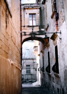
This painting was the very first one of the my Malta street scene series, painted over fifteen years ago. Common masking tape was used to create - or actually protect - each new shape before paint was put down.
.
Plain masking tape was torn or cut into the proper shapes then placed anywhere I didn't want the paint to go. Each new layer of paint was one value darker than the last one, with the colors painted almost randomly without regard for what object was being painted. After each layer of paint dried, more tape was torn or cut to fit the next shapes that I didn't want paint on. This process continued for seven layers of tape and paint.
.
The advantage of using masking tape this way is that the wet paint sneaks under the edges of the tape and creates a unique, batik-like look. When the tape was removed, some corrections were brushed in to adjust edges or values, and the wall on the right had to be repainted a lot. The fence and details of the lamp were brush painted, too.
.
Compare this with the recent posts of the same scene to see what a difference technique choices can make on a painting. This is one of my paintings that I wish I still owned, but an architect bought it years ago. It was my first successful 'tape' painting, and although the lines and shapes were somewhat crookedy, I really enjoyed looking at its unpredictable qualities. Or maybe the crookedy part was my favorite part. (That's not a real word...but it describes it pretty good.)
.
Plans are in the making for painting it again soon with hot wax batik and watercolor. Once that one's done, I'll post the photos of five different paintings done from this photo of Malta, each created with different techniques. Although I've painted this picture at least a dozen times, I sometimes (often) neglected to take photos of my work. So, now I have no record of those other paintings. (Thank goodness for the convenience of digital cameras.)
.
"LIGHT UNTO MY PATH #1" Transparent Watercolor on 140#CP Arches 11 x 15" COLLECTED

3/12/09

NEW APPROACH - OLD FAVORITE

This photo, one my sister took in Malta, has been a source of inspiration for me to paint from over the past fifteen years. The March 7th post (WARMING UP) shows one of those completed paintings, but here the image has been reversed. The approach and techniques used are also very different than before when I painting this same subject.

The black and white image (above) relates to the basic light shape in the photo. In that simplified design, there are three black shapes with one continuous white shape, which goes off the page on three sides. That white shape's was transferred to the watercolor paper and was left white - unpainted - in the few first steps of the painting.

The first layer of paint was very, very pale and was also the opposite temperature of the finished painting. Some of the painted edges creeped into that white shape more than I

wanted, but they'll be ok.

The gray areas shown around the balcony, the door, window panes and the upper window, and in the light are not paint, but actually gray miskit painted on the paper to keep it totally white. There are some splatters of miskit in various places, too, especially in the walkway. It'll all be removed later.

Next, a few small warm dark shapes were added within the painted areas, touching the white shape somewhere. You can see a variety of edges, from sharp, hard edges to soft to disappearing edges in the dark shapes. The contrast of dark and light helps establish the basic range of values early in the painting.

To finish the painting, the largest areas must be painted first, then medium sized shapes, with the smallest details added last. The next couple of photos represent the gradual progress of painting from large to small.

Areas that used to be pure white are adjusted, and the original white shape seems to slowly disappear. That good white shape was important to help establish unity to the final painting. The white shape won't be visible when the painting's done, but that part of the painting will have the best glow and the purest colors.

I enjoy using as many sedimentary colors as possible in paintings like this to take advantage of the textures created by the granulating colors. Lots of violet has been added to the warm oranges and yellows on the walls, and the only brown used was Quinacridone Burnt Orange.

That initial cool glaze over two thirds of the painting helped quiet down or 'gray' the outer edges of the warm colors. The subtle graying of those warms away from the focal area actually makes the focal area have more impact and seem to glow more.

There are several stages of this painting shown here so you can compare each progressive stage of the painting. Once the upper right hand windows had some color on them, I applied miskit over the lighter parts of the windows to preserve the shutter highlights. After darken that window area, the miskit on the windows was removed. In the third to last picture, the miskit has finally been removed from around the door area, exposing pure white paper.

The last two pictures seem almost the same. In the last picture, the lamp has been separated from the archway and detail added to the boarded up windows. The tree was lightened a bit and the balcony shadows darkened. The last thing painted was to darken the top panes in the upper window to anchor it better.


.
.
.
.
.
"CAUGHT UP IN THE MOMENT" Transparent Watercolor on 140#CP Arches 18 x 24" COLLECTED

3/11/09

SEE IT NOW! BRUSH-PAPER-WATER

It's not too often that we meet a 'giver' who gives with no expected return. Then there's Chris Beck. She started her own art blog, then quickly decided to start another blog with the sole purpose of featuring other watercolor artists.

This week at BRUSH-PAPER-WATER, Chris chose to feature my work and took the time to write up a nice bit of info about my art journey. She really knows how to make a person's day! Click on over to the blog for a look-see and be sure to stop in at her art blog, too, to check out her dynamite adventures with her brush.

Thank you, Chris, for being so generous with your time and talents, for encouraging others, for promoting watercolor and artists. You are so appreciated!
.
This painting was posted on this blog a long time ago but seemed appropriate today, too. It's a good journey when life is full of good friends and art. Like CHRIS!
.
"OXFORD CIRCUS" Transparent Watercolor on 140#HP Arches 30 x 22" COLLECTED

3/10/09

ORANGE HOT SPOTS

This was posted earlier, but here it is again with some small orange hot spots popped into the painting. Clicking on the image will enlarge it enough to better see the orange hot spots as well as the textures.

No more changes can be made since Diane took it home with her on Friday. It can be very hard to know when a painting's finished. For me, it seems the only way that I'm ever positively sure that my painting's really finished is when someone else owns it.

Several paintings - some which had even won awards - have been taken out of their mats and frames in my studio so that I could work on them again. A few re-do's from the past were ruined in the tweaking process, too, so at least I've learned to go forward more cautiously.

"RIVER WALTZ" Transparent Watercolor on Heavy Weight YUPO 19 x 28" COLLECTED

3/9/09

BUBBLES TO THE RESCUE

Several of my classes have 'painted' with bubbles, then created a painting from the bubble print. On Thursday, Suzanne mentioned printing her pomegranate picture with the bubbles. BRILLIANT IDEA! So I stole her idea and printed mine, too.

The original (below) was okay but the addition of the burnt orange bubbles seem to add a much needed texture and interest to this simple still life, as well as contributing more unity by slightly warming the background. The thin bubble lines compliment the pen and ink, too. Thanks so much, Suzanne.

One of things we all value in the classes is the creative synergy that occurs. Although many say that art is a solitary occupation, it's evident that artists creating together build on each other's energies and input, especially when the atmosphere is so positive and encouraging.
I spend a lot of hours planning and painting alone in my studio but do think I paint better when I'm with other artists. It's certainly more fun, too.

"THREE OF A KIND" Pen & Ink with Fluid Acrylic and Fluid Acrylic Bubbles on 140#HP Arches 15 x 9" COLLECTED

3/7/09

WARMING UP

Check out the difference between this painting and the cooler version below. The 'blue' painting is the original, painted on gessoed watercolor paper several years ago.

This week, that blue finally got to me, so I dug out my mouth atomizer, diluted some transparent pyrrol orange fluid acrylic in water, then sprayed or actually 'misted' the blue painting to warm it up. Those ancient streets just looked wrong in cool colors.

A few small blue shapes were taped off before spraying, like the walk in front of the fence and parts of some windows. It would have been impossible to glaze paint over the surface because the friction from my paint brush would've easily lifted the existing watercolor paint right off of the gesso.

Once the orange dried, darks were added on the left hand side, and the sky area was darkened a lot to decrease the importance of its shape. A smattering of burnt orange was touched into the distant wall and more warms added to the lamp. Some of the darker shapes were darkened even more, and the fence was extended over to the wall.

A new painting is in the works right now of the same subject, but the approach is very different this time. The temperature dominance WILL be warm, for sure. It'll be posted once it's completed.

"MALTA EVENING" Transparent Watercolor with Fluid Acrylics on 140#CP Gessoed Arches, 15 x 21"

3/6/09

PATTERNS & POSSIBILITES

Shapes capture more attention when they have some diagonal movement to them. This painting is about placing recognizable, diagonally oriented shapes together to create a patterned painting. It leans slightly toward a grid look or checkerboard composition.

Watercolors - five different colors - were washed over the paper initially, with many blossoms and textural effects encouraged to occcur in the wash. Then opaque gouache watercolor was added to enhance, define, and bring out the emphasis of the shapes. Stencils were also used for the lettering, roosters and chickens by using a sponge to lift out each shape from the paint through a piece of precut acetate stencil.

After lifting out the shapes, some areas in the stenciled shape were touched up again with paint. The rooster feathers were left as is, showing the underlying textures, with only the face and leg areas painted with detail.

Repetition was important but couldn't be over done. Temperature dominance was understated but still evident. The use of straight edges in the background against the fluid edges of the birds and egg helped add contrast, too. The painting needed some surprises and stronger contrasts of value to keep it interesting.

The egg has a lot more value changes within a small space than this blog shows. It did turn out really good with just a hint of warmth on the lower side of it. Click on the pix to see the textures along with the chicken wire --- which could have been done with a stencil, but was painted in.

The elements of design that were meant to be emphasized included shape, color, and texture. My natural inclination when painting is to put a very strong emphasis on value, but not this time. The whole process was like going on a mystery trip, since there was no initial plan to go by. Although most of my work is usually preplanned, I really get charged up by the challenges of finding my way in a painting like this.

"THE EGG CAME 1ST!" Transparent Watercolor & Gouache on 140#CP Arches 20 x 14"

3/5/09

FALLING AWAY

Watercolor is often defined as a medium that incorporates the pigment with water to extend it onto the paper. That could include many kinds of paint like tempera paint/poster paint - from grade school - plus opaque watercolor made by mixing chalk with the pigments (gouache) to acrylics to water based inks to casein and egg tempera paint. Even watercolor pencils and crayons technically qualify as watercolor if water is added. But transparent watercolor is what the majority of people 'think' when they hear the word 'watercolor.'
This painting, done on the slick YUPO surface, includes 'regular' transparent watercolor with fluid acrylics over parts of it, with gouache added in thin layers plus water based inks drawn in last. It's a 'watercolor' technically, but PURISTS wouldn't consider it one.

Very few watercolor societies limit the definition of 'watercolor' to mean just transparent watercolor (as PURISTS do.) There's certainly validity in having a group or show for only transparent watercolor paintings because the difficulty and challenge of painting with only transparent watercolor is great. It's good to compare apples with apples in a 'watercolor' show occasionally.

The majority of my paintings are only transparent watercolor, yet it is exhilarating to be able to select whatever medium it takes to produce art. Years ago, I let the restrictive interior "WATERCOLOR POLICE" keep me from trying out other water mediums. My goal was to increase my expertise with the transparent stuff, and I (unwisely) shunned all the other possibilities.

For so many watercolor artists, it can be a big deal to take that first step away from using ONLY transparent watercolor. It was a giant step for me several years ago. However, now, whatever it takes, whatever works - that's what art's about for me, and it certainly allows so much more freedom to be able to express and create.

This painting's title came about partially because of my 'fall' from transparent watercolor. It was one of the very first that I'd tried as I used gouache and acrylics and broke away from the limits I'd set on myself. It's several years old, and tomorrow's post will include another oldie from that time, using gouache, too.

"FALLEN ANGELS" Transparent Watercolor, Gouache, Acrylics, Ink on YUPO 13 x 8"