12/2/09

KALEIDOSCOPE

Today marks my 400th post on this blog. Yeah! Thanks to Rhonda's encouragement, this blog was begun in October, 2007, over 784 days ago ..... intended to be a record of my art journey to share with grand kids and family. When it was started, little did I know of all the wonderful connections we bloggers would make together.

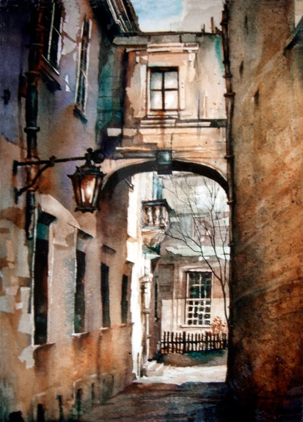
Posted today is a kaleidoscope of some of my own favorite paintings which have already been seen here over the past two years, not in any particular order at all. This journey is so much fun. Thank you all for visiting here, for the positive feedback and helpful suggestions. What an extraordinary journey we share!


12/1/09

BRUSH ONLY

This portrait was the my quick demo for the portrait workshop - done without any drawing on the paper. You HAVE to be in your right mind to do this well, since it's all about seeing shapes accurately, capturing their values and creating the kind of edges each shape has.

Of course, the purpose wasn't to make a masterpiece or even a presentable work of art. The purpose was to SEE better so we can paint better.

My hope was to have a somewhat human form when I was done, and I was happy that it turned out as good as it did, looking a whole lot like young Paige. That doesn't always happen, especially in a quick demo.

Try it. It's a great warm up exercise - less than 15 minutes time - about 14 x 19" with only Quinacridone Burnt Orange Watercolor (or whatever single color you like,) water, and a large synthetic round brush.

11/28/09

MINOR CHANGES

Making changes in a painting when it's nearly completed must be done slowly and carefully. One or two strokes of the brush can make a BIG difference - or ruin the freshness of a watercolor. Stepping away from the painting frequently helps me see how much more needs to be adjusted. In fact, when a painting is nearly finished, it's common for me to paint only two or three strokes before stepping back to check the progress.

These little Tufted Tit Mice visit our feeder often and are delightful creatures. The earlier unfinished painting, below, has now been lightened in some areas, and more twigs and a bit more foliage have been added to help move the eye through the painting. The top inch of the painting was cropped, too, to 'set' the birds higher on the painting.

The colors are very high key for me - especially for a painting on YUPO. Normally I paint with stronger colors, so I'm battling with myself not to add darker values. The textures add an effective and subtle touch to the home of these feathered friends.

Time to head to the studio and paint .... after I feed the birds. Let me know if you have suggestions for further changes.

"VISITORS" Transparent Watercolor with Graphite and Charcoal on YUPO 18 x 14" COLLECTED

11/26/09

FLOCKING TOGETHER

Today we give special thanks for our many blessings as families across America enjoy this special day commemorating the fledgling days in our nation's history. Many will be feasting on turkey, dressing, and the works as well as watching a lot of football on TV.

These turkeys are part of the flock of ten that will grace our dinner table as our whole family gathers together again. Jillian, Paige, and Ty created them so well. Aren't they delightfully fun - just a 'little' glue, some feathers, felt, googly eyes, and 2" clay pots with wooden balls glued on top. The idea came from our REMC electric consumer magazine - many thanks.

HAPPY THANKSGIVING to each of you!

11/25/09

TALKIN' TURKEY

Grandkids are such a blessing, and we have a nine year old and three six year olds who love to make art in the studio. This weekend, Ty decided he had to make a really BIG turkey and wanted a big piece of paper. The first masterpiece shown here is his, and it's 18 x 24". Isn't that huge bird just gorgeous with all those exquisite feathers!?! Awesome.

Paige's turkey shows her natural talent at making a fashion statement - on a turkey! She is very creative, especially with the way she made those incredible feathers float so gracefully around the turkey. She told me that I get to keep the painting, and I'll treasure it forever.

Jillian's turkey has the bluest eyes, just like hers, and the colors on each feather are so intense and striking. I love that smile, too. Notice the clever way she wrote her name. What a marvelous painting!

Brant gave me his art paper sculpture of a Native American Indian that he made at school. It will be part of our Thanksgiving decorations, too, and is already hanging above the table for everyone to enjoy.

Before these turkeys were created, the six year olds also made our place setting decorations for the holiday table. They'll be posted tomorrow. I just love children's art!


11/24/09

SOARING

This weekend, hawks seemed to be on every fence post and telephone wires. I saw several Red Tail Hawks soaring on the wind currents, too. It's always a thrill each time I see one.

Here's an updated version of the Red Tailed Hawk that I painted earlier this year on YUPO. The tree was brought more into focus to anchor the foreground of the bird, and a few lights and darks were adjusted, too. The hawk's shoulder was emphasized to show that he had his back to us, and the extra branches and twigs added the needed detail to the painting.

Below is the earlier painting before these changes, and you can see that the final one has been cropped a little. YUPO is incredibly fun to paint on because anything goes - including being able to easily adjust and change areas. I do love its versatility and the way that it continues to challenge me creatively. It's like it has a life of its own!


"SEARCHING" Transparent Watercolor on YUPO 14 x 18"


11/23/09

ARTIST TRADING CARDS SET #5

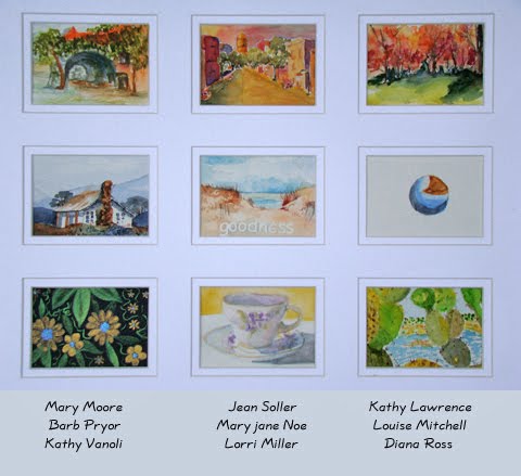
These are the final nine cards of my five sets of cards from my weekly classes this past year. I smile each time I pass them in the studio. Every card is unique, some done by professional artists, some by people who haven't been painting that long. Each is a small but glorious treasure. Thank you for painting them and sharing them.

11/19/09

ATC SHOWCASE #4

Teaching others about making art is one of the very best 'jobs' in the world as far as I'm concerned. Yesterday the Queen City Artists Club held a mini morning workshop to learn more about YUPO. The group worked, no, actually played, with watercolor on YUPO with great results. Watching what each unique artist created was exciting for me.


These ATC cards from some of the artists in my weekly classes show great variety of subject matter, style, and technique. Each artist approaches a bigger painting with that same uniqueness. Can't wait for class to get here this morning!

11/16/09

SHOWCASE TRADING CARDS

Here is the third set of five of the artists' trading cards in the studio. The unique style of each artist is evident even in a painting so small. This photo does not do them justice at all...my apologies to the artists.

11/12/09

SHOWCASE #2

This group of trading cards again shows the diversity of styles and techniques each artist used. The cards are small - a little over 2x3." Each artist who gave me a card received one of mine, too, and I did some of them on YUPO with fluid acrylics:-) Painting small is not my style at all, so this was challenging.
There will be more to see in the next post, but now it's time to finish up the details before the portrait workshop here on Saturday and Sunday. Have a good weekend.

11/11/09

SHOWCASE #1

Over the past year, each of my weekly classes decided to create Artists Trading Cards, sharing them with the other artists in their class. The posts over the next several days will showcase the cards, although they are not necessarily arranged according to which class made them.

The mats came precut from Art Supply Warehouse in North Carolina. These make a great addition to my studio walls and are inspiring. I love the diversity of style and techniques used. Each artist trading card is unique, just like the artist who made it.

I will treasure these forever! More to come tomorrow.

11/6/09

DEMOS

The first painting posted here was created this week during a demo for the Western Ohio Watercolor Society, and it's on YUPO, painted with FLUID ACRYLICS. The second painting is on 140# rough Arches, with nearly the same scene from Venice and painted with Transparent Watercolors only. It was painted as a demo the day before for one of the weekly classes I teach.

The result was two totally different moods just because the paper surfaces were so different. The quiet serenity of the Arches painting looks more like Venice looked when we were there last year. But, the YUPO painting feels more like I FELT when we were in Venice last year. Hope that makes some sort of sense.

Each person will have reasons for liking one over the other. I'd love to know what you think.

"GRAND CANAL GONDOLIERS" Fluid Acrylics on Heavy Weight YUPO 21 x 15"
and
"GRAND CANAL GONDOLAS" Transparent Watercolor on 140#R Arches 21 x 13" COLLECTED

This is the painting before changes were made to unify it more - see comments for details of what was changed. THANKS to Kathy's good eye!

11/3/09

CHOP AND CROP

Tomorrow evening I'll be doing a demo at the Springfield Museum of Art in Springfield, Ohio for the Western Ohio Watercolor Society. YUPO and FLUID ACRYLICS are on the menu, and this post shows a recent YUPO painting after an extreme makeover.


This painting was warm and cozy - see below - but changed now to be cool with hot accents in the focal areas. Lots of cropping was also involved. Using fluid acrylics on YUPO allows for an infinite number of changes and a million possibilities. Tomorrow evening should be lots of fun - and challenging, too.

"EVENING RIDE" Fluid Acrylics on YUPO 12 x 17"


Original look of painting

before adjustments,
as shown above


11/2/09

GONE

Saturday morning, a young man died whom I'd been praying for. REALLY praying for.

There are no answers that explain why a vibrant young father should die. The doctors' expertise along with the many thousands of prayers in the past month did not prevent his death.

The bottom line for me was that there was no one to blame but God. He could have stopped this and didn't. That hurt so much. Of course I told Him what I thought - loud and clear - how angry I was and just how I felt, many many times today.

This painting, done a couple of years ago, seems to 'hold' what I'm finally feeling now. The sense of despair is vanishing. Finally, after all my yelling, something healing is taking the place of the anger and blame. There's a perfect peace..... no answers to explain..... but His pure tender presence, deeper and new, full of LOVE and HOPE. The deep sadness and pain remain, but the blaming, the resentment, the anger are gone, removed so gently by Jesus.

We won't KNOW, will we, until we see HIM face to face? Until then, it's faith.

"THE WAIT" Oil on Canvas 6 x 10"

10/29/09

INNOCENCE

This little lady, now almost six and a half, will be dressed up tomorrow evening as Tinker Bell's helper and her sister will be Tinker Bell. The little fellow below, who is also six, will be none other than Peter Pan! Their older brother will be wielding Captain Hook's sword as they trick or treat throughout the neighborhood.

In two weeks, I'll be teaching a portrait class here in my studio focused on capturing the innocence of children with watercolor. Each artist will work from their own resources to capture the likeness of their favorite little ones. Join us if you can. See the side bar for more details.

I have a feeling that I'll have just as much fun (probably even more fun) trick or treating with these kids as I will teaching the portrait workshop.

"PAIGE" and "TY GUY" Both painted on 140#CP Fabriano COLLECTED

10/26/09

MAKING A DIFFERENCE

--- ADJUSTED PAINTING
Everyone has different ideas about how to know when a painting is finished. Here's what seems to work best for me...

A painting is completed when it's no longer in my possession. Until then, it's open for adjustments and changes, even if it's in a frame under glass (just ask Deb Ward, who so expertly framed, and unframed, for me for several years.) While it may not be good advice to give others, it works for me.


This second photo shows the ORIGINAL PAINTING as it was completed tttt(before any changes were made) and posted this past January. Occasionally it would sneak out of storage and let me consider making adjustments to it. Finally it was matted and displayed in the studio.

Then Lydia returned to class from her travels and commented that this particular painting was not one of my best ones. It made me think long and hard about what could be done to make it better.

Because this was my first attempt at using masking tape on YUPO with fluid acrylics, I'd fallen in love with the possibilities of the process and set aside the importance of tweaking a good composition. Finally it was time to make amends and find a solution to make this a more dynamite painting that would compel the viewer to enjoy my impressions of the antiquity of Venice.

By comparing the earlier version with the 'finished' one, you can see that stronger oranges were added to parts of the wall and that the upper part of the painting was muted and darkened, thereby allowing the pure vibrancy of colors to stand out stronger in the focal area. The street light and its post also have more value changes to help add more interest there, especially as the iron 'arm' work moves across the dark of the window and in front of the dark doorway. The flatness of the white wall was darkened in the foreground to lend more depth, and the doorway was enriched with deep colors. The value contrast between the white wall and the brick was minimized at the bottom edge of the painting, too, by softening the edge of the white wall. In a few select areas, a pale wash of teal was touched in for a cool temperature surprise and to help make the oranges vibrate more.

There's a bit more drama and sense of atmosphere now in the painting with places that say 'look at me' and places to rest. Both excitement and quietness dance together, and the painting shows more about how I felt when I was there. The earlier painting let my eye float out of the top of the picture, but now my eye moves through the whole painting, finding more surprises along the way.

There's certainly a time to stop and step away from the painting. Going back into a completed painting can be tricky. In the past, for me, it was a tough lesson that took years to learn --- that trying to make it perfect with just one more brush stroke would simply kill the life of the painting. Many of my pretty good paintings ended up in the trash because of trying for that perfection. Yet, this painting needed help. Thank you, Lydia, for your 'wake up' comment. It made a wonderful difference.

"JOURNEY" Fluid Acrylics on YUPO 14 x 25"

One of my favorite quotes comes from Michael J. Fox. "We can strive for excellence, but perfection is God's business." Great advice for any painter. It's an art not a science!

10/25/09

IMPRESSION

Today is a spectacularly beautiful fall day here in the Midwest, with Sugar Maples at their peak. Rain from the last couple of days caused all the Ash and Walnut Trees to defoliate, but the Sweet Gums, Oaks, Pears and most Maples are in full glory.

This little painting was created nearly two decades ago using lots of carefully painted miskit to preserve the whites of the Beech Tree so that the background could be painted with a spontaneous fresh and loose look. I do love trees. Enjoy the week, everyone:-)

"BEECHED" Transparent Watercolor on 140#CP Arches 15 x 11" COLLECTED

10/22/09

ARCHIVES AGAIN

Here's a painting from over a decade ago that was lots of fun to paint. Colors were introduced randomly to the otherwise golden corn shocks to add visual interest to them.

A friend purchased this because her husband had grown up in a town that manufactured barbed wire. I have vivid childhood memories, too, of climbing over the barbed wire fence behind our house, and I rarely got snagged by it.

Hope many of you in the northern hemisphere are enjoying a beautiful autumn like we are. It's been gloriously colorful with great weather to enhance the colors, very inspiring for an artist.

"Cornival" Transparent Watercolor on 140#HP Arches 14 x 29" COLLECTED

10/18/09

CELEBRATE

Months ago several friends advised me to enter my Italian pigeon picture in the Watercolor Society of Indiana's annual juried show. Since, at most, I enter only two shows a year, it didn't seem right to submit a painting that seemed to me so boring or too simple. But these giant sized pigeons did make it into the juried show - which was a pleasant surprise, for sure.

Today awards were presented in the Indianapolis Museum of Art, where the WSI show will hang through the first weekend of December. The pigeons received the third place ribbon, along with a generous gift certificate from Cheap Joe's in North Carolina:-) and a very nice junk of change! THANK you for being so encouraging and having the eye to see what to enter. Your advice is so appreciated, and your friendships are such a blessing. Now let's celebrate!!!

10/13/09

AUTUMN

Painted over ten years ago, this little still life really should have been painted on YUPO. The colors would be so exciting and vibrant. There's even some Indian corn in the studio ready to be captured in a painting so maybe tomorrow morning's class will have to watch another demo.

"EARLY HARVEST" Transparent Watercolor on 140#CP Arches 20 x 14"

10/12/09

NOT DICTATION

Little children peddling bikes into the morning sunlight through the narrow passages in Venice made me wonder where they were going. The backpacks they wore meant they must be headed to school somewhere. And the scene meant it must be painted, too, when I got home.

A month ago this was attempted in a workshop with Alvaro Castegnet, and now it's redone with more time taken for composition and value changes. The first post here is the final painting.

The second photo shows how the painting looked as I demo-ed it in one of the Wednesday classes. They insisted I stop at that point, that it was completed, but when they left, they all knew I would have to add more to it before I called it completed.
The original first draft is the really dark painting that's shown next, which was hurriedly done in the workshop and posted last month, too. I do love the warmth of the street in this one, though.
The last photo, my photo reference for this painting, was taken during those four glorious days in Venice. Lots has been left out and lots has been added. It was only a reference, an inspiration from that moment last year in Venice. In fact, in class, now I so often quote Alvaro's wise advice, "Don't let what you're looking at dictate what you paint."
"VENICE IS FOR KIDS - LIKE ME" Transparent Watercolor on 140#CP Arches 15 x 22"