10/20/07

PAINTNG ON YUPO

Almost 10 years ago, I attempted to paint with watercolors on YUPO. Two years of frustration finally resulted in a wonderful 'ah ha!' moment, and I was really hooked. Back then, no one gave workshops about how to paint on YUPO, so I plodded and experimented on my own.

Now on video you can watch George James demo the many, many ways paint can be used to transform the slick YUPO surface. Creative Catalyst Productions produced the videos, and James also gives workshops throughout the US. Several of my friends have taken his workshops and learned a bunch.

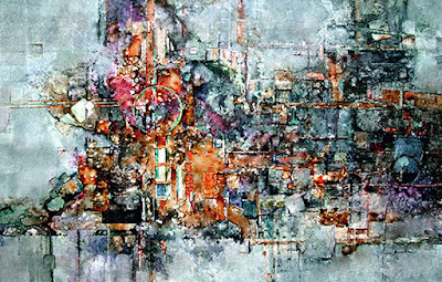
The painting below started out as a workshop demo and was awarded Best Of Show at Viewpoint 2004 at the Cincinnati Art Club. The painting on the right is more recent and received a first place in another show after getting a rejection notice for Viewpoint 2006. My inspiration for the one on the right came when my friend, Ginger, donated some chemistry flasks to my studio still life collection.

"UNDERGROUND RAILROAD" on YUPO 40 x 26", and above, to the right, "PARTY TIME" on YUPO 26 x 40"

YUPO IN EUROPE

"EUROPE'S BEST" on YUPO 40 x 26" SOLD

If you haven't painted on YUPO, you are missing a great adventure with watercolor. I wanted to paint as impressionistically as possible on YUPO and had a blast doing this painting. I worked from a small color study I'd done in oil, and referred to the photo below only for small detail info. The paint sits right on top of the plastic paper surface and maintains its brilliance and intensity, and anything with texture deserves to be painted on YUPO. It takes the aspects of watercolor into a new level.

MY PHOTO REFERENCE BELOW AND, TO THE RIGHT, MY SMALL COLOR STUDY DONE IN OIL

10/19/07

EXPLORATION

Some paintings take on a life of their own, telling me what to do next. This one was fun to discover. Having NO IDEA at all what I would end up with, I began the painting using my taping process along with some of my favorite transparent colors.

After many glazes had been washed on, I removed the layers of tape and began to search through the chaos of the colors and shapes for some sort of form. I hoped to preserve as many textured areas as possible.

"SECOND HAND ART" on Arches 140# HP 30 x 22"

The little old ladies on the right '''showed''' up and led me on a fantastic journey. Much of the tape texture was covered up with gouache and watercolor as I developed the composition. I also used Caran d'ache crayons, a water soluble crayon that is freeing to use on paintings.

Robbie Laird said that this method of work takes chaos and turns it into control. I agree. It's certainly the most challenging approach for me. I removed the painting from its frame three times and made changes before I was happy with it.

The painting's presently in the Ohio Watercolor Society's 2007 Traveling Art Show and also won the Best of Show in 2006 at the
Middletown Arts Center Annual Show.


DETAIL OF SECONDHAND ART - textures resulting from tape make fantastic patterns.

Just another note--- At a recent show, a couple was admiring this painting. I leaned toward them to hear what they were saying, and when I discovered that they really liked it, I felt a panic in me that they might purchase it, that it would no longer be mine. Up to that point, I hadn't realized how attached I'd become to the picture. Some paintings are just too hard to part with when you've invested so much in them, and this is one of them. I can't wait to get it back.

FOREVER

"FOREVER" on Arches 140# CP 27 x 21"
Today's a gorgeous fall day. The colors outside remind me of this painting done two years ago about this time. Before using all transparent watercolor, I placed masking tape, torn into the appropriate sizes, to mask out the lightest value areas, before painting almost randomly with color to evenly darken the remaining areas. Usually it takes about six to seven layers of tape and paint glazes to get the textural effects and value patterns as seen here. Putting all that tape on then removing it when I'm all done is tedious, but I love the results.

My desire was to portray the 'old' of the village with the old, old couple, and I was pleased with the outcome. The painting received the Gold Medal from the Ohio Watercolor Society's Annual Juried Show in 2006, with Stephen Quiller as judge. YES!

10/18/07

ICE STORM INSPIRATION

" THE BIG ICE STORM" on Arches 140# HP 18 x 30"


The reference photo on the right shows many more branches, etc. than in the painting. Artistic license is important to use so that the reference photo doesn't become the 'boss' of the painting.

.


One of the classes wanted to know how to paint 'ice.' We had a really long lasting ice storm this past March. Every day for seven days I snapped photos, thinking I shouldn't take more... but each day was even more beautiful than the last. I couldn't resist.
Choosing a reference photo and cropping it using the Phimatrix program I'd purchased, I was inspired to teach the class how to paint ice. Of course, all we could paint were shapes, edges, values and colors. But they looked like ice when we were done:-)
The phimatrix system is a great tool to help an artist find the ideal focal point for a painting. The site's listed as one I visit often (on the right hand side of this blog.) Check it out at http://www.goldennumber.net/ It's good reading and awesome info for an artist. From that site, I'd purchased Gary Meisner's Phi Matrix program (inexpensive - $14.95 download and so easy to use!) which helped me find the ideal center of interest.
The upright branch divides the top of the painting into a 'phi' proportion, making the right hand side .618% of the whole width of the painting. Right at the bottom of that branch, where the redbud seed pod hangs down, is an ideal focal point. Putting sharp edges and strong contrast of value and color there helps to grab the viewer's attention. Hopefully you felt a 'brrrrrrr' when you looked at the painting.

10/17/07

LANDSCAPE COMPLETED

Doing a small --------- My Reference Photo
value study (on the left, done in graphite,) always helps me see how well the final painting will 'read.' There's no color used at all, just black, white, and grays. I can tell right away if my eye is going to move through the painting or not, and if the composition will hold together.

The value study also helps me spot compositonal goofs that could be hard to fix later. This value study took maybe 20 minutes to do, and I used it almost exclusively as my reference when painting. I only referred to my reference photo for final details. Check the previous post of the not-yet-finished Italian painting to compare it to the value study and my original photo, used mainly for inspiration as well as some reference.
"NORTHERN ITALY" completed, on Arches 140# CP 30 x 18.5" COLLECTED

10/15/07

LANDSCAPES

Today's class focused on how to best create a landscape in watercolor. The demo painting is getting close to completion. The lightest, biggest, furthest away shapes were painted first, followed by closer, light shapes, like the water areas. Darker values were added next - the cypress and dark foliage tree line. Details had to wait until medium sized shapes were finished. There's more to do but the basic areas are in. I'll include a value study and the original reference photo in the next post but wanted to get this on line for people who watched the demo today. PARTIALLY COMPLETED LANDSCAPE

After class, all four grandkids painted pumpkins with acrylics, then made prints of their palettes, which turned out very colorful too. However, one of the prints was placed near this painting, the fan was blowing ---- and surprise! I had vibrant magenta in the hills of Italy. I had to resort to opaque white gouache to hide the goof. Worse things could've happened, but it really did bend me out of shape for a while.....

10/14/07

PAINTING CHILDREN

It's been a busy weekend here with grandkids. I'm posting a couple of my earlier paintings of two of them. (Too busy to paint this weekend, that's for sure. We did the pumpkin patch, played at a great park in Cincinnati, carved pumpkins, got to church this morning, then took off for 'Otterville' for an afternoon of play also. Took a trolley ride. Making some good memories. And we took plenty of pictures that could be future paintings...)

Our oldest grandchild with his very, very large dog, part lab, part great dane -

This is a painting of one of the triplets, but they are a couple of years older now. So much fun and so many questions to answer. Tomorrow we will all find time to paint in the afternoon..