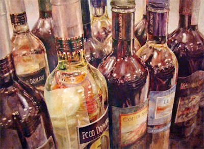
 Finally, my younger brother and sister-in-law's Christmas present is ready to wrap. What fun it's been to paint eleven bottles of wine in full color, actually twelve if you count the smidgen of one on the lower right. For that last whole bottle on the right, step by step detailed photos are posted below. What follows is an attempt to describe the process.
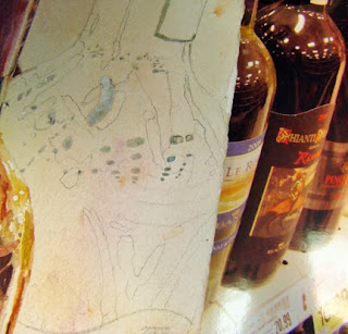 This first smaller photo shows the bottle with gray miskit preserving the whiter shapes/reflections on the bottle. The bottles seen to the right, with Kroger's prices below them, are my photo reference, with the middle bottle being the one to focus on for this drawing. You can see a pale warm wash that was previously applied over the whole paper after the miskit was in place. Notice the pencil detail of the shapes, based on the light, medium, and dark value shapes of the surface of the bottle.
 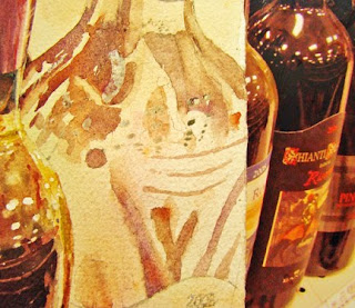 This photo shows the medium light to medium values painted in the appropriate shapes. Using lifting pigments like cobalts as well as earth pigments makes blending easier to do later. Cobalt Violet Deep along with Transparent Pyrrol Orange and Lunar Earth were the main colors for these light to medium value shapes.
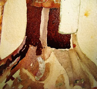 The neck of the bottle shows the dark values just painted but not yet blended in. All the edges are crisp and sharp at this point and won't be softened or blended until the entire connected dark area is painted. Even if the paint dries, it'll be easy enough to blend colors that are this dark into those medium shapes that were previously painted.
 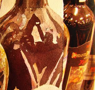 This shows the pattern of darks from the neck of the bottle down to the label, still with mostly hard edges. Check the photo reference right next to the bottle to 'see' why shapes were painted as they are. Though the painting's not completely accurate, the shapes are close enough to work.Colors used to create the darks include puddles of Quinacridone Burnt Orange, Transparent Pyrrol Orange, Quin Magenta, Indanthrone, and Ultramarine Turquoise, all from Daniel Smith in Seattle. The mixture is not just one puddle, but several that may be a bit bluer on one edge or more magenta on another edge. (Is bluer a word?) I mix the colors together very little in the palette, preferring that most of the mixing happens as they meet on the paper surface. Also, my brush is not rinsed between colors to avoid lightening the puddles with water.
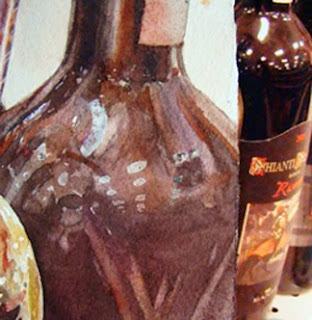 As soon as I took this photo, I could see in the small screen on my camera that the darks were way too light in many areas. At this point, most of the shapes have been blended, softened or left sharp, according to what's observed in the photo reference. The miskit is still on the paper but will be removed soon to reveal whites and lights. This is when I often think the painting is lost. Nothing has any snap, and it looks pretty messy.Although the wine bottle was brownish, I choose to use several colors to create that dark brown. Certainly one brown color could have been used and lightened and darkened as needed. But by using several colors mingled together, a bit more excitement is created in the painting than if the bottle had been only one brown.
 More darks have been added now to help give the bottle a lot more dimension. Often it's the lack of strong darks that cause paintings with reflections to lack any luster. Observation of where those darks are located and just how dark they are compared to other shapes is critical, as is whether they have sharp, soft or lost edges.
 It's been said that the most important tool that any artist can have is eyes to see. Being able to observe and notice shapes and values and edges makes painting glass and reflective surfaces a whole lot easier. It's almost like putting a puzzle together, piece by piece. Just making each specific shape have the correct value with the correct edges will get the job done for sure.
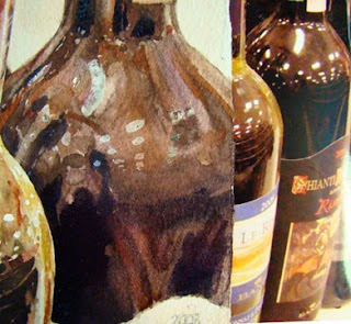
 Finally the miskit's off. It's important to wait until you're sure that you won't have to paint in that area again, and of course, the paper must be completely dry before the miskit is removed. Miskit is about like using WhiteOut. It leaves a sharp, defined, non blended edge that must be dealt with.
For this painting, the miskit shapes were softened with a thirsty, but damp, flat brush, and color was lifted from those edges into part of the white shape. Care was taken to keep paint off of the center of the shapes. Adding even a little bit darker values to those whites would lessen the impact of the dimension of the bottle. A few spots needed to be even softer, so I used a stiff scrubber brush along with a drop of clean water to gently loosen or ''erase'' the paint where necessary. Blotting each spot with a white tissue took care of the excess water and loosened paint - see next photo.
 Finished. After stepping away from the painting and seeing it reversed in my overhead mirror, I decided that the whites on this particular bottle were too white. A gentle swoosh of clean water over the whites took care of the starkness of those whites.
White is the first thing we see, especially on watercolor paper, so the whites need to be in important areas. These whites on this particular bottle were close to the edge of the paper and pulled the eye almost out of the picture. Until they were toned down with mostly clear water, they were strong enough to rob the focal area. The three thin, gentle curved lines were lifted with a thirsty flat brush, since I goofed and painted over them earlier.
Reflections are not hard to do - as long as you use your observation skills. This whole painting was painted with my favorite 1" flat brush, except for when I applied the miskit. Careful application of miskit is crucial so that the white shapes have fluid edges, not scratchy ones. I use a rigger 00 size and rinse it in Goof Off when I'm done. After the Goof Off dissolves the miskit, the brush is rinsed in Dawn Liquid Detergent then rinsed in hot water.
Now to get the gifts wrapped and ready to go........ The title of the painting is Kevin's Domain, and it's bigger than the last bottle painting - about 20 x 14", on 140# Arches cold pressed. I think he and Gail will love it!
 My Mother-in-Law, who turned 90 in September, is a fantastic and diverse woman who has lived through many, many changes throughout her lifetime. She tells about her childhood Christmases and the memories of her dad always waiting until Christmas eve to cut down an evergreen. None of the kids would see the decorated tree until Christmas morning, and she recalls that each holiday the tree was tied to the ceiling fan so that the cats wouldn't knock it over!


