 For the past two weeks, my Wednesday evening class has been challenged to paint portraits in a less than photo realistic style. Painting loose and free looks so darn easy, but, at least for me, it's not.
 I think the deception is that it just looks like the paint was slopped down on the paper with reckless abandon. And actually, it just about is like that. But there's LOTS of thought before the brush touches down - exactly where does that shape go? How light is that shape? Does the shape change in value and get darker or lighter? What kind of edge does the shape have, and how and where does that edge change? And of course, what COLOR is the shape?
The last question is actually the least critical of all of the questions, but it's the one we respond to the most. Just to get it out of the way, let me list the colors I used - Raw Sienna, Quinacridone Coral, Quinacridone Magenta, a little Cerulean, a little Quinacridone Burnt Orange for skin areas.  For the hair, it was Cobalt Blue and Quinacridone Burnt Orange with a bit of Lunar Earth for texture. Seven colors, total - a warm yellow and red, a cool red, a cool and warm blue, and a two browns. Any other colors could be used, with each selection lending a different feeling to the painting.
Color gets our attention. How many times have you heard someone ask, "What colors did you use?" Color is magic. But the thing is, the painting usually succeeds, not because of the colors chosen, but because of the way the shapes, values, and edges are handled. Good composition and technical skills along with the ability of the artist to pour emotion into the painting are the final key factors for real success.
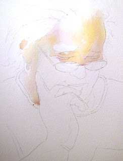
Applying the pale washes of color into each dry shape, spreading the very fluid paint into the area it belonged, then creating a soft or lost or hard edge helped form the structure of the face.  Only pale values were used, no darks - pictures 1 & 2.
Notice the pure white areas left on parts of the face. The photograph we were working from had color in those white spots, but they were the lightest areas. Leaving those areas completely white gives so much more dimension to the painting and adds freshness and sparkle to the painting. 
After the paper was bone dry, a darker wash was applied in the same way - very fluid, juicy paint. Edges were softened, etc.  Notice that there's no hard edge or 'line' where the hair meets the forehead. Edges are SO IMPORTANT.
When I'd finished the hair, I thought it needed just one more stroke above the ear to break up a dark shape. I didn't check the paper to know that it had lost its shine, and when I put that brushstroke down, I got a really bad blossom there that looked like a caterpillar crawling through her hair. I grabbed the spray bottle and spritzed the area lightly, hoping it would help. Whew! Now it's my favorite part of the painting. Pure luck.
Small shadow areas and details were added - the blur of lashes and brows, the dark by the nose, suggestion of glass rims and temples. The whole lip area was painted with the paper upside down. It was an unusual shape that was really easiest to follow upside down.
The supporting parts of the painting - the clothing, book and background area - were done quickly, with not much detail so that the focus would remain on the face. Using mostly cool colors there helped emphasize the warmth of the face, too. The painting's captured the sense of someone really enjoying a good read but is not a photo copy of her face.
She never looked up when I was taking pictures. It must've been a good book!
"CAN"T PUT IT DOWN" Transparent Watercolor on 140#CP Fabriano Artistico 22 x 15"


