4/12/08

YUPO CLASS DEMO

This painting started out as a short class demo on Monday morning, and I decided to pursue it until I thought it was complete. The painting is filled with symbolism that holds some kind of significance to me and to my view of the world around me.

I used George James' grid process to show the class how to focus in on one area, making that area significantly more important than the rest of the painting. Earlier that morning, one of my new students shared a painting she'd done of a bridge similar to this one, so I borrowed the bridge idea and reorganized the shapes to suit my design and demo. Since this was very impromptu, I was excited about the results.

"WHERE HAVE ALL THE SOLDIERS GONE?" Transparent Watercolor on YUPO 16 x 13"

4/10/08

NEXT YEAR

I'm already looking forward to next year at Kanuga. That place is special.

This photo was taken before dinner, on Tuesday evening, from the big porch which has lots of comfortable chairs and rockers. (But we didn't take time to sit in them because we were so busy painting.)

Next year, many of the same artists will return to enjoy another four days (at least) of instruction and inspiration. It's like a big family reunion, and although I've missed the past two years, I felt immediately at home this year when we all got together for dinner the first night.

Spring 2009 will be a whole new line up of instructors, and I'm leaning towards signing up for Miles Batt's class. I like the class description, and I've been told that he's an excellent teacher. If anyone knows about his workshops, please fill me in on what they are like.

If you're interested in going to a top notch workshop event in the beautiful Smoky Mountains in western North Carolina next spring, check out http://www.kanugawatercolorworkshops.com/index1.html. Hope to see you there.

4/9/08

YUPO AGAIN

This abstract was concocted right before class ended on the first day of our George James workshop last week. I was trying out some of the techniques and processs on YUPO that I wasn't very familiar with, like pulling the paint with a squeegee, and kept on going until I liked what happened.

Colors never soak into the YUPO surface since it's made of a very high grade of polypropolene, aka as plastic. Because they don't soak into any paper fibers, the colors stay intense and bright just like they are when they are wet and glowing.

Whatever surface or materials I'm working with, my hope is that I can create a piece of artwork that is meanigful to me, first of all, and also evokes an emotional response in others. Both are rewarding.

A new (to me) artist commented today on one of my posts. She signs in as PAINT ON HER FINGERS, and on her new blog she's posted the best quote - "She's happiest when she has time on her hands and paint on her fingers." Don't you love it?!? I live there for sure.

"TIME ON HER HANDS" Transparent Watercolor on YUPO 17 x 13"

4/8/08

YUPO - START TO FINISH

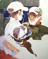
As promised in yesterday's blog posting, below are the eight photos taken as I worked on this painting. The first shows the beginning step, with one big, irregular white shape that goes off the paper on all 4 sides. Basically, I painted one light value in the shapes around it. The second shows a few strong darks added next to the white shape, breaking up some of the white shape in the sunglasses and hat areas.

The third and fourth photos show the progression as more values are added to help meld the darks and lights together. (All of this basically came from instructions given in a workshop I'd taken a couple of years ago with John Salminen.)

Our workshop teacher, George James, also started with a few simplified shapes placed within a specific chosen grid, within the gridded page, and generally included one bigger white shape. I added his grid idea to the big white shape idea and proceeded to design the shapes.

Things started out okay, but I was not happy with the way the painting was going in photo 4. The white hat on earphone guy was too too strong (but needed to be important,) and the painting seemed to be way too predictable.
Thank goodness George suggested pulling the big white shape on the left side (shoulders and backs of the 2 guys in photo 5) all together. After taping the edge of the hat to protect it, in photo 6, you can see how I used a squeegee to drag some green paint through that area. I was 'back in business.'
From that point on, I was having way too much fun, adding more patterns to the painting in the form of checkered flags effects as well as road stripes. There are some cool textures added at this point, too, that can be seen if you click on the paintings.
The last three posted progressions have very small areas changed in them, but the changes significantly improved the way the painting reads, I think. Much to my surprise, my husband, who strongly prefers very realistic paintings, said he really liked this one. (He LOVES racing.)
My hope was that the painting would express the feelings of speed, the activity, the excitement that goes along with this sport, and I purposely chose colors for the painting that are on the race flags - black, white, yellow, red.
I've also posting the two reference photos that this painting was sketched from. I liked that I could combine an Indy car race driver and car owner, along with a Nascar race fan, in one painting and get away with it. Someone in class today commented on how 'good' A.J. looked in the painting, (a little like a younger Paul newman.) The first reference photo is of A.J. Foyt Jr. and his namesake grandson, who now drives for him.
Thank you to George James for opening my artist's eyes and ears. He is a brilliant master teacher as well as one of the most progressive artists in our age. We called him 'George' all week, but while writing this blog up, I wondered if I should've called him 'Mr.' or 'Professor' out of respect. He has my full respect either way.
I surely appreciated all that he discussed and shared with us throughout the four days last week and hope to take another workshop from him in the future. I'm also looking forward to his fourth DVD which should be released soon from Creative Catalyst Productions. (His other three videos are excellent, by the way.)
Now I'm headed to the studio to continue work on my new series of sports-related paintings. This time it's golf.

4/7/08

YUPO AT THE RACES


This is my work from the third and fourth day of the workshop and was compiled from a couple of photos I took several years ago. The class had only 8 people in it and was billed as a 'master' class.

The goal for this class was to be able to transform our paintings into strong, artistic, visual expressions, no matter what our material or subject or style was. Any watermedia could be used, and any surfaces could be painted on.
My own goal for this year is to be able to express myself better, be able to place concepts and ideas on paper with paint, and that's why I took the class. Those four days helped me a bunch in moving in that direction.
The first morning, George James spent about an hour and a half showing us various ways he puts paint on the YUPO - his various 'techniques.' After practicing what he showed us, we were on our own to design and paint. The other three days, he discussed specifc ideas and philosophies related to creating artistic expressions - challenging us to move forward into making the art that only we can make. He discussed just a little on painting preparation, layout, and composition. During the week, he also did some small, individual demos for those needing direction.

I found it refreshing that George gave almost no input to design or composition. In fact, this workshop had the least info on design/composition that I've had in a long time. We were really focused on finding our own voice, expressing our own personal point of view. To say the least, it was utterly fascinating to me. I LOVED IT!

The best thing about the whole class was when I realized how much freedom I really do have in painting. (I thought I already knew that but got a whole new, refreshing perspective this time.) Tomorrow I'll post photos of this painting as I painted it from beginning to end so that you can see the process I went through with the design and exploration.

"ON THE FAST TRACK" Transparent Watercolor on YUPO 20 x 28"

4/6/08

YUPO TO MARKET

'Day Two' of our workshop was a really good one. More mind stretching info from George James about creating meaningful art helped us as we explored ways to express what is meaningful to us.

This painting, on YUPO, drawn with a Derwert watercolor pencil and painted with transparent watercolor, is about 26 x 20". I've posted my reference photo below as well as a photo of another painting done last summer from the same reference, for comparison.
My goal for last summer's painting was to create an impressionistic look on YUPO. For this new painting, I was more focused on creating a contemporary look.
The paper was gridded out first, then I constructed the drawing, making a specific section within the grid most important. The grid lines on the YUPO were there to encourage me to play more with the design elements rather than be realistic. The grid also aided me by helping keep a flat look to the painting. (Normally a paper is gridded out to aid in transferring a drawing from one paper to another. This type of grid had an entirely different purpose.)
Proper perspective or realism weren't my concern at all. The main thing I wanted to do was create a dynamic painting of a special place, and I wanted the painting to appear flat rather than 3-D when it was done.
Creating shapes within a good design was a lot of fun to work out ahead of time. I incorporated John Salminen's process of using just ONE good white shape to start the painting.
A very kind woman named Grace purchased the painting on the last day of the workshop, and it was hard to part with it so soon after painting it. (But I don't have to get it framed:-)
'Europe's Best' (Below on YUPO) with reference photo used for today's painting as well as this one - - -