The blog below describes in detail how using a good white shape in the planning stages will help hold the painting together. If you're an artist and want a challenge that will help make your paintings stronger, read on.
After making a sketch of the bird and branch, specific areas were miskited that had to stay light or white, like the feathers on his shoulder and chest and the top of his beak. There's a highlight speck of miskit in his eye and a thin line around it, too, and his feet on the branch have some miskit on them.
Applying miskit is an art in itself. The best way to think about its application is to realize that you are actually painting the exact white shape that you want in the finished painting. No haphazard, sloppy brush strokes, please. Make the edges of the miskited shape appropriate for the texture of the surface, too.... like skin areas would be smooth edged, tree bark might be rougher at the edge, etc. Along with applying miskit to the specific white/light areas, some miskit was splattered over the paper to add extra sparkle later. Any directional shaped miskit splatters were removed once they were dry, leaving only round-shaped splatters on the paper.
Temperature dominance of the painting was the next consideration. Would the overall temperature be cool or warm? It would be cool, and the focal area would include the opposite temperature to make a nice, eye catching warm contrast against the overall coolness of the painting. Contrary to instinct, the first layer and biggest of paint would be warm, not cool.
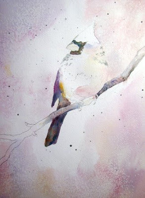
Both Steps 1 and 2 are shown in this photo, but Step 1, the lightest wash, will be discussed first. A juicy mixture of mostly pale warm colors was painted very lightly over the painting, except in a specific shape that was determined before the painting began. That shape, known as the good white shape, would serve as the bones of the painting to help hold it together and give it unity, even though it would not be visible when the painting was completed.
By definition, a good shape must have a diagonal or oblique thrust, be unpredictable in its shape, and be irregular. The shape also needs to have either mostly curvilinear lines or linear lines and go off the page on at least three sides. It needs to take up no more than a third of the paper and to include all the areas that would remain pure white. Finally, it must be one connected shape.
Shown next is a super imposed blue outline defining the original good white shape of this painting. Creating a good shape to serve as the bones of the painting is crucial for this process, so below is a description of what seemed to work well to help establish that good shape.
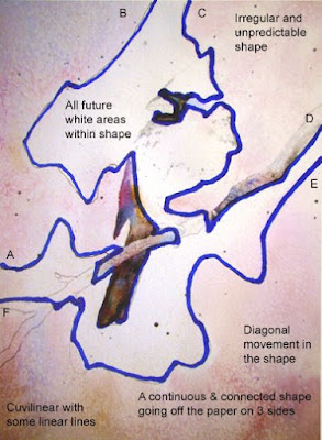
Starting on one edge, a line was drawn over to another edge to create the first side of the shape, A to B. None of the whites in the painting were in the corner shape created by line AB.
Then starting close to B, a second line was created from C to D, with the whites of the painting located between the first and second lines. Care was taken to NOT outline much of the obvious shape of the bird in order to keep the white shape unpredictable.
Adding the third line starting next to D and continuing over to A completed the shape. Notice that the three lines never cross or touch each other and therefore make one continuous shape, going off the page on three sides. Care was taken to make sure that all the future white areas were included within the shape. Usually adjustments must be made at this point to make the shape more irregular and unpredictable, but this process creates a basic overall shape.
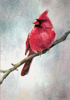
Referring back to the first picture posted here, you'll notice that the white shape has mostly soft or lost edges and is very subtle. As paint was applied around the good white shape, attention was given to whether an edge was to be hard, soft, or lost. Most of the edges were softened or lost because they were part of a larger sky area that had only gradual value changes in it. Some hard edges remain around the bird's head and the branch.
Step 1 of this process presents a perfect opportunity to create varied textures in the wet or damp wash, by making back runs or blossoms, stamping, spritzing, etc. The old standby of popcorn salt was added here to the barely damp background, and reapplied as the paper dried, creating various sized speckles of white. The paper was allowed to dry completely before going on to Step 2.
The next step involved adding some dark shapes. The selected colors would be made up of mostly the opposite temperature of the first wash and would establish the dark values in the painting. The dark shapes would cover less than 15% of the overall picture, somewhere touch the white shape, have soft, hard or lost edges, and could have a variety of dark values within each dark shape. Every dark shape should be a different shape and size, too.
The darks in the bird's wings, tail, and mask all touched the white shape as did the branch, so those areas were chosen for the darks of Step 2. Notice that none of the dark value shapes encroached into the white shape just yet.
Step 3 helps pull the painting together. Master artist and excellent teacher, John Salminen, who introduced this process to us at a workshop at Springmaid Beach via an abstract painting lesson several years ago, called this the INTEGRATION STAGE. The white shape, the pale wash area, and the darks will all be integrated together now to make a 'real' painting.
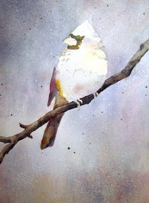
By following basic watercolor procedures, you can integrate the painting at this point. Choose the largest unfinished area, in this case the background, and complete it. Then select the next largest area or palest area and work on it, and so forth. During the process of painting, most of the white shape will probably be covered up with at least one layer of paint.
At this point, the background was completely painted with a cool wash, and more popcorn salt was added to the barely shiny wash. The dissolving salt revealed the warm color under it, creating a bit of mystery and depth to the atmosphere around the cardinal, with that first layer of salt texture showing through to add more dimension to the painting also.
Think of Step 3 as 'painting like you normally would paint a painting.' Ignore the white shape. The background has been resolved here and the whole branch darkened. There's hardly any evidence left of that original white shape.
Painting the rest of the cardinal shape included painting a warm yellow over most of the bird, then adding magenta and orange to the moist yellow. Careful attention was given to the changes in values in the reds. Keeping the lightest areas really light helped give roundness to the bird's body.
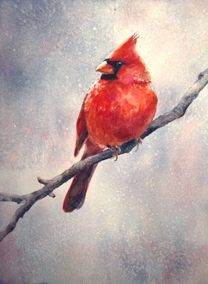
Step 4 involved finishing details and removing miskit. If you like details, you'll be in heaven doing this step. A few select darks were popped in to help add dimension to the bird and bring more emphasis to his face. All the miskit was removed and more adjustments were made to those edges, too.
The distant branches in the painting were actually an afterthought and slightly suggested already in the first two washes on the sky area. The background needed to be balanced against the strong shape of the cardinal, so a 1" flat brush was used to jab in some very pale "Y" lines to indicate branches here and there. The color used was actually just dirty water, which was perfect for quiet gray branches out of focus in the distance. Some of the lines were blotted lightly with a tissue before they dried. That helped make them look less conspicuous. They were not carefully done, but slapped on and blotted off randomly.
 Colors used in this painting were all from Daniel Smith Company in Seattle and included Ultramarine Turquoise, Indanthrone, Phthalo Blue-Green Shade, Transparent Pyrrol Orange, Permanent Yellow Deep, Raw Sienna, Quinacridone Magenta, Quinacridone Burnt Orange. Except for miskit application and signature, a 1" flat brush was used for the whole painting. Any colors or brushes would work, but those were the ones used for these painting this time. More important than the colors or the brushes was the fact that each painted area was allowed to dry very thoroughly before painting on it again, to avoid dullness or a muddy look to the colors.
The completed painting, begun with considerable planning and shape making, scarcely shows any evidence of all that shape making work. So what's the point of going through all that good white shape business?
John Salminen explained that the shape would 'hold the painting up' just like our bones, though not at all visible, hold our bodies up. Indeed, it does.
Applying that first opposite temperature wash around the good white shape eventually helps neutralize colors that are furthest away from the focal area. The colors added later in the white shape are pure colors, rather than grayed ones, and enhance the luminosity of the painting where it really counts.
The other thing that using this process seems to accomplish is this. Since the focus is on 'shape making,' which is a right brained, creative activity, more of the expression of the artist is released.
So often, painters duplicate the things they see, like tails, and eyes, and hands, etc. The result is a well rendered duplicate of their reference. But by focusing on painting shapes, not things, more of the artist's hand and heart will come out in the painting. Expression is more likely when we're in our 'right minds.' Painting shapes (not things) is one good way to be in our right mind and to increase our artistic abilities.
Although the 'skeleton' of this picture is very hard to see, it IS holding the picture together in a way that wouldn't have happened if I'd painted the background first, then the cardinal, etc. My normal background sky might have been a sweeter, prettier blue overall without the subtle nuances that exist painting this way. Those first couple of steps of the good white shape process make all the difference in the unity as well as the strength of the painting.
In the earlier post on Jan. 8 of the demo cardinal, you can 'find' the great white shape there by looking at the purity of color in the background and on the bird. The sky area is a beautiful, clear blue near the bird's head and chest and is slightly grayed as it moves toward the edges of the paper.
As a teacher, it's been rewarding to see the improvement of so many of the artists in my classes who have embraced this approach to painting. It is challenging to apply at first, yet the results are so worth the effort. If you want to see a variety of paintings done using this good white shape process, check the lower right hand side bar of labels under great white shape.
Thank you, John Salminen, for sharing this process and being such an excellent teacher and encourager. And thank you, again, Lynne, for allowing me to paint from your beautiful photo of this glorious bird.


