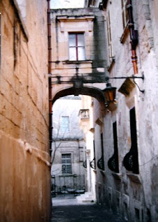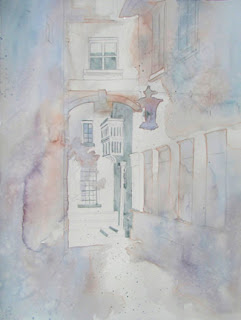
 This photo, one my sister took in Malta, has been a source of inspiration for me to paint from over the past fifteen years. The March 7th post (WARMING UP) shows one of those completed paintings, but here the image has been reversed. The approach and techniques used are also very different than before when I painting this same subject.
The black and white image (above) relates to the basic light shape in the photo. In that simplified design, there are three black shapes with one continuous white shape, which goes off the page on three sides. That white shape's was transferred to the watercolor paper and was left white - unpainted - in the few first steps of the painting.

The first layer of paint was very, very pale and was also the opposite temperature of the finished painting. Some of the painted edges creeped into that white shape more than I
wanted, but they'll be ok.
The gray areas shown around the balcony, the door, window panes and the upper window, and in the light are not paint, but actually gray miskit painted on the paper to keep it totally white. There are some splatters of miskit in various places, too, especially in the walkway. It'll all be removed later.
Next, a few small warm dark shapes were added within the painted areas, touching the white shape somewhere. You can see a variety of edges, from  sharp, hard edges to soft to disappearing edges in the dark shapes. The contrast of dark and light helps establish the basic range of values early in the painting.
To finish the painting, the largest areas must be painted first, then medium sized shapes, with the smallest details added last. The next couple of photos represent the gradual progress of painting from large to small.
Areas that used to be pure white are adjusted, and the original white shape seems to slowly disappear. That good white shape was important to help establish unity to the final painting. The white shape won't be visible when the painting's done, but that part of the painting will have the best glow and the purest colors. 
I enjoy using as many sedimentary colors as possible in paintings like this to take advantage of the textures created by the granulating colors. Lots of violet has been added to the warm oranges and yellows on the walls, and the only brown used was Quinacridone Burnt Orange.
That initial cool glaze over two thirds of the painting helped quiet down or 'gray' the outer edges of the warm colors. The subtle graying of those warms away from the focal area actually makes the focal area have more impact and seem to glow more.
There are several stages of this painting shown here so you can compare each progressive stage of the painting.  Once the upper right hand windows had some color on them, I applied miskit over the lighter parts of the windows to preserve the shutter highlights. After darken that window area, the miskit on the windows was removed. In the third to last picture, the miskit has finally been removed from around the door area, exposing pure white paper.
The last two pictures seem almost the same. In the last picture, the lamp has been separated from the archway and detail added to the boarded up windows. The tree was lightened a bit and the balcony shadows darkened. The last thing painted was to darken the top panes in the upper window to anchor it better.


