2/19/10

WISHES

All of us here in the Ohio River Valley have a zillion photos now of our record snowfalls. One snowfall was beautiful, the second one was gorgeous, the third was enough but they kept falling, almost daily. This lovely hula snow honey greeted all the artists yesterday who made it to classes. It's wishful thinking that it could be warm enough to wear flip flops.

It's supposed to snow Saturday so I'm heading north, out of here. There's a Watercolor Society of Indiana meeting on Sunday in Indianapolis with artist Rena Bouwer painting to live music provided by guitarist Joe Peters. Before that, I get to do some serious 'Grandmothering.' I'm packing lots of paint and paper for them to use up when I'm at their house.

Yesterday Dawn let me know how wonderful the weather is in her neck of the woods --- in the mountains. SIXTY DEGREES!!! Makes me think about moving, but I do love it here.

Have a great weekend, and I promise - no more snow pictures. Thinking spring:-) By the way, the hula snow honey has a REAL belly BUTTON, but it didn't show up in the photo since it was white, too.




2/18/10

HAPPY DAY!

Finally, a couple days without snowfall. We're happy, all of us, even our blanketed deer seen outside the studio walkway. She was waiting and wondering where all the artists are. They've returned to paint. YEAH!

Two nights ago after my honey cleaned everything off again, it snowed again....of course. We should be used to it by now but most of us are whining.

He really does enjoy that John Deere snowblower, but it was a bear to clear all the snow from our up hill drive and the parking area. What were we thinking when we sold our snow plow 20 years ago? Global warming, maybe.
It's so good to paint with friends again. Class yesterday was perfect even though several in the class couldn't make it.

Some like to paint alone but I'm definitely a paint-with-people-person most of the time, unless I'm getting a painting ready. When I'm planning, I need solitude and quiet. When I'm painting, I so enjoy the creative energy of other artists. We're all different. How about you?

2/17/10

TWENTY

Here's the latest of my twenty minute paintings. The inspiration comes from all the snow we've had - a record for sure. This black glove has seen it's share of digging out snow, and painting it was pretty challenging, too.
While looking for paper to paint on, I came across some 'textured' papers I'd created several years ago at a workshop with Peggy Brown. Twenty minute paintings would be a perfect way to use these watercolor-painted textured papers. The first photo shows the finished painting, then each successive photo shows the work in progress going backwards. Also a reference photo taken after the painting was finished is at the end of this post.

This shows the painting with only 2 minutes left to paint. The edges must still be softened here and there (the darks are too harsh,) and some adjustments need to be made to the lighter areas. A few light hard edges must be softened, but keeping hard edges near the focal area is crucial.
I'm pleased with the fresh look of the glove at this point and must be be cautious now with each brush stroke. Overdoing it is so easy to do. Every stroke counts, especially with watercolor at this point. The pressure is on!
When 15 minutes showed on the timer, this was where the painting was. Almost all the main shapes are in, except for that big shadow shape yet to come and the rest of the wrist of the glove. Focusing on painting just the shapes in the correct value takes intense concentration. My inclination was to paint the fingers of the gloves instead of the shadow shapes on them. I wanted to paint the glove like I would pull it on my hand. THINK shadows and shapes.
To make the dark black of the glove, I dipped into the darkest colors in my palette, using controlled moisture, and let them mix pretty much on the paper. There's some Quinacridone Violet, Indanthrone, Ultramarine Turquoise, and Quin Burnt Orange, plus some Cobalt Blue and Cerulean. No black paint, though. The colors make the blacks seem livelier to me than black paint out of a tube.
This shows ten minutes worth of painting time. I remember wondering if I could get the painting done in another 10 minutes or not. Since I had no drawing to start with, I had to rely on painting connecting shapes. The proportions were close enough to be believable so far, at least. There's a lot to do before this will look like a glove, though. It was hard to stay focused on values and shapes, yet the folds in the glove made such neat shapes to paint - see photo below.
It sure seemed like a great idea to start with the darkest shapes, connecting those shapes as much as possible. With no pre-drawing, it was a challenge to make the correct angles and curves in the correct relationship to each other. I started with the buckle, a most fascinating shape and near what I hoped would be the focal area, at the lower left, and worked my way around the finger shapes. Using just one value at this point helped simplify the process a little. My eyes looked for the darkest darks, and that's what I focused on painting. This photo was taken exactly five minutes after the painting began.
Here is how the paper looked before the painting began. Subtle textures of muted colors would make a perfect background for the winter gloves. The paper is 80# Strathmore Aquarius II, a synthetic blend that doesn't stretch and is quite soft. Paint shapes, paint shadows, forget about the THINGS you see and paint those shapes and shadows. Then fix the edges of the shapes to be either hard, soft or lost edges. Use whatever colors you love and get the values correct. It'll work every time! Have fun:-)

< Reference used of my husband's two gloves. He's spent lots of time outside that last two days clearing snow. I really hope to have class in the morning, first class in two weeks' time, due to the weather! It's been beautiful, though.
Blogging this took about ten times longer than painting it. It's sure faster and easier to paint with a one inch flat Daniel Smith synthetic brush than use a computer and keyboard to tell about it.

2/15/10

DEMO

Wednesday morning's class asked for a demo on pouring miskit and pouring paint to create a background for a painting. Steve Blackburn introduced this technique, winning major awards with his paintings. He also teaches workshops to help artists discover how to create this unique look.

First, a small blop of miskit was placed on the paper, and immediately the edges of that miskit blop were lightly spritzed with water to make the miskit trail out into those spritzes. The paper was turned and tilted to encourage a random miskit pattern. Eventually, the white paper had miskit trailings crawling over much of the surface. (See Steve's website for better instructions.)

When the miskit had dried, watercolor paint was poured over the paper and allowed to mingle with other colors which were added while still wet. For this one, warm colors were poured first over most of the paper first. Then when they were completely dry, cool colors were poured in chosen areas, with soft edges created with a sprayer. The whole paper was covered with paint, leaving no pure white areas anywhere. When all the paint was dry, the miskit was removed to reveal intricate patterns of whites which would play an important role in the painting.

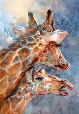
The drawing was done next, as well as a small value study in black and white. Once the painting began, the idea was to preserve as much as the original poured areas as possible and to include some of the white patterns within the focal area. Negative shapes behind the subject must be painted in, as well as darker areas within the subject - like the shapes on the giraffes, the eyes, etc.

Check out another master at this process. Kathy Wirth has adapted this technique to her own style of painting and creates breathtaking and unique florals, pouring miskit and paint first before 'pulling' out the flowers almost magically from the poured surface.

It's a lot more difficult than it looks to create beautiful art this way. The challenge always seems to be to NOT PAINT what you are painting. That's sure confusing, but it's true. To let the beauty of those original pours be the highlight of the painting, they should remain untouched in the focal area as well as in other parts of the painting. This process is a great way to shift an artist's thinking from painting things like flowers or giraffes, into painting shapes of lights and darks.

These giraffes were finished last week during a snow storm, and today we're getting a lot more snow again. It'll be a great day to paint on YUPO and watch the birds.

"TWO FOR LUNCH" Transparent Watercolor on Hot Pressed Crescent Premium Watercolor Board, 20 x 30"