
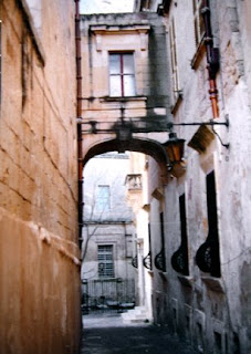
 This photo, one my sister took in Malta, has been a source of inspiration for me to paint from over the past fifteen years. The March 7th post (WARMING UP) shows one of those completed paintings, but here the image has been reversed. The approach and techniques used are also very different than before when I painting this same subject.
The black and white image (above) relates to the basic light shape in the photo. In that simplified design, there are three black shapes with one continuous white shape, which goes off the page on three sides. That white shape's was transferred to the watercolor paper and was left white - unpainted - in the few first steps of the painting.

The first layer of paint was very, very pale and was also the opposite temperature of the finished painting. Some of the painted edges creeped into that white shape more than I
wanted, but they'll be ok.
The gray areas shown around the balcony, the door, window panes and the upper window, and in the light are not paint, but actually gray miskit painted on the paper to keep it totally white. There are some splatters of miskit in various places, too, especially in the walkway. It'll all be removed later.
Next, a few small warm dark shapes were added within the painted areas, touching the white shape somewhere. You can see a variety of edges, from  sharp, hard edges to soft to disappearing edges in the dark shapes. The contrast of dark and light helps establish the basic range of values early in the painting.
To finish the painting, the largest areas must be painted first, then medium sized shapes, with the smallest details added last. The next couple of photos represent the gradual progress of painting from large to small.
Areas that used to be pure white are adjusted, and the original white shape seems to slowly disappear. That good white shape was important to help establish unity to the final painting. The white shape won't be visible when the painting's done, but that part of the painting will have the best glow and the purest colors. 
I enjoy using as many sedimentary colors as possible in paintings like this to take advantage of the textures created by the granulating colors. Lots of violet has been added to the warm oranges and yellows on the walls, and the only brown used was Quinacridone Burnt Orange.
That initial cool glaze over two thirds of the painting helped quiet down or 'gray' the outer edges of the warm colors. The subtle graying of those warms away from the focal area actually makes the focal area have more impact and seem to glow more.
There are several stages of this painting shown here so you can compare each progressive stage of the painting.  Once the upper right hand windows had some color on them, I applied miskit over the lighter parts of the windows to preserve the shutter highlights. After darken that window area, the miskit on the windows was removed. In the third to last picture, the miskit has finally been removed from around the door area, exposing pure white paper.
The last two pictures seem almost the same. In the last picture, the lamp has been separated from the archway and detail added to the boarded up windows. The tree was lightened a bit and the balcony shadows darkened. The last thing painted was to darken the top panes in the upper window to anchor it better.


17 comments:
Wonderful demo Sandy, thanks for sharing your steps
Sandy -- this is so awesome -- both in painting and in step-by-step -- THANK YOU SO very much!!! LOVE LOVE LOVE your Italy paintings!
Absolutely beautiful :) -- thanks again for the detailed notes and the photographs showing the different stages!I think you have a couple of books in these blogs !!!
I want to tell you that if I ever want to go to art school, I want you to be my teacher. You are a master, my master! I don't want to say mistress because you are not really my mistress, okay maybe teacher is better.
Thanks, Anita. Glad you stopped by today.
Lin, I LOVE ITALY and it's sure inspired a lot of paintings in me. Glad you like them.
Meera, A book will not be written by me- too much time and pressure. (I'm such a whiner.) Blogs are great for sharing day to day, and I love that. Thanks for commenting.
Ces, You MUST be a comedian...you keep me laughing with so many of your comments. It is great that we all teach each other via our postings. Thanks for your encouragement. I appreciate it a bunch.
Wonderful post, Sandy. You explain your methods so clearly. Thank you for that and sharing this beautiful painting.
Love this painting with its mellow colors and textures. I'm intrigued by the b/w image at the top: such baroque shapes that I didn't see in the photograph. How did you distill these shapes? Your painting of this street in Malta reminds me a little of the Griechische Gasse in Vienna. Similar perspective and atmosphere. Thanks for sharing your process!
Thanks, Ann, for your kind comments. Hope spring is happening in your part of the world.
Mineke, the shape was derived from my drawing based on the definition of a good shape - irregular, unpredictable, and oblique. John Salminen's directions for creating a good shape include it going off the page on 3 sides, taking up about 30% of the area, and being either mostly curvilinear or straight lines. I took those things into account as I 'looked' for a good shape in the drawing. The white shape also needed to be one continuous shape and include all the future whites of the painting.
I start on one side of the page and draw a line up to the white areas, adjusting it until I have it going off another side of the paper. I start the next line at that 2nd side of the paper and make a new line to eventually go off the 3rd side of the paper. The lines cannot touch or cross. The third line starts near that point where the last one went off the paper and moves over near where the original line began, never crossing or touching exisitng lines.
I love shapes and have a good time playing with this future good shape. The purpose of all of this is to establish an underlying sense of unity in the painting. That original good shape will be hidden, and when the whole process is floowed, yet the colors in that white shape area will be purer and more vibrant than the rest of the painting. It's such a subtle yet very successful way to incorporate unity while developing the whole aspect of the painting at one time - no background/foreground problems, since they are developed together. Complicated subject matter really paints esier this way, toot.
Sounds like a hassle - and was until I did it several times. Now I love the whole process, except that the painting time seems lessened because the of the nature of how this process works.
Long reply - in hopes others may want to try this. Keep those brushes wet.
Thank you so much for that explanation, Sandy. It's most informative and inspiring! I love shapes too, but never tried anything this methodical. I love how you coaxed these dynamic shapes out of a somewhat static subject (especially on the left). I can see how it would lessen the painting time, but I imagine that you paint with more confidence and freedom on a solid underlying structure like this. I always pay attention to the shapes at the top (skyline)of my compositions, but am often at a loss about what to do with the sides, especially in architectural subjects. Your approach gives me something to think about and experiment with. Thanks again.
Amazing, thank you for the step by step demo.
Hi Cathy, Thanks for the stopping by. It's an approach that can be used with florals like you paint so beautifully too.
Mineke, Your paintings are to die for - and they never look like there were ever any problem areas in them. Thanks for your support and encouragement, and for visiting.
Great demo and such a lot of process detail we all love. The extended info on one of your comments is also very very helpful and love the idea of working subject and b/g together in this process. BTW the resulting painting is well worth all the hard work to achieve those lights and tones.
Another beauty!! The colors are so appealing to me.
Hi Sandy,
I keep seeing your name on Myrna Wacknov's and Mike Bailey's blog, so I thought I'd take a look. Fascinating demo, thanks. You've captured the light and feel of the old sections of a European town, village or city. Wonderful!
Hi Joan, Your recent pink gessoed acrylic painting made me start thinking of another approach for this painting. Love how our ideas can flow internationally and so fast.
Sandy, Thanks for stopping by and glad you like the colors.
Peggy, So glad to get to visit your blog too. Good luck with your painting in the show. Please visit again soon.
Wow, Sandy, what a great demonstration and lesson - and beautiful painting. I think I might attempt this someday soon, and hopefully get a really 'finished' watercolour!
Cathy, It's a great way to keep a paintng together and anchored. Sure love that new beach scene on your blog.
Post a Comment