1/26/10

20 MINUTES AT A TIME

Pop on over to Kathy Cartwright's challenge blog to see that artists can actually paint a picture in just 20 minutes. We must set our timer for exactly 20 minutes, then begin on clean, untouched paper. It's ok to draw the pix as long as that's included in the 20 minutes allowance.

Several of my weekly classes have taken up Kathy's challenge. Comments from the artists - it is difficult to fit an extra 20 minutes into a day's activities.... but once the painting is started, it's a wonderful break from life.....finding something interesting to paint can be challenging, at least at first.

Twenty minutes of just being creative. There's no pressure that the finished (or not finished) painting or drawing will ever be hung on a wall. Accuracy is great but not required.

Some of the benefits include making time for doing something that you love to do as well as honing your observation skills. Things must be simplified into basic shapes to get a small painting down in just 20 minutes. Kathy says that this exercise will help you also see your own style and identify your own idiosyncrasies. Try it! I dare you.

These are my five paintings done over the past week, all 5x7", painted with a one inch flat brush, and most were completed in a little under 20 minutes. Some were sketched in first. The bell did ding before the paint bottles below were done, though, so they are not finished. Here's the link to Kathy's challenge blog - http://www.twentyminutechallenge.blogspot.com/

The ipod has a pure white, unpainted background that looks blue here. The hyacinth was painted because Rhonda Carpenter dared me to. And today's her birthday:-)

The fluid acrylic paints had just arrived and were the toughest to paint for some reason. My favorites to paint were the sunglasses and the electrical plugs, and I think that shows in those two paintings. Have fun painting.

1/20/10

CHILDREN'S PORTRAITS

Any weekend that includes seeing the grand kids is a great weekend, and this will be one of those great weekends. We already have plans to camp out downstairs. Each of the 4 have their own tent all set up with a sleeping bag inside, but I have to sleep 'above ground' in a bed. WHEW!
This portrait shows our youngest granddaughter resting on her mama's shoulder. It was painted several years ago in watercolor on 140#CP Fabriano Artistico and is one of my favorite portraits. My son loves it too.
Tomorrow is a full day of classes here in the studio, then I'm off to totally enjoy three 6 year olds and a 9 year old. It will be a full weekend, for sure. Happy painting, everyone!

1/18/10

ONLY 20 MINUTES

Kathy Cartwright has an excellent art blog, and in it, she challenges readers to take her "20 minute challenge." Click here to see her blog and read more about this challenge.

Last week, two of my classes were challenged with Kathy's 20 minutes idea. Each class was instructed to paint several small paintings this week, taking only 20 minutes per painting.

We set a timer in class while they did the first one. So many were surprised at how much fun it was to 'whip up' a painting in 20 minutes. The guidelines include starting with a blank sheet of paper, stopping when the buzzer goes off, and painting something that is visible at the moment - no photos or memory painting. Most are using watercolor, but pen and ink or graphite are fine - any medium is ok to use.

Of the five I've done this week, two of them were from a view out the studio window and significantly show the dreary days we're having here in southern Indiana right now. All are small, about 5x7" and done with transparent watercolor on Arches, 140#CP. I started out with the brush in my hand and made no drawing before painting.

Tomorrow the class will bring back the week's work. I'm really looking forward to seeing their creations.

The cardinal and chickadee at my feeder were painted this afternoon, and the cardinal started out as a small tufted titmouse. It's a good thing that watercolor can be corrected to some extent. I did take the liberty to 'rearrange' the tree that the feeder hangs from, since our feeder really hangs down from the upper deck.

The tricolor beech looked very bleak and lonely in the cold, even with its few leaves still tenuously attached to the twigs. A couple of days ago, a buck rubbed his antlers on the thin bark of this beech, scraping a large gash in the bark, but the damage doesn't encircle the bark. The tree should survive.

These daffodils are blooming right now in the studio, along with an impossible-to-paint purple hyacinth. Painting any yellow flower has always been a challenge for me, but painting them in just 20 minutes
kept me from overworking them. Still, I found it impossible to capture that spring-like freshness that daffodils have.


The last two paintings were demos done in class. People have told me that I paint fast, and I must. Each painting was done before the timer went off.
Maybe I should slow down and draw the subject first next time. It would have helped the shape of the copper pot, especially the spout. Nevertheless, Kathy's challenge is a lot of fun to do and seems to stir up my wanting to paint even more!


1/15/10

REALLY DIFFERENT

Over the holidays, one of my sister-in-laws took on the challenge of painting with watercolor, and she did very well. Hopefully, she now has her painting hanging in her office in Colorado.

This first painting shows the little demo I did to help her get started, and it's quite small, maybe 5x7." The second painting is also mine, painted more than a dozen years ago and is about 28x40." Both were painted without any visual references, but what a difference there is in the two.
The paintings were done years apart.
They are vastly different in size.
Each was painted for a totally different purpose.
The smaller one took less than 20 minutes to create.
The larger one took over 20 hours.
Different color choices are evident - lots of Indanthrone in the smaller one and too much French Ultramarine in the big one.
The looser style of painting contrasts sharply with the tight, controlled look.
The smaller painting, even though it's fairly simple, shows a brush which has had more experience.

It's not in me anymore to create a painting like the big sycamore and creek. But if I did paint it now, it would be simplified, quieter, less grassy stuff and fewer branches, with more emphasis on what was important to say, etc. If it were painted again, it would have a totally different outcome.

Here's the biggest difference. The sycamore painting was about accurate recording of all the THINGS shown in the painting, while the quick study painting was about paint application, value differences, and shape making. Recording things on paper just doesn't interest me as much anymore. Hope that makes sense.

We talked in classes this week about developing our own style of painting. Although there's a vast difference in time, size, colors, style, etc, of these two paintings, is it likely that the same artist painted both of them?

Compare painting styles to handwriting. Each of us has a distinct signature that we sign our name with. My stance is that each artist also has a distinct style within that naturally shows up in every painting. The longer we paint, the more obvious the style is. We don't have to develop it because it's already there, ready to show up when we learn how to paint.

That unique style can be camouflaged at times, like when a student artist is learning the style of a particular artist or trying new techniques. But even then, the way the brush hits the paper is different for everyone, and that unique 'painting' signature is evident.

One last comment - - - the big sycamore was painted as a graduation gift for our son, who requested a painting of a creek, snow and sycamore. He likes realism so that was the big focus when it was painted. At least that's my excuse, and I'm sticking to it! Have a great weekend.

1/10/10

BATIK LOOK-ALIKE PAINTINGS

In the late 80's this Amish buggy was 'parked' outside a small grocery in Greentown, Indiana and looked like good painting material to me. However my desire was to paint it with more of a contemporary flair to contrast with the old fashioned look of the buggy.
Having tried one or two 'tape paintings' (that's what I called this process,) I decided that 'taping' the painting would be the way to express what I envisioned. Since this was one of my first 'tapings,' I had virtually no plan or even a drawing, just masking tape, paint and a photo to inspire me. The batik-like look that resulted from this painting hooked me for good. I knew then that all the work of tearing pieces of tape to fit each shape would be worth it. The resulting textures were so unique and exciting.
Later this buggy painting was entered in a local show and was awarded second place. The judge, Jerry Smith, WSI, asked me why I left off the horse's head. He may have wondered if it had meaningful significance. When I told him I ran out of room because I hadn't planned ahead, he grinned and shook his head.
This taped painting of a village in Italy was one of my favorite ones to do. Last week's post, also about taped paintings, has a similar painting. Once I had completed this one, I realized that zooming in on the people would make a great painting without all the buildings.
Because the watercolor paint seeps under the tape in an irregular way, wonderful and unpredictable textures result. Over the years of experimenting, I've discovered which brands of tape 'leak' the best - or worst. Still, it's always a surprise when all the painting part is completed and the masking tape has to be removed. Often adjustments must be made once the painting is revealed.
My previous blog last week included a taped painting of this same shuttered window and quilt. Check out the difference in colors changes and how that affects the mood of each painting.
It's impossible to 'copy' a taped picture because of the way the masking tape tears and the way the paint seeps under it. What a surprise it is to remove the many pieces of tape to find glorious color combinations, too.
This painting was an experiment done just for fun, with no plan. It's called "Throwing in the Towel," and is quite small, only about 8 x11" Only four layers of tape were used, as compared with my normal six or seven layers. There's also a little stamping added in the whitest areas.
The previous post also had a painting of this very same window with tulips under the window. The three taped paintings shown on this post each have their own 'flavor.'
Recently, someone posted an opinion about artists who repeat the same paintings. They believed that repeating a painting was "self plagiarism". Tell that to Monet with his haystacks!
If I love a photo I've taken, if I'm inspired by it time and again, I WILL paint it more than once... because it's still brewing inside of me ....don't know how else to explain it. Some things just never stop intriguing me, and I must paint them again and again, using different approaches each time.
The vast array of textures in Italy are perfect for this taping technique. These old buildings began as a taped painting on YUPO using FLUID ACRYLICS, applied with a watercolor approach to be transparent.
This was the first taped painting I'd tried on YUPO. Regular watercolor lifts off of YUPO, so it wouldn't work for the taping process.
Thank goodness for the flexibility of Fluid Acrylics. Only three layers were taped on this, then the rest of the work was done with a brush.
Both gouache and transparent watercolor were used for this taped painting, which was begun with absolutely no plan. Once the tape was removed, after seven layers of taping and painting, (see below)the painting needed a lot more definition. 'Finding' a direction for the painting was a challenge until Barb mentioned that she could imagine a woman with a fancy hat on, something like a Kentucky Derby hat.
The next photo shows how the painting looked after the tape was removed. The last photo shows the work in progress as I slowly 'found' her with her hat in all the tape design. Almost all my taped paintings begin with a specific plan, but this one didn't. It was lot of fun to discover what the painting could be.
There's a workshop scheduled in April this year in Indianapolis where I'll be teaching this unique process. You can check out the 'batik-look-alike' taping workshop on my side bar to find out all the details. Hope to see you there.

1/3/10

BATIK LOOK - ALMOST BATIK!

These paintings on today's post have been created with watercolor in an unusual way and tend to have a batik-like look. The process is one I developed in the mid 90's using masking tape. The masking tape is torn or cut and then pressed onto areas that are not to be painted. Layers upon layers are added along the way throughout the painting process.

Once the painting's completed, it's actually totally covered with many bits of masking tape. Then the tape is carefully removed to reveal the painting underneath. I love the surprise element involved in this kind of process, and I never know for sure until the very end if the painting is working or not.
A straight edge razor blade was used to tear and shape many of the the tape pieces for this tape technique painting of an old window in historic New Hope, Pennsylvania.

This April, the Watercolor Society of Indiana is sponsoring a 4 day workshop in Indianapolis, Indiana, where I'll be teaching this unique watercolor process. Check out the side bar for more info or click HERE.

This archway/window painting combines both watercolor and gouache, an opaque watercolor, along with the taping technique. It's obvious that correct perspective wasn't a goal. Capturing the essence of the locale was far more important in this instance.


This is a detail of a tape painting that also has gouache on it. It began as an abstract and slowly evolved to be a little old lady watching her friend knit....or is that a paint brush? Only select areas of the taping process remain, since many were covered over as the painting developed. This shows only a detailed area of a much bigger painting and is my favorite part of the painting.
Double click on the any of the paintings to see the taping effects or batik look better.


This was a two day painting - two FULL intense days! And it was worth it because this painting took awards, the best being a Gold Medal at an Ohio Watercolor Society juried Show.
This scene, taken from a photo I took years ago at Sauder's Village in northern Ohio, is one I've painted several times, with adaptations each time. Anything with strong contrasts lends itself to being painted with the taping technique.


These Masai women show such power and strength, and the patterns in their beautiful handmade clothing made me want to use the taping technique to paint them. Creating their face details with tape certainly presented new challenges. This painting now 'lives' in Germany with my sister-in-law, Chris, and my nephew, Jonathan, took the original reference photo. Double click on the photo to see the taping effects better.
This scene in northern Italy also won a nice award at one of the annual Watercolor Society of Indiana's juried shows. The tape technique is a natural for creating textures to look like old stone work.


Here is another New Hope, Pennsylvania, window, and the flowers were added via artistic license. This is another scene that intrigues me so much that I've painted it several times in different ways.


As you can see, buildings easily lend themselves to this taping process, partially due to the straight sides of buildings and masking tape. This Italian village had many, many sets of ancient stone steps. The color isn't very accurate in this photo...too orangee and pale. Sorry about that.


This is one of my first taping paintings and is still one of my favorites. An architect bought it years ago, and since then, I've painted the same scene several different ways, but never with the same luminosity that this one had. This is one of just a few paintings that I wish I still owned.
The title of this painting almost caused it to be ignored by a judge who was tired of seeing so many watercolor flowers. "ORANGE BLOSSOM TIME" made him smile when he finally saw the painting, and he gave it Best of Show back in the 90's!
This van is the one I drove back and forth to my hometown in the late '90's to teach classes two days a week...putting over 12,000 miles on that van in one year alone! I did see LOTS of orange construction barrels, for sure.

John Deere tractors are usually bright green, unless they are rusted like this old boy. The taping in the sky area let some paint sneak under to look a little like cobwebs.


Every fall at our lake, people would pull their boats ashore. One drab day, I caught this scene and decided to make a tape painting of it. Although it's monochromatic, I still find it fascinating to explore.


New Hope, PA, again and another window, too. That town is packed with history as well as great painting material. I think I remember reading that George Washington even slept there!


Sturbridge Village in Massachusetts offers so much to see and paint. It's a wonderfully educational place to visit too. My sister and I were there on a very cold winter day when this shot was snapped. It's also one of the earlier taping pictures when I was first figuring out how to do what I wanted to do with the tape, so a lot of regular brushwork was done in this one.
This is one of my very first taping paintings, and it's won two Best of Shows!
The photo also came from Sauder's Village in northwestern Ohio.


This painting had lots of curves in the tree and house, so miskit was used along with tape to preserve areas that didn't need to be painted again. Miskit is easier to curve than tape. This old Italian home is atop a hill with a great view of the Ohio River.

The reflections in this back door caught my eye, so I started taping with these results. A mundane subject can sometimes become a good painting.


This old homestead was deserted. With the tape technique, the painting
became more about the feeling of the house than of an accurate rendition of the place.


This is a partially taped painting. The sky and background were painted with pale washes before the taping began, then avoided as the painting progressed. Quite a bit of regular brushwork was done, with the taping being a secondary part of the painting.


This very, very early tape painting was an adventure that didn't work out as well as most of the others. There's a lack of unity in the painting due to the jumble of techniques used. Still, experimenting is a great way to learn - and if there's success, then that's a bonus! The orange reflections on the water were gorgeous, though.

Thanks so much for 'grazing' through this collection of Tape/BATIK LOOK Paintings. One of these days, I'll try to post a taping in progress to show you just strange it looks before the tape's removed. Be sure to checkout the WSI workshop on the sidebar if you're interested in learning hands on how to create watercolors or fluid acrylics with this technique.

12/24/09

CHRISTMAS 2009

My Mother-in-Law, who turned 90 in September, is a fantastic and diverse woman who has lived through many, many changes throughout her lifetime. She tells about her childhood Christmases and the memories of her dad always waiting until Christmas eve to cut down an evergreen. None of the kids would see the decorated tree until Christmas morning, and she recalls that each holiday the tree was tied to the ceiling fan so that the cats wouldn't knock it over!

This year our Daughter-in-Law is making a very special dinner for Grandma GeeGee (my Mother-in-Law) the day after Christmas when we'll all gather to celebrate. My husband has the car packed with gifts to take, but the best part will be being with the whole family.

This painting was done as a commission almost two decades ago and certainly has the sentimental overtones for this time of year. May your holidays be blessed with peace, joy, and love. See you after the new year.....

12/22/09

READY TO WRAP

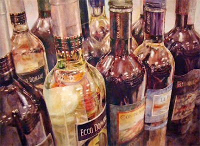
Finally, my younger brother and sister-in-law's Christmas present is ready to wrap. What fun it's been to paint eleven bottles of wine in full color, actually twelve if you count the smidgen of one on the lower right. For that last whole bottle on the right, step by step detailed photos are posted below. What follows is an attempt to describe the process.
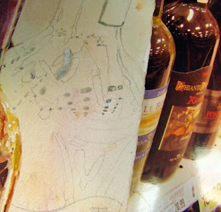
This first smaller photo shows the bottle with gray miskit preserving the whiter shapes/reflections on the bottle. The bottles seen to the right, with Kroger's prices below them, are my photo reference, with the middle bottle being the one to focus on for this drawing.

You can see a pale warm wash that was previously applied over the whole paper after the miskit was in place. Notice the pencil detail of the shapes, based on the light, medium, and dark value shapes of the surface of the bottle.
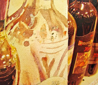

This photo shows the medium light to medium values painted in the appropriate shapes. Using lifting pigments like cobalts as well as earth pigments makes blending easier to do later. Cobalt Violet Deep along with Transparent Pyrrol Orange and Lunar Earth were the main colors for these light to medium value shapes.
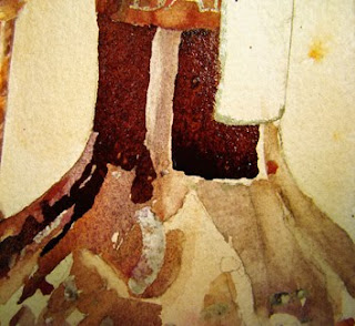
The neck of the bottle shows the dark values just painted but not yet blended in. All the edges are crisp and sharp at this point and won't be softened or blended until the entire connected dark area is painted. Even if the paint dries, it'll be easy enough to blend colors that are this dark into those medium shapes that were previously painted.
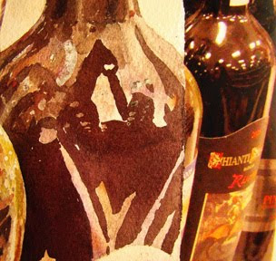
This shows the pattern of darks from the neck of the bottle down to the label, still with mostly hard edges. Check the photo reference right next to the bottle to 'see' why shapes were painted as they are. Though the painting's not completely accurate, the shapes are close enough to work.

Colors used to create the darks include puddles of Quinacridone Burnt Orange, Transparent Pyrrol Orange, Quin Magenta, Indanthrone, and Ultramarine Turquoise, all from Daniel Smith in Seattle. The mixture is not just one puddle, but several that may be a bit bluer on one edge or more magenta on another edge. (Is bluer a word?)

I mix the colors together very little in the palette, preferring that most of the mixing happens as they meet on the paper surface. Also, my brush is not rinsed between colors to avoid lightening the puddles with water.
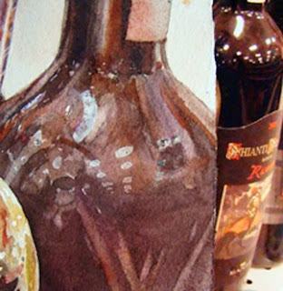
As soon as I took this photo, I could see in the small screen on my camera that the darks were way too light in many areas. At this point, most of the shapes have been blended, softened or left sharp, according to what's observed in the photo reference.

The miskit is still on the paper but will be removed soon to reveal whites and lights. This is when I often think the painting is lost. Nothing has any snap, and it looks pretty messy.

Although the wine bottle was brownish, I choose to use several colors to create that dark brown. Certainly one brown color could have been used and lightened and darkened as needed. But by using several colors mingled together, a bit more excitement is created in the painting than if the bottle had been only one brown.
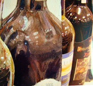
More darks have been added now to help give the bottle a lot more dimension. Often it's the lack of strong darks that cause paintings with reflections to lack any luster. Observation of where those darks are located and just how dark they are compared to other shapes is critical, as is whether they have sharp, soft or lost edges.

It's been said that the most important tool that any artist can have is eyes to see. Being able to observe and notice shapes and values and edges makes painting glass and reflective surfaces a whole lot easier. It's almost like putting a puzzle together, piece by piece. Just making each specific shape have the correct value with the correct edges will get the job done for sure.

Finally the miskit's off. It's important to wait until you're sure that you won't have to paint in that area again, and of course, the paper must be completely dry before the miskit is removed. Miskit is about like using WhiteOut. It leaves a sharp, defined, non blended edge that must be dealt with.

For this painting, the miskit shapes were softened with a thirsty, but damp, flat brush, and color was lifted from those edges into part of the white shape. Care was taken to keep paint off of the center of the shapes. Adding even a little bit darker values to those whites would lessen the impact of the dimension of the bottle. A few spots needed to be even softer, so I used a stiff scrubber brush along with a drop of clean water to gently loosen or ''erase'' the paint where necessary. Blotting each spot with a white tissue took care of the excess water and loosened paint - see next photo.

Finished. After stepping away from the painting and seeing it reversed in my overhead mirror, I decided that the whites on this particular bottle were too white. A gentle swoosh of clean water over the whites took care of the starkness of those whites.

White is the first thing we see, especially on watercolor paper, so the whites need to be in important areas. These whites on this particular bottle were close to the edge of the paper and pulled the eye almost out of the picture. Until they were toned down with mostly clear water, they were strong enough to rob the focal area. The three thin, gentle curved lines were lifted with a thirsty flat brush, since I goofed and painted over them earlier.

Reflections are not hard to do - as long as you use your observation skills. This whole painting was painted with my favorite 1" flat brush, except for when I applied the miskit. Careful application of miskit is crucial so that the white shapes have fluid edges, not scratchy ones. I use a rigger 00 size and rinse it in Goof Off when I'm done. After the Goof Off dissolves the miskit, the brush is rinsed in Dawn Liquid Detergent then rinsed in hot water.

Now to get the gifts wrapped and ready to go........ The title of the painting is Kevin's Domain, and it's bigger than the last bottle painting - about 20 x 14", on 140# Arches cold pressed. I think he and Gail will love it!